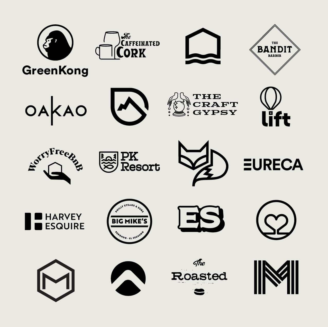
We all have a bank of memorized logos in our minds–the big names that we recognize at the quickest glance. This, of course, is not an accident. Any good logo is created with thought and purpose. It is made to be recognizable and iconic. A logo is more than an eye-catching symbol; it represents everything your brand is about. Since it will appear on every product, advertisement, business card, website, and social media channel you use, the main elements cannot be overlooked. That’s why we are sharing our top 5 logo design pro-tips.
1. Keep It Simple.
Although a logo represents everything included in a brand, it does not need to be complicated. It is a symbol of identity that immediately connects the viewer with your brand. It should be easily recognizable without too much information to process in a glance. A masterfully-done logo is complex in the creation of the design, but simple and memorable in the execution.

2. Know Your Audience.
Every business has a target market; your logo should speak to that audience. What other kinds of products attract your target market? What do those logos look like? You want to be unique, but you need to stay focused on what kind of look will attract the customers you want. Know what they like, and they will gravitate toward you.

3. Know Yourself.
Yes, your logo is designed with your audience in mind. But it should also match your company’s mission and values. You need to first know what you are about, in order to identify it to other people through your logo. What is the core purpose behind your brand? With that in mind, think about how you want people to feel about your brand when they see your logo. Know your brand, and make your logo a visual display of it. It’s the same idea as “be yourself, everyone else is taken”. You should know your brand like you know yourself, you audience will connect to your self confidence.

4. Make It Versatile.
Gone are the days when a logo was simply the writing on a sign above a storefront. It appears on everything connected with your business, and you want it to look good on every platform. It should translate seamlessly from the digital view to printed products. Your logo should be scalable, so that it looks just as good on a billboard as it does on a business card. The font can be artistic, as long as it is clear and readable anywhere it will appear.

Read more about what makes a logo versatile here.
5. Use Color Wisely.
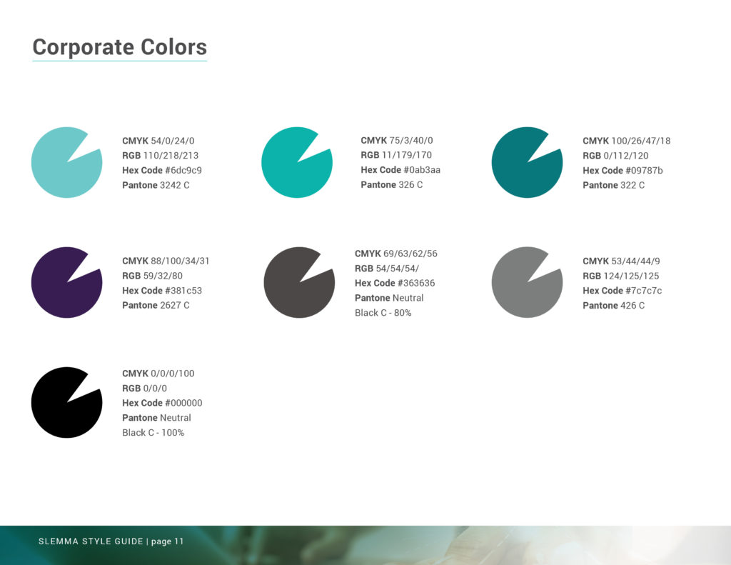
Research has shown that colors can make us think and feel a certain way. Your logo color should inspire the right feel of your company while matching the type of product you offer. Again, consider your target audience and the color schemes that connect with them. Along those lines, the use of white space can also affect the feel of a logo. It can bring balance and calm to a collection of colorful design.
Using our top 5 logo design pro-tips, you can better create an effective logo that connects your audience with your brand. Your logo needs to accurately represent the purpose and vision behind your business. And while it doesn’t need to be complicated, it does require care and thought to create your brand’s visual stamp on the world.
