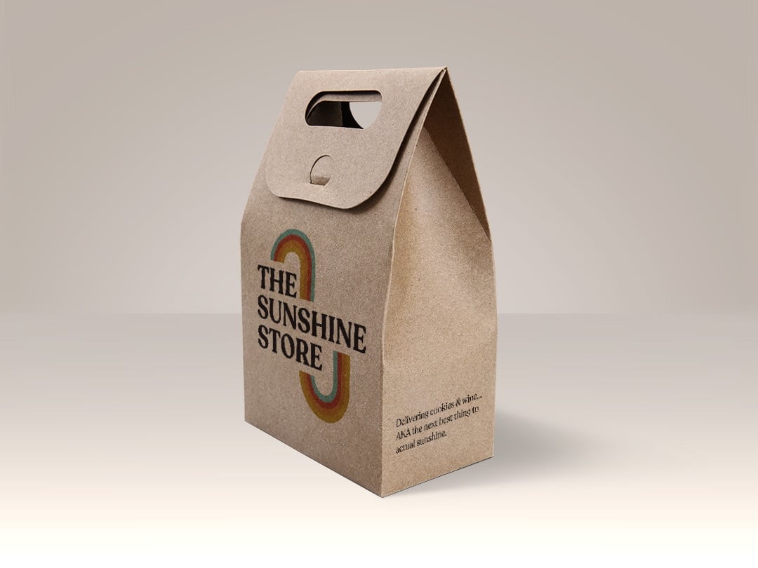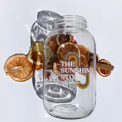
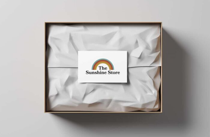
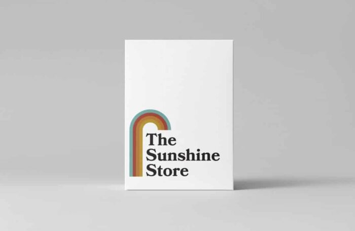
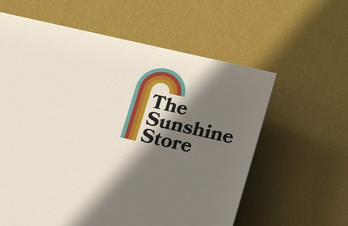
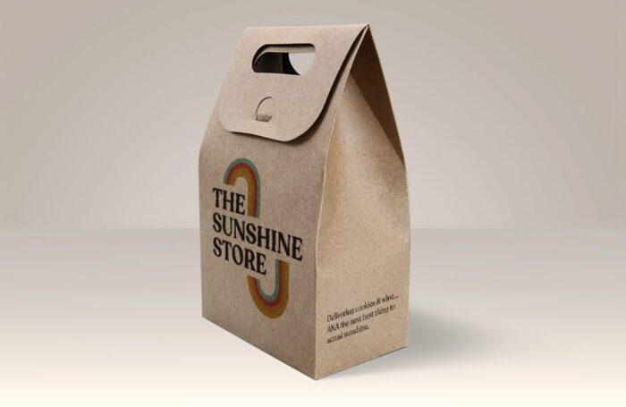
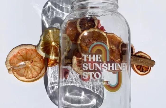
The Sunshine Store is a subscription box of cookies and wine! We know, it doesn’t get any better than that! That is why we knew we had to take on this project. We assisted with the logo design and brand direction for this project.
Our client expressed that she loved rainbows and sunshine-like colors. She also mentioned she wanted a very “California” vibe, which luckily, fell right into our design style.
We had a lot of fun playing around with different color palettes, a variety of arched and radial shapes, and trying different san serif, serif, and display fonts. Initially, the client expressed she liked a simple and clean san serif but after we did the first rounds we had a clear winner using the serif font Recoleta.
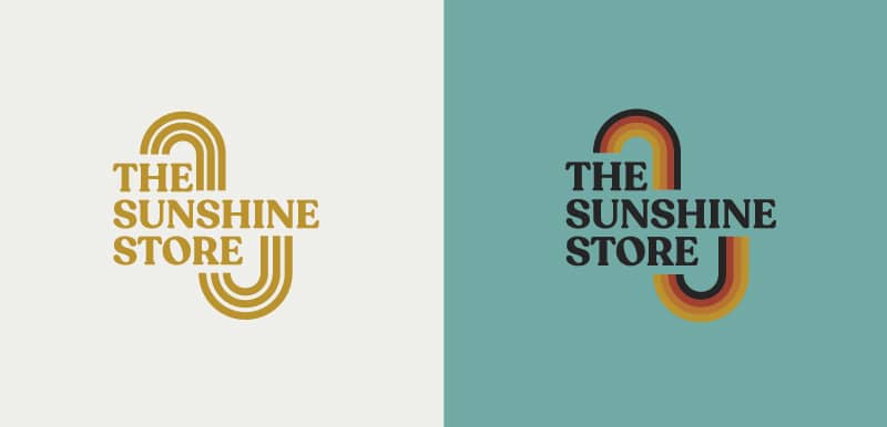
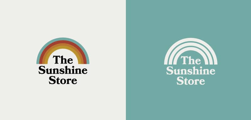
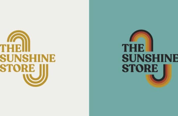
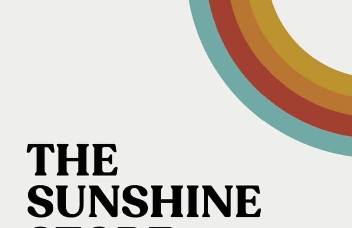
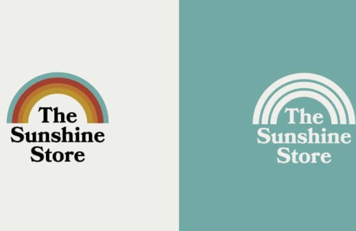
For the final color palette, we went with a mix of sunshine colors, red, orange, and yellow mixed with a dusty aqua color to represent the sky. We kept all the colors in a dusty range to keep it from looking too juvenile. The lock up the client liked best was very vertical so we worked off that comp to build out a variety of lock ups they could use in different scenarios, all keeping the same font and assets.
The one work around with this logo design was creating a version that worked as a one color. We had to break the rules a little bit and modify our “rainbow / sun rays” to have 3 stripes instead of 4. This allowed for us to keep the same line thickness while putting space between each line so it would print as a one color.
All in all, we couldn’t be happier with the outcome of this project! It’s going in the books as one of our favorite logo designs and we can’t wait to subscribe to our own box of sunshine!
