Logo design is something that is very near and dear to my heart. Prior to starting my branding agency I worked in-house for a few different companies in the art department. I used existing logos and brand guides to create marketing material and the occasional logo variation for a special product. It wasn’t until I started my branding agency that I really fell in love with logo design.
Everything about logo design excites me. I love the process, I love the meaning, I love a good logo! So let’s take a little deep dive into logo design… we are going to look at the history of logo design, this goes back longer than you might think! What makes a good logo design? What are qualities of a good logo design? Is a logo your brand? How important is a logo? What is the purpose of a logo? And lastly… how to create a logo. I will walk you through my logo design process!
History Of Logo Design
Did you know the first logos were actually cave drawings? Looking back to the Paleolithic times, cave drawings of symbols in the Lascaux Cave in France do represent a logo or icon! Yes, it’s a little stretch to call this a logo, but the idea is using a symbol or shape for identification. The simple sketches were identifying marks of the time.
Logos were also used in Ancient Grease, Egypt, and in religion throughout history. While they are sometimes called a “symbol” instead of a logo they are essentially the same thing. Egyptian Hieroglyphics used symbols as identifiers to document their history and leadership. Hieroglyphics are almost like an accent icon pack, symbols telling the viewer what they need to know.
If you see the Star of David you immediately know that is a symbol of the Jewish faith, same as the cross with Christianity.
Logos were also used in Ancient Celtic and Anglo Saxon cultures all throughout the middle ages. I know this is a total fiction reference but think of any of the big battle sense from Game of Thrones… each house had a symbol or, logo if you will, that was sewn on their banners and battle outfits. That logo was an identifying mark that visually showed the world who they were with, who their tribe was.

If you want to know more about logo designs throughout History, check out this article from 99 designs. But I hope we have covered the basics for you, logo design is nothing new! Logo design has been a key form of identification since the beginning of man kind.
Want to know more about the history of logo design? We got you!
What Makes a Good Logo Design?
Visibility
When it comes to a good logo design, visibility is key. Think about the purpose of your logo as being able to identify your product or service. Before the logo can be identified it needs to be seen. That is the visibility! Making sure your logo design will scale, meaning look just as good as a tiny app icon as it would on the side of a building, is crucial. Read more about logo designs that scale here.
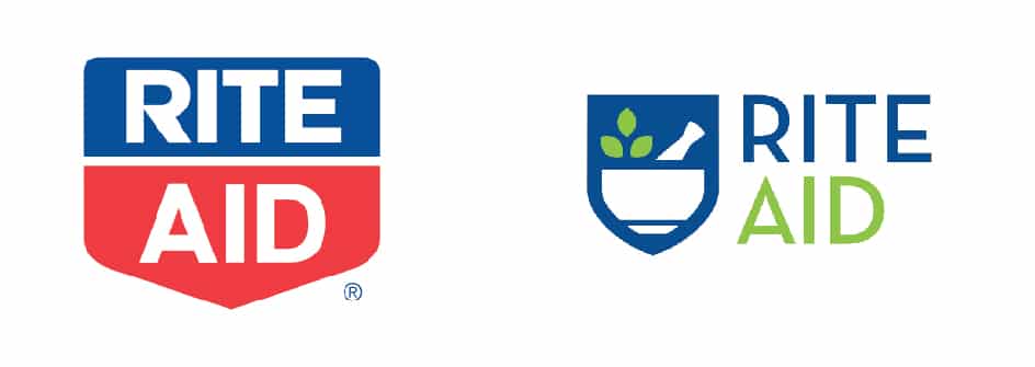
Along with scale, the visibility aspect comes in with color. Picking colors that stand out and don’t get lost on the eye is a big deal. Rite Aid drug stores recently changed their logo and branding from a red and blue shield logo to a blue and green mortar and pestle. While I don’t think the new logo is bad, the big miss was using the light / bright green color. I was driving past a Rite Aid the other day and on the sign all I could see was “RITE” because the “AID was printed in a chartreuse green color on a white background. The visibility was totally lost.
Memorability
A good logo design should be simple, why? Simple is memorable! Without thinking, you know what the Nike swoosh is or the Facebook F. If your logo is too complex, people will not remember it. I know it sounds crazy but the best logos should be able to be re-drawn by a 5 year old. That is the test of memorability. If you try to put too much detail in your logo, not only will it not scale, people will not be able to picture it in their mind effortlessly. You don’t want people thinking, “gosh, was there a monkey or a raccoon in there? It’s like a cabin right?” That is too much!

Simple shapes are quick to remember! Memorability builds familiarity which builds credibility! Simple shapes are crucial when it comes to good logo design.
I want to challenge you to think of all the top brands you use and love, can you picture their logo correctly in your mind without seeing it? What does their logo look like?
Appropriateness
Appropriateness doesn’t mean the opposite of inappropriate in this case (meaning something G Rated lol)… but is the logo mark and word mark appropriate for your business and brand? It needs to make sense. It doesn’t need to be extremely literal either… look at Nike, they create products for several different sports but their logo is not a football or a golf ball. But their logo does show motion. Motion is something that all sports have in common making the Nike swoosh appropriate for their business.
Qualities of a Logo Design Built to Last
While some iconic logos, like Coca Cola, have been able to adapt and last the true test of time, there are some qualities you can pay attention to now to make sure your logo will last in the future.
Is it simple?
Yes, keep it simple. We are in the tech age and who knows what that tech will bring us in the future but we do know a simple shape will adapt better than a complex one. A great example of this is the Oculus Logo by Mackey Saturday. He talks about how the logo needed to be a simple shape since the product is Virtual Reality goggles… we don’t know what the future holds but there is a chance the logo will need to live in a Virtual Reality and making it a simple recognizable shape will help ensure the usability of it.
Think of all the app icons on your phone. The ones that stand out the most are the simple shapes like Twitter or Facebook.
Ensuring your logo design works as a one color is another test of making sure it will last! Logos cannot always be used in color so making sure your design is solid and recognizable with that brand color is key to making sure it will last!
Is it trendy?
If the answer is yes, head back to the drawing board right now! Trendy logos will not last. Trendy logos will be outdated in a few years and you will be tempted to rebrand. Rebrands are inevitable in the life of a business but your brand should never be drastic and the overall idea of your logo will stay the same. Look at Subways recent re-brand, it still looks like subway.
I like to take a collection of classic logos like Target, FedEx, and Apple, that are just plain good, and set my logo design next to them. If my design looks like it could be on the same page as them, we are good. If my design stands out as “it was designed in 2016 when everyone was into that weird X thing” it’s not the right design. Stay away from trends like water color, calligraphy, and that weird X thing.
Is Your Logo Design Your Brand?
We get a lot of confusion around this point… while a logo is a component of your brand, it is not your brand. Your brand is actually many things and how those things come together to create a physical thing. I like to think of a brand as a person… if you were to design a person you would start on the inside and figure out how that person thinks before deciding what that person wears.
That is like your brand… knowing your brand and how your brand thinks will determine what your logo is. Logos often get mistaken as the brand since they are the most noticeable asset for the brand and overtime become the identifier for the brand. But let’s get it straight… a logo is not your brand.
A logo is an identifying mark for your brand. Think of it as the headshot for your brand.
How Important is a Logo Design?
I know I just bursted your bubble by saying your logo design is NOT your brand… but don’t think that means your logo is not important. Your logo is a huge deal. It is one thing you want to get right. Remember how I said it’s the headshot for your business? In your business headshot we all want to come across how we want to be perceived.
For me, it look years to get the right headshot, I wanted to look cool, artistic, welcoming but not overly excited, and professional. I have a big smile so if I smile too big, it’s in your face, but I also have a resting bitch face. I don’t mean to look like a B, but if I am not smiling, I could look that way… so a serious headshot was out the window. I finally got the right shot with a slight smile and black sweater so my work still stood out over my fashion choices.
Now you need your logo design to do that for your business. If you want to be seen as bold and professional, you need a bold strong mark. If you want to be professional but still have a fun light heartedness to your look, try a professional make with softer rounded edges. That will take off some of the edge.
A logo is a huge deal when it comes to creating a brand. Getting this step right from the get go will save you so much time and money down the road. Even for a small business, changing a logo design is costly. Think of everything you have printed with your logo on it… you need to change it. And all your digital assets… that takes time and time is money. Changing your logo design is also dangerous if you have already built up brand equity in your logo. You don’t want to change your logo and have your customers not recognize you.
Logo designs are extremely important. We suggest always doing your due diligence, putting in the time and money it deserves and getting it right the first time! A great logo can make a business and a bad logo can mean a business that never gets beyond start up.
Need some logo design tips? Check this out!
What is the Purpose of a Logo?
“A logo is identification, not communication” – Sagi Haviv
Yes, I wish I could take credit for this brilliant statement but I can’t. Sagi Haviv, a very talented expert logo designer, said that statement. Check out this Ted Talk he did!
People often get so confused on this one and want their logo to do all the talking. But, really a logo is an identifying mark, it’s not meant to tell your whole brand story. Think of the Nike swoosh, it’s a swoosh showing movement, you see it, you know it’s Nike. It is an identifier, not a descriptor. If Nike wanted to tell their whole brand story (meaning they make quality active wear, athletic shoes, and sports accessories for every sport from golf to yoga to football…) through their logo, that logo would look like a hot mess trying to represent all of that.
Instead, the Nike logo represents movement. It’s a clean shape that is easily adaptable and works on all of their products. It works on the side of a building just as well as it does on the side of your running shoe. If you know Nike, you see the swoosh and can identify it as their product. However, if you came from Mars yesterday, you might not know the swoosh as Nike, and that is okay! You know it has movement and overtime you will recognize it as Nike.
I challenge you to look at other corporate logos… if you came from Mars yesterday would you understand that the Chase Bank mark was for Chase Bank? Would you know what FedEx does? Would you know that Target was a store where you could get an outfit for a dinner party along with a toilet bowl cleaner?
In the logo design process your logo will evolve over time as you gain recognition. You will most likely start using a logo mark with a word mark and a descriptor. Check out this Target ad from 1962. On the ad it says, “Target is a new idea in discount stores” and at the bottom it says,“Target Discount Store”. So you know it’s a discount store. Now over the years Target has built up so much brand recognition they could drop the descriptor and eventually drop the name and just use a symbol. That is pretty remarkable when you can rely on a few circles to tell people who you are.
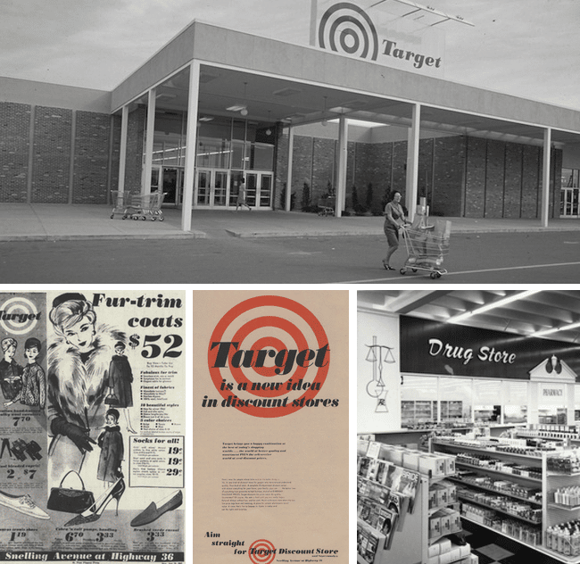
Here is a little more on the Target story.
How to Create a Logo
Logo designs that look like the simplest shapes are actually the most challenging to create. Believe me… I have spent weeks on a project only to land on a rectangle as the logo mark.
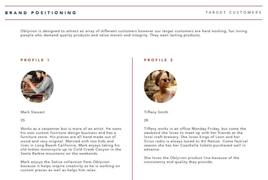
While every designer is different at Stellen Design we start all our logo designs with a questionnaire to our clients. Asking what our client is looking for and knowing who their ideal customer or client is, is a crucial step in the process. Designers are not mind readers so tapping into our clients minds a little bit helps! We also ask them to share any visuals they have gathered for their brand. If they have a mood board they have put together, that is a great start!
If you want to know more about creating the ultimate mood board to turn your vision into profits, get our guide to creating a mood board! It’s free and can be very helpful! (link to sign up)
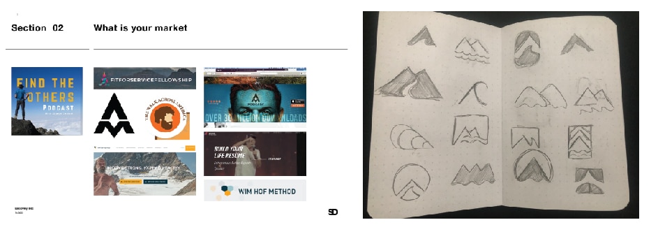
After reviewing our clients responses we draft up a discovery document. You might be wondering what that is… well a discovery document is something we put together to guide the project. We document our findings after researching our client’s market and competition, we include their findings from the responses to our questionnaire, we layout a mood board for the project (it is important to have a visual reference point!) and we like to include styling reference of styles we think would work for the client’s project. We also include an outline of some ideas we think could work!
Once we have reviewed the discovery document with the client and they are on board with our plan, we begin sketching by hand and eventually taking the sketches to the computer where the magic happens! Sometimes the ideas we outlined in the discovery work brilliantly, other times they flop and we have to pivot. But that is all part of the process!
Eventually we flush out the best of the best and present those to the client! Once approved we build out the chosen design into a logo design system to ensure maximum exposure and usage! Here is an article on what a logo set or system is! Know how and what your deliverables should look like.

How Much Should a Logo Cost?
The truth is logo design has a huge, and I mean huge price variance! The price can range from free to $500,000 +… that is crazy right?
So what is a realistic budget for a logo design? Well, like most anything in life, you get what you pay for. Meaning free is not going to be the best route to go. Sort of like the “free” version of HR Block where you file your own taxes…
I have put together a quick run down logo design pricing. For more info be sure to read our full article on how much a logo design should cost! Also check out this read! (he pretty much echos what I am saying here!)
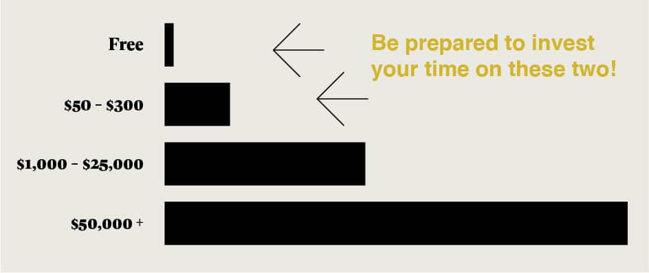
Free – DIY Method:
This means you are using a free DIY logo builder on a platform like GoDaddy or WIX website builders. I get it, sometimes you need to do what you need to do… like everyone dying and cutting their own hair during COVID… but if you don’t know what you are doing I suggest going another route. These website builders are pre-built templates and what you are using as your logo is probably being used by someone else who used the same template. You will also not be able to copyright the work.
$50 – $300 Online / Overseas:
Sites like UpWork, 99 Designs, or Fiver where you hire a designer (most likely overseas) to create a logo for you. This process is cost effective but can take time and chances are you are only getting a logo… no brand work or strategy behind it.
$1,000 – $25,000 Freelancer or small agency:
Depending on experience level this could range from $1,000 on the beginner side to $25,000 on the more experienced / small agency side. Small agencies don’t carry the overhead large agencies do so you are able to find the same level of work at a lower rate. They are not supporting 100 + employees. (Incase you were wondering, this is the Stellen Design bracket).
$50,000 + Large advertising agency / expert:
In 1986 Steve Jobs hired Paul Rand (a renowned graphic designer) to create the logo for his computer company Next. Paul charged Jobs $150,000 for 1 logo with no revisions or changes… that was in 1986 so you can only image what Rands pricing would be today!
When asked why he doesn’t give options Rand said, “You don’t go to your Dr. and ask him for options to cure your illness. He gives you a solution, I am going to solve your problem.”
Remember when hiring a logo designer, go with the person who understands your vision and who’s style resonates with you most! Price should not be the sole factor.
To conclude…
Logo design is something very near and dear to my heart. It is what makes me tick, what makes me excited, and is the reason I get out of bed everyday! I hope this article has brought some clarity to you on what a logo is, why it matters, and how they are made!
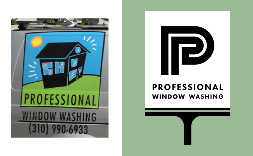
Check out some before and after logo design we have helped with!
