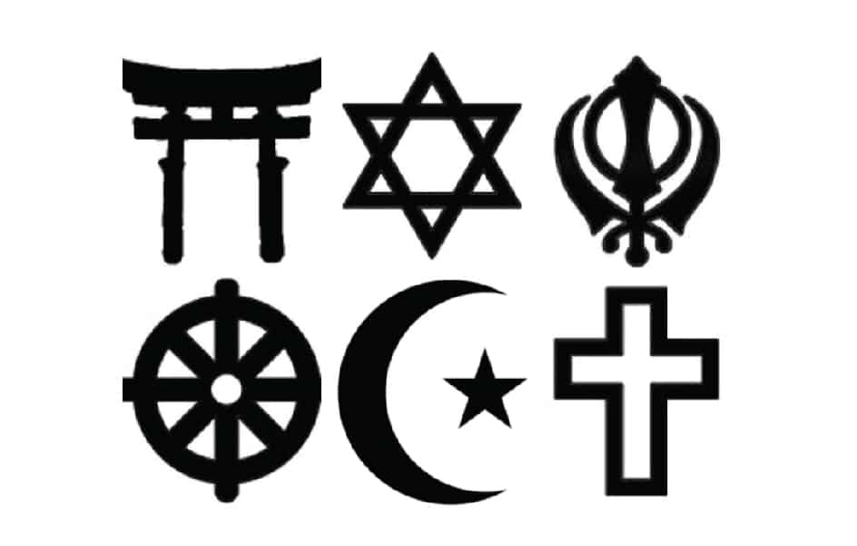
I know you might not see a religious symbol as a logo… but really isn’t the star of David or the christian cross a logo?? A logo after all is an identifying mark. Those symbols were and still are used to identify a person with their faith. So yes, in a sense those symbols are really old logo designs!
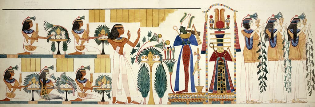
Logos are identifiers and have been used for centuries! Looking back on ancient cultures, logos or symbols have been used to identify different tribes from one and other. They show up in Egyptian tombs and were used on flags and banners of medieval kingdoms. Logos are older than the alphabet! They were used before a written language was created and could be used universally since they are symbols instead of words.
Think of a battle scene in Game Of Thrones… the “house sigils” or logos if you will… were the only things saying, “I am with house Lanister” vs “I am with house Stark”. They identified the fighters with their house. Now we use logos for the same purpose on sports teams! Look at the NFL, the logos of each team are printed on the sides of their helmets.

While logo designs were often used on products throughout history, it wasn’t until the industrial revolution in the US and Europe in 1760 – 1840 that putting your logo on your product became a must. When items began to be mass produced you needed a way to mark your product so people would be able to tell the difference from your competitors.
Did you know the word “brand” actually comes from a Norse word meaning “forged in fire” and it was for a cattle brand? You would “brand” your cattle with a symbol (a logo) as a way to say, that is my cattle and it’s better than Joe Schmo’s cattle down the road.
During the industrial revolution you needed to brand your products. Imagine if you made an awesome hand cream and all of a sudden it was getting mass produced and shipped all over the country. You needed people to know it was your awesome hand cream. That is when logo design really took off!
DuPont and Ford Motors are two companies to come out of the industrial revolution that are still around today. Of course both of their logos have evolved to work in our world today, but they have had an identifying mark for the company since the beginning.
Check out this article for more on the evolution of logos.
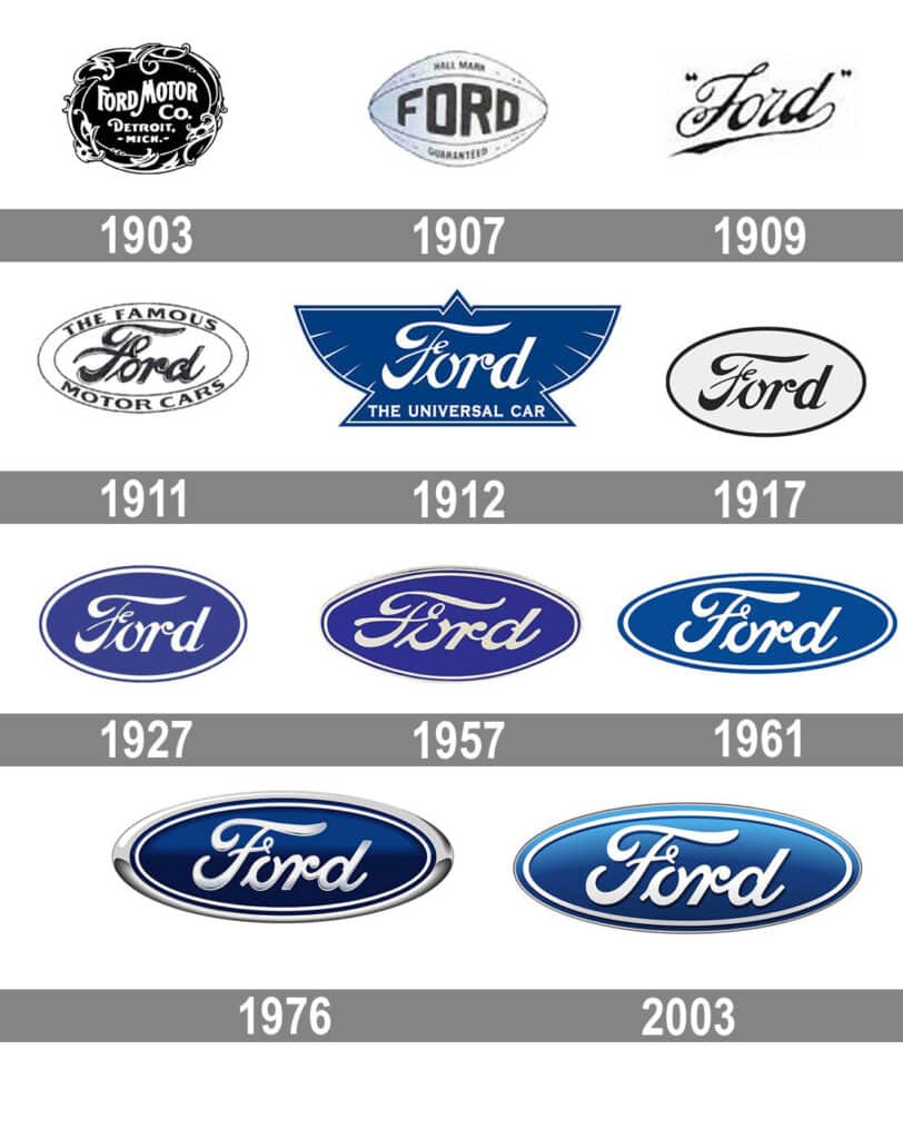
Logos during the revolution were designed with the end use in mind. For them the use was on the product. If you sold a hand cream that came in a round jar, you would probably have circular / badge style logo. If you sold shoes your logo was probably a rectangular shape that worked well on a shoe box. Today, we need our logos to work on so many different applications! A website, on a product, on an app icon… the list goes on and on! That is why we now design logos in a system!
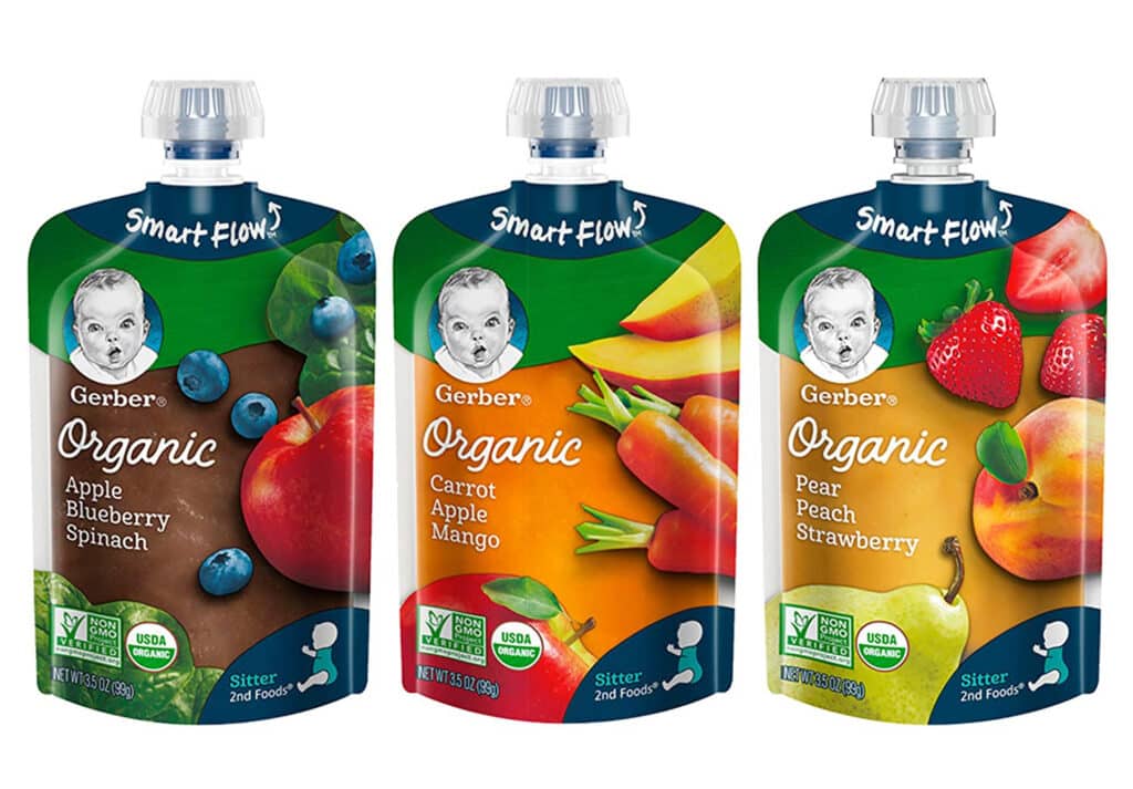
Gerber is still using the same logo they have had since the founding of the company almost 100 years ago. The Gerber Baby has become an icon and taken on a meaning beyond baby food! While it is rare a company is still using the original logo from 100 years ago, it’s also awesome and a logo done right can serve you a lifetime!
With advancements in technology we have sort of come full circle… logos these days are clean, simple, and scaleable. Nothing like the ornate badge style of the industrial revolution. We are back to simple shapes like the Christian cross or the star of David. I come from a fashion background and I remember laughing in my History of Fashion class (yes that was a class)! Clothing started with simple tunics and wrapped fabric, then it got crazy ornate and complex in the medieval times then started to get simpler and simpler after the 1800’s… now we are back to a tunic (which is the same shape as t-shirt) and wrapped fabric (simple dresses).
I can’t help but wonder if we will go back to the ornate and complex logos in the future or if simple and clean is hear to stay! Either way, start simple. It’s easy to add on if needed but a clean and simple mark will always serve you!

