Recently I spent two weeks traveling though Europe. Some the cities we covered were Reykjavik, Berlin, Brussels, and Brugge, with a few others in between. I was inspired by so many things, but these are just a few logos and marketing items that caught my eye. Overall, I have noticed a trend in minimal, clean and strong design. I am a true believer that less is more and you can see an abundance of that in European design.
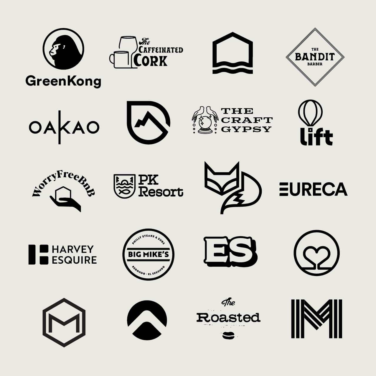
Check out this quick view of logos we liked! We also found a shop in Reykjavik that had grass flowing from the sidewalk through the store and completed with natural flowers in the corners of their displays. It was unlike anything I have ever seen or done in the states!


