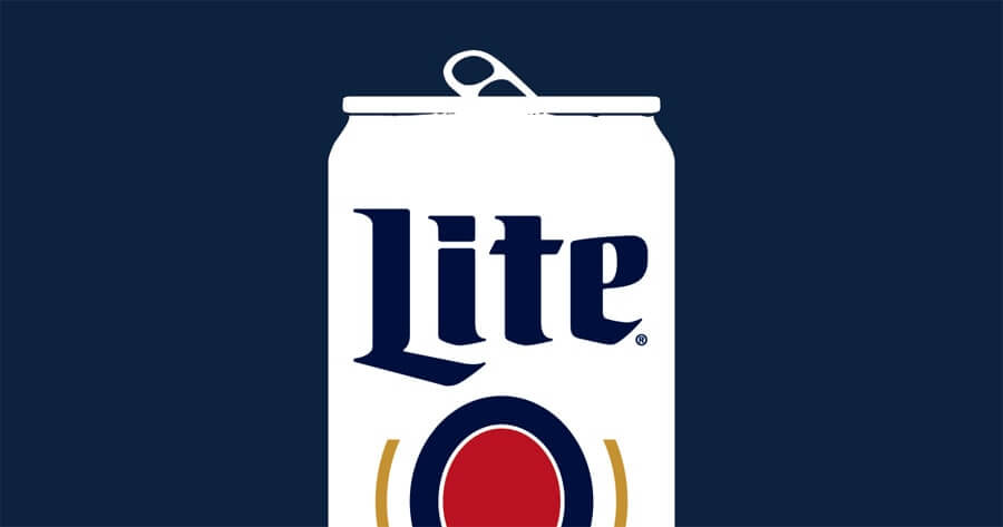
Here at Stellen Design, we are big believers in the idea that less is more, simple speaks, and original is always cool. Miller Lite has nailed this theory in their rebrand. It’s been a few years now since they went back to the original can design, but every time I see one of their ads or billboards, my heart skips a beat.
Before rebranding their can (and whole business, for that matter), they were competing in a sea of blue and silver gradients: Bud Light, Natural Light, Keystone Light, Coors Light… all blending together in a sea of 30 packs. Then they got smart and looked to the past. A favorite designer of mine, Aaron Draplin, always preaches about looking to the past for design inspiration: in those days, they did it right while having fewer tools to depend on. They had to think it through and get nail the design, without the help of command-Z.
Miller Lite simply looked to its past, evaluated the evolution of its design, and ended up reusing their second-ever can design from 1974. A clean, white can with blue, gold, and red accents and a wheat design in the logo, it’s both strong and simple. In fact, the look of their past design is exactly what is on-trend now and what a lot of craft breweries are doing. Given that they rebranded in 2015 during the craft beer boom, you have to think that is why they did it. They needed to compete with the craft market instead of focusing on the lite beer market. We know loyal lite beer drinkers will always drink what they like, but the odds of appealing to a hipster who has not decided on a lite beer preference yet are much higher with the new/old design.
Not only is the retro design powerful, but it must also be saving the company tons on print ads—no expensive photoshoots or extensive layouts, just clean lines and bold color. They have effectively made more of a statement with less.
I personally would like to see more products in store revert to their original brand images. It’s a great design strategy and one that really resonates with consumers, helping foster an emotional connection to the brand.


