The Problem
Sage of Sage Gracie Interior Design started her business off like most and used a logo designed on a website builder… After hitting a point in her business when she needed something more original and more reflective of the type of clients she wanted to work with, she knew it was time for more.
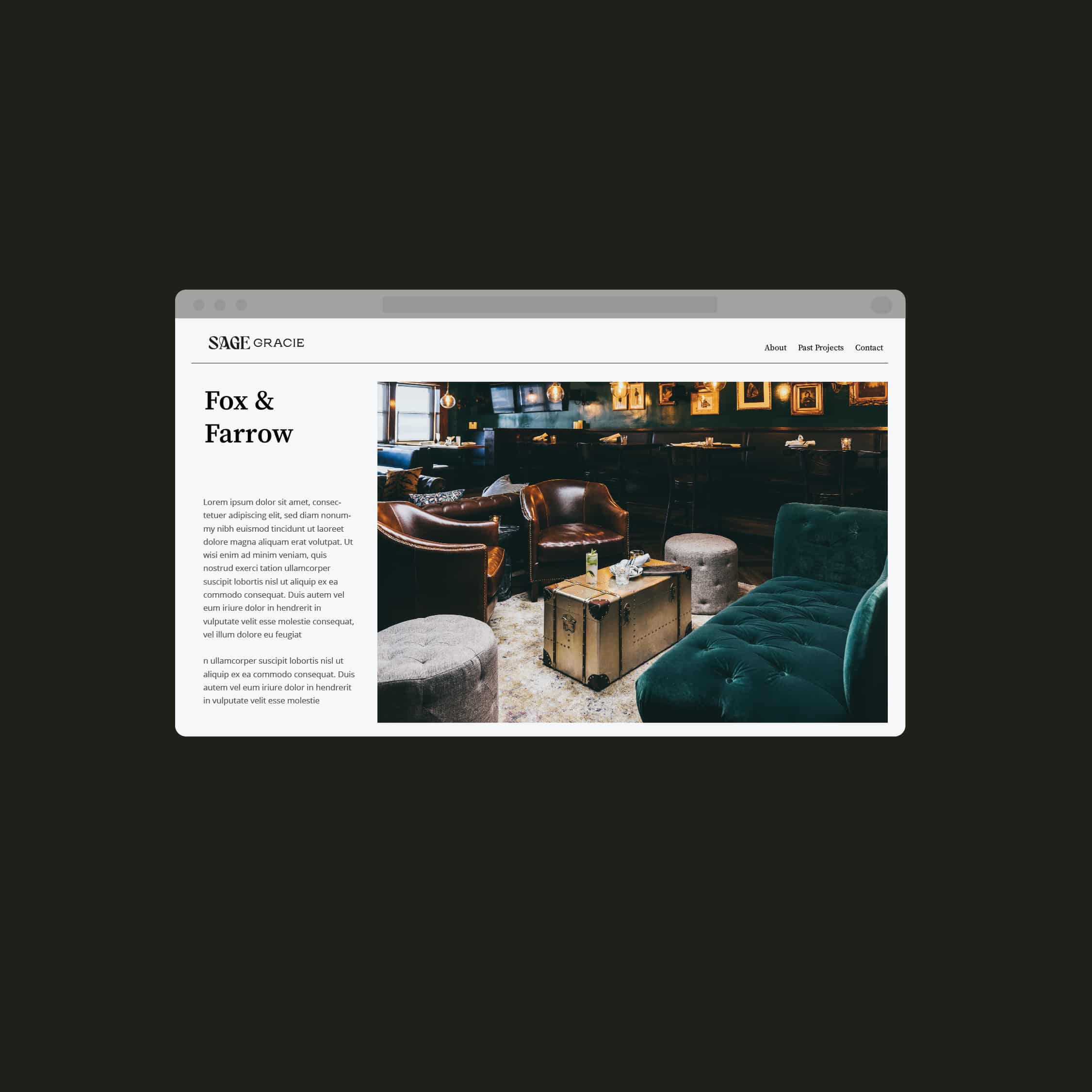
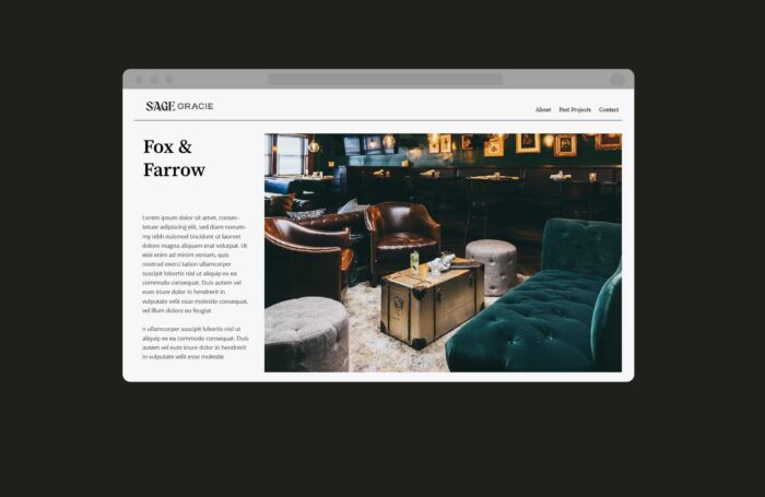
While she is based in the beach communities of Los Angeles, she did not want to work on the typical California Beachy home. She wanted to do more dark and opulent stuff. We partnered on Fox & Farrow together and she mentioned that was one of the few projects she has worked on that felt like what she really wanted to do.
How We Helped
Through our discovery process we learned Sage has a more unique and opulent style. She likes darker tones and more ornate details. While she still understands the California look, she can put a very cool spin on it.
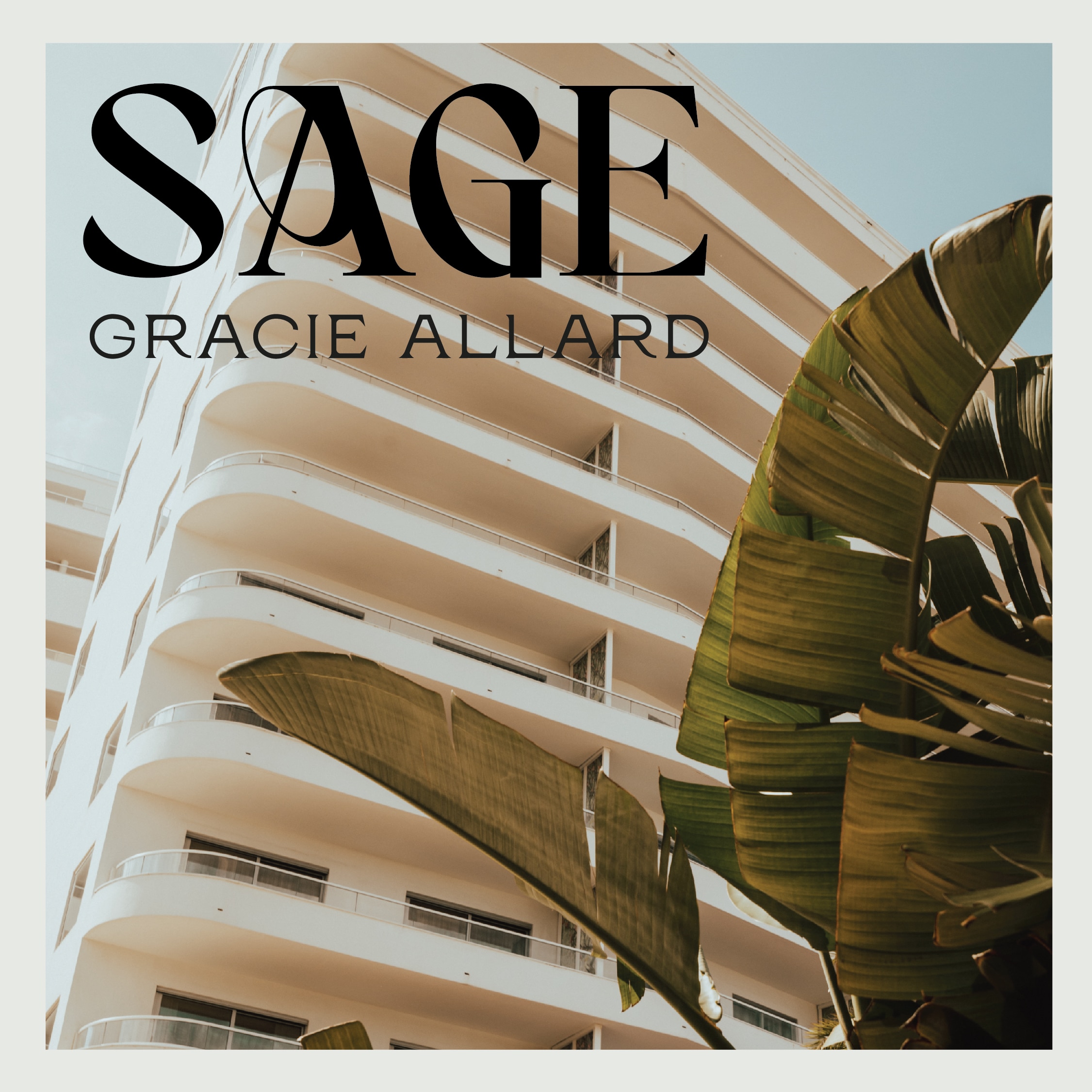
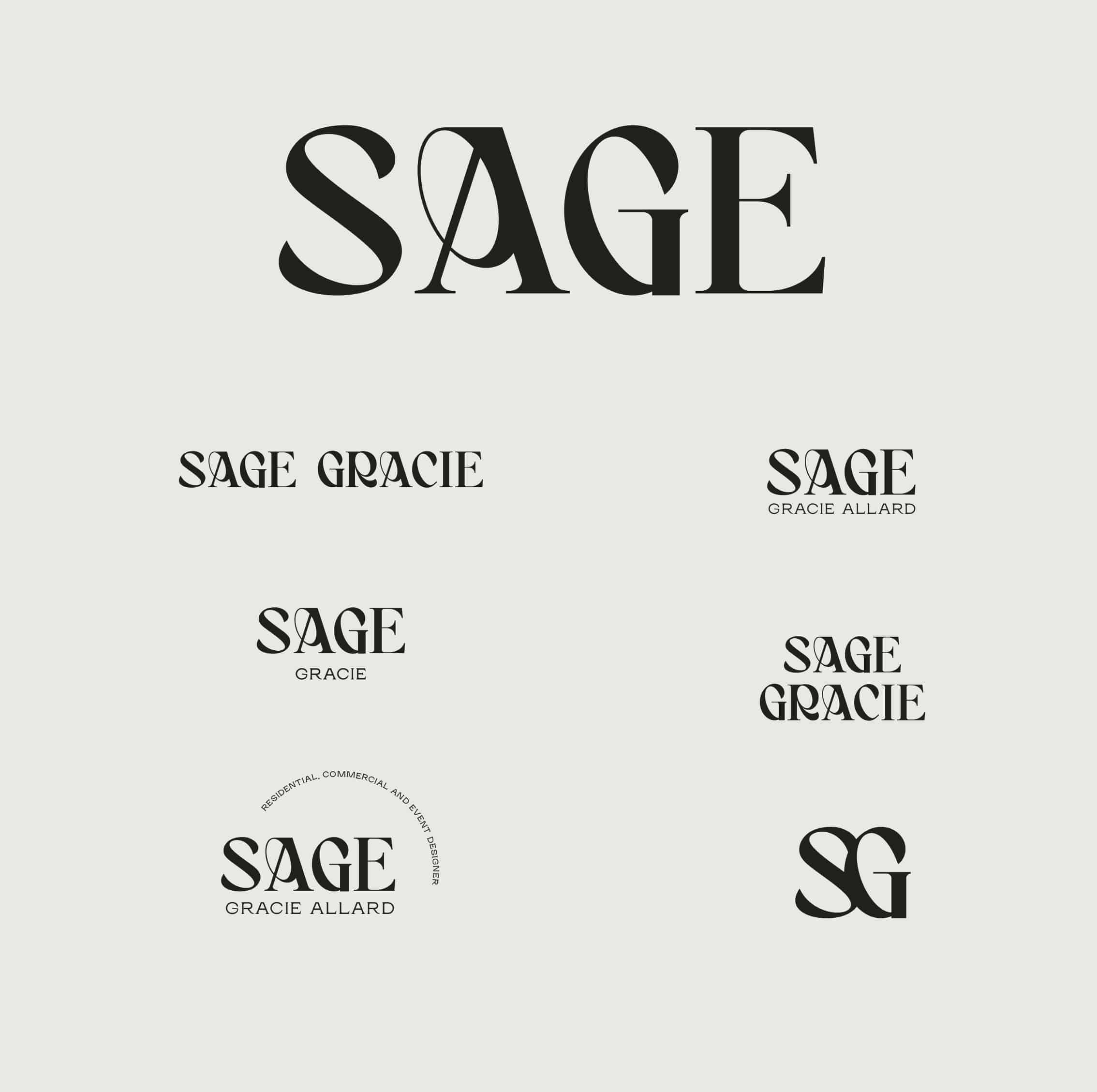
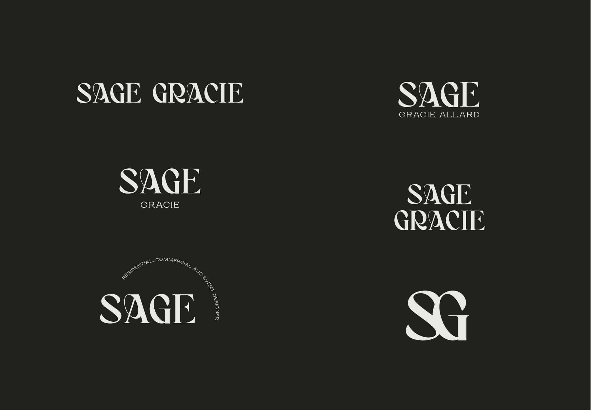
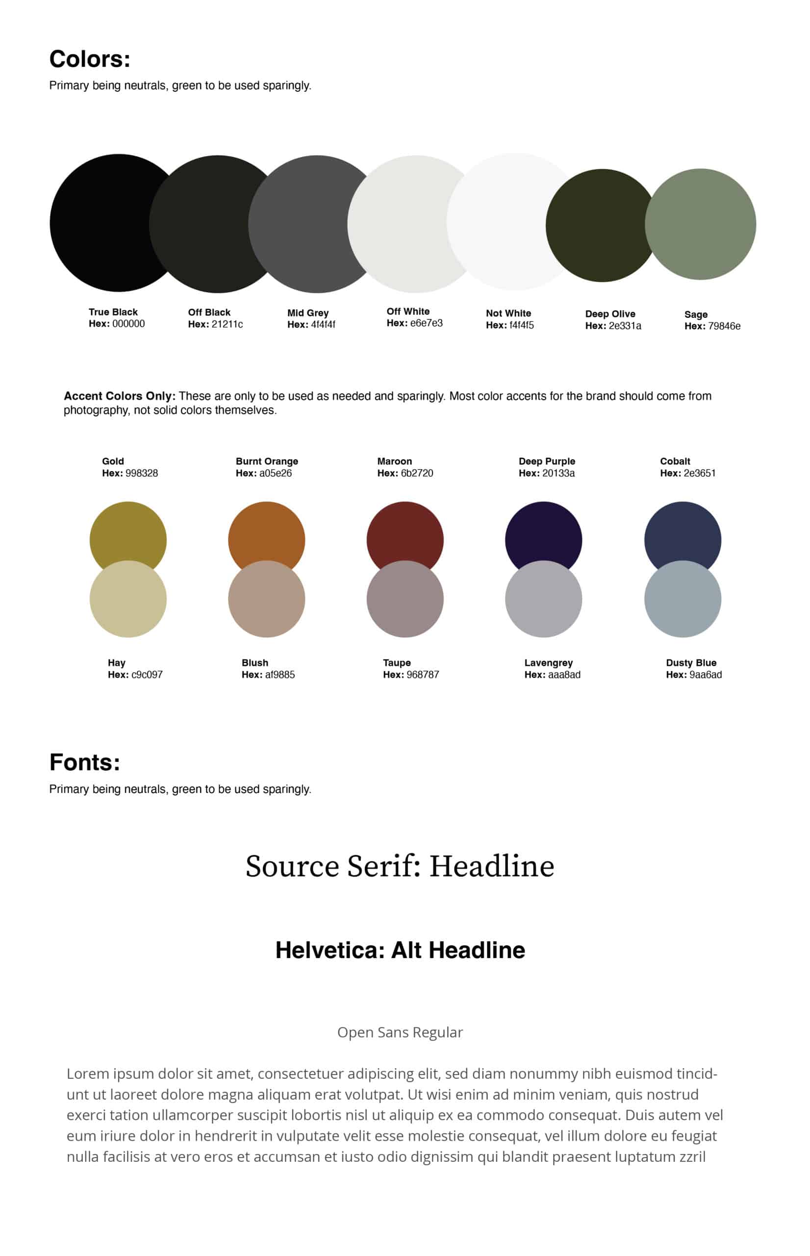
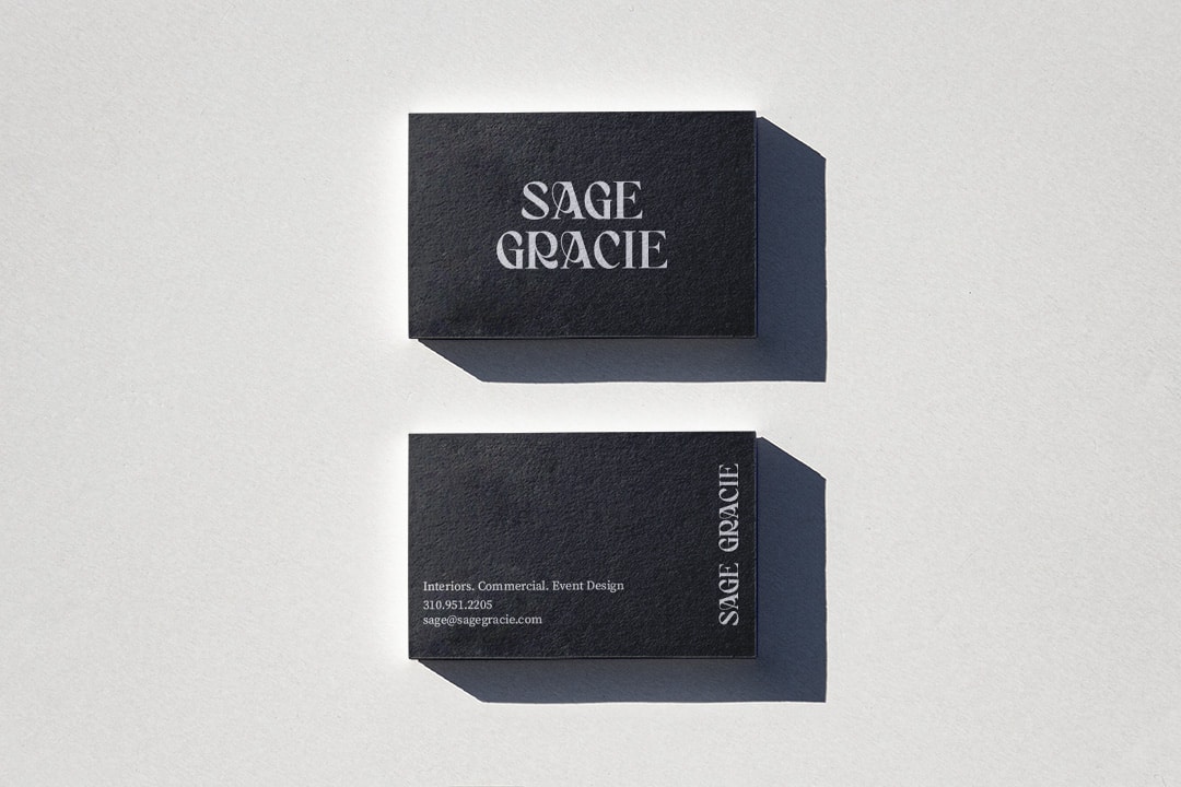
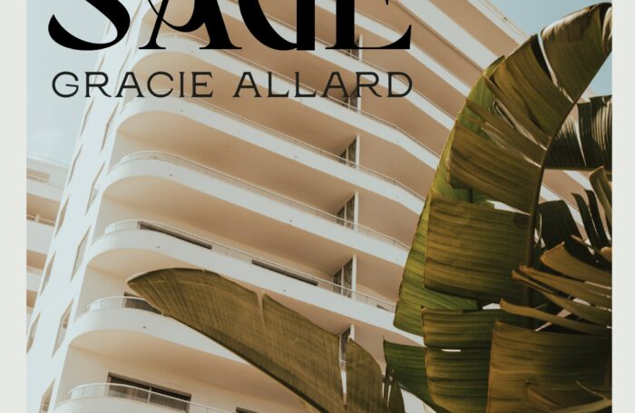
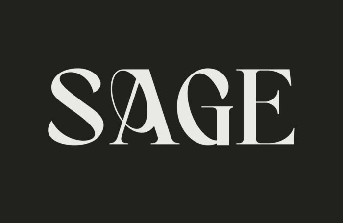
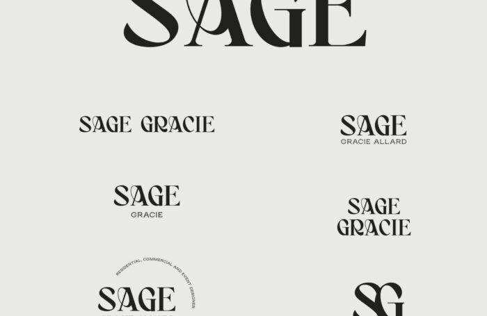
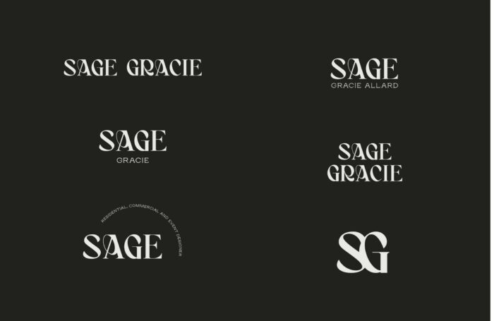
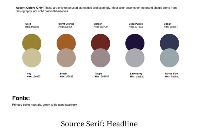
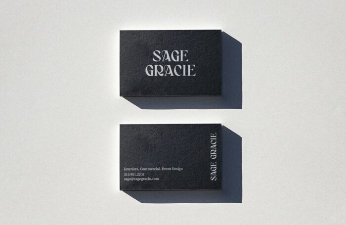
We crafted a wordmark logo that was reflective of her ornate style. We chose to use an off black and a light cream for her brand colors instead of true black and true white. This helped give the brand that subtle edgy, yet warm vibe.
The Result
Sage is booking more of they types of projects that she wants to work on and stands out amongst the sea of white background and simple black logo California interior designers.
Words From Our Client
“When I saw the discovery board, I literally had chills. This logo just feels so right for my business and so reflective of my work. It has helped me define myself as a designer and differentiate myself from my competitors “
– Sage Allard / Owner
Services
