When it comes to choosing a brand font, it might seem like a quick and easy decision. But the truth is, selecting a brand font is a HUGE deal.
Fonts are a very subtle, subconscious way of telling your audience who you are and what your brand represents. Font choice can be the deciding factor for how someone perceives your company.
Let’s look at examples from a veteran car manufacturer, Mercedes Benz, and cutting edge Tesla. For instance, a classic font could say, “We have been creating top of the line cars for nearly a century, and we know what we are doing.” While a modern, designer font says, “We are a new, innovative company changing the world by creating high-performance cars powered by sustainable energy.”
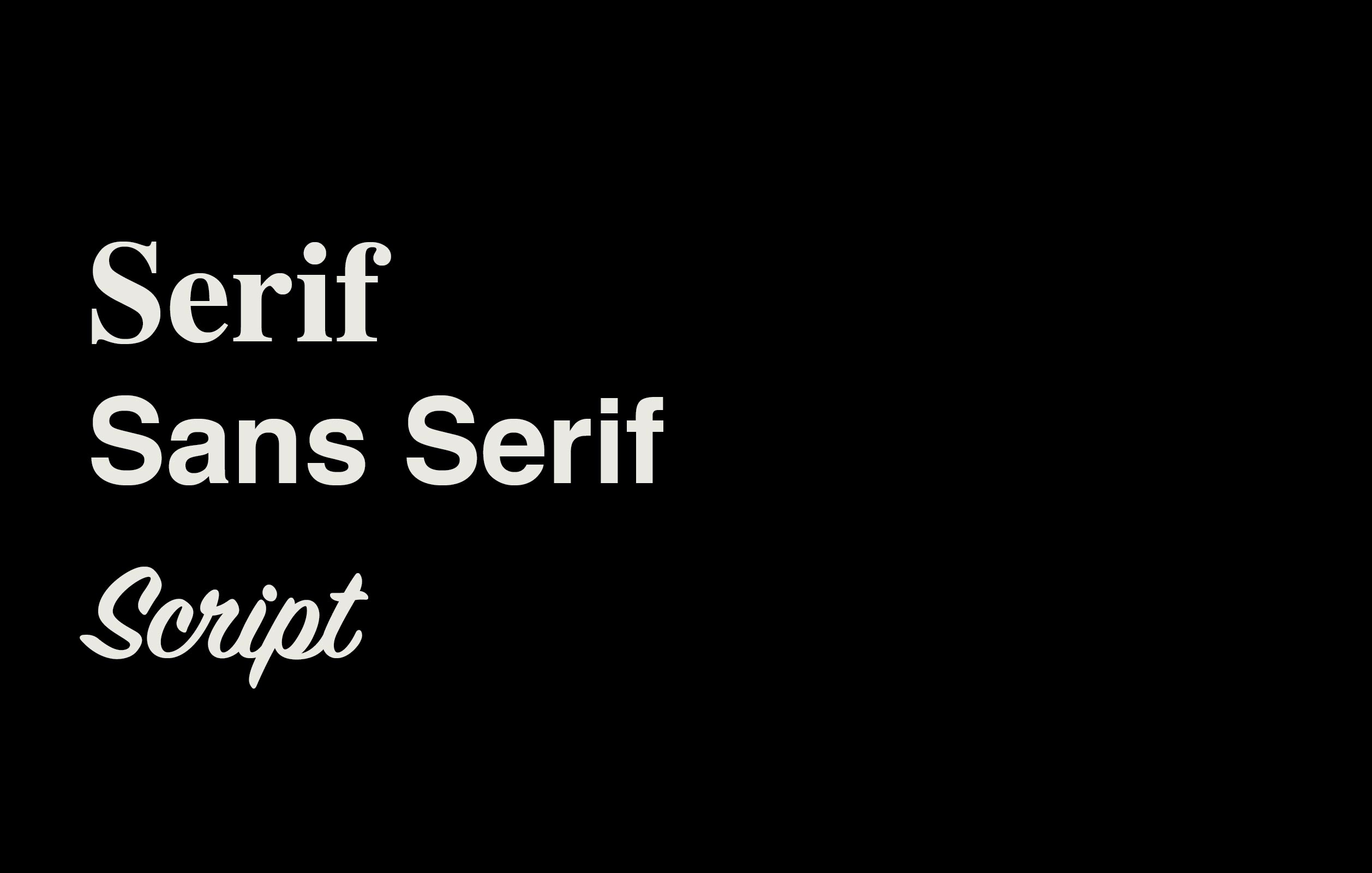
Mercedes Benz uses the oldest style of letterforms, Serif. Serif style letters date back to ancient Rome and can be seen on architectural pieces like Trajan’s Column. Serifs are the fancy flare outs on the bottoms and tops of the letters that emulate how it looks when you write with a flat head brush. Mercedes uses this old but classic font. They are almost a 100-year-old company, and they want to be known for their strong reputation.
Tesla, on the other end of the spectrum, uses a digital style San Serifs font. San, in French, means without, so San Serifs means without Serifs. While Tesla’s wordmark can be considered a display style font, it is technically a San Serif. San Serif fonts are very clean and modern. A bulk of new businesses have opted to go the San Serifs route, and just recently, a few major fashion brands ditched the serifs when re-branding.
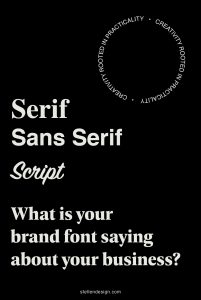
Now that we know the main differences between fonts let’s get to the good part. What is your brand font saying about your brand?!
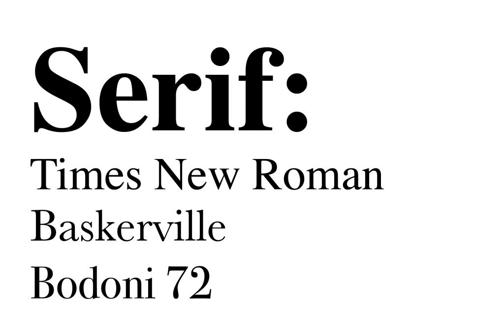
Serif Brand Font
Professional, classic, serious, old school (this could be interpreted as an actual old business or a new business that wants to convey nostalgia), prestigious, collegiate, higher learning, intellectual
If it were an outfit: The little black dress and pearls or a classic blue suit
Great for: Law firms, professional services, nostalgic brands
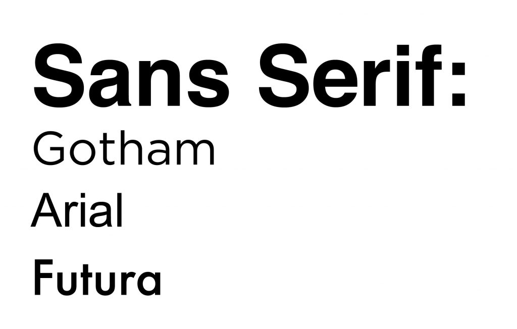
Sans Serif Brand Font
Approachable, innovative, relevant, light-hearted, versatile (sans serifs can be very high end or very down to earth), forward-thinking, modern
If it were an outfit: Blue Jeans…dressed up or dressed down
Great for: Any business that wants versatility associated with them or wants to portray a modern brand
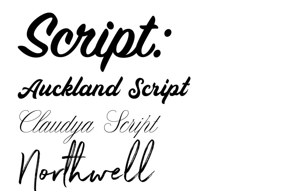
Script Brand Font
There is one other major category that fonts can fall into, and that is script fonts. I try and stay away from using scripts on logos for legibility reasons. Brands like Coca Cola who use script have been around for ages and have built up brand recognition. If you are a new brand coming out the gate, viewers will not recognize your logo when they see it on a billboard on the side of the highway like they would Coca Cola. But if you are a new restaurant and don’t plan on ever needing your logo to be visible on a billboard, sure, let’s try a script!
Script fonts can take on a variety of different meanings, calligraphy style (beautiful and elegant), handwritten (fun and playful), a sign painted (retro and cool)…you name it!
Of course, there are other categories of fonts like displays, slab serifs, and more, but we’ve covered the branding basics!
If you have questions about what is the best font for your business, reach out! We are happy to talk you through it and give you some suggestions!
For project inquiries, contact us here.
Wondering where we shop for great fonts?? Creative Market!
