A few month back while I was in Salt Lake City, Utah for a design meet-up, I was able to tour some of the most eloquently-branded coffee shops and restaurants I have ever seen. As a resident of Los Angeles, I was a little surprised to be so impressed by the branding of places in Salt Lake City, and I was excited by the city’s very cool design community. It had sort of a earthy, hippie-meets-modern-hipster vibe.
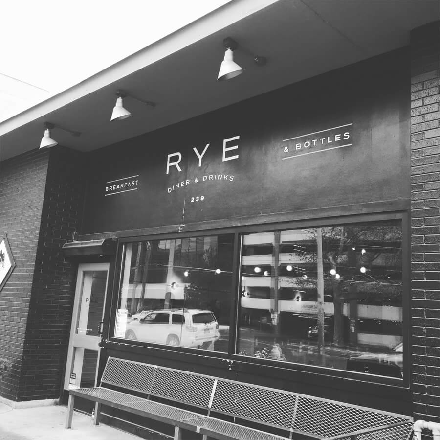
There was one spot in particular that really struck me: RYE, a casual eatery whose claim to fame is whiskey and waffles. We went for breakfast one morning and I was immediately impressed by the exterior, which was all black, with their logo painted on the side of the building. The interior was a sort of branding Disneyland for me; the more I looked around, the more I noticed little things I loved. It was subtle and strong brand consistency.
While their logo, a bird with wings made of wheat or rye, is striking, what stuck out for me was the use of the branding in the interior design. They had given thought to environmental design, which can be hard to come by. Near the entrance, they have a wood partition with the “rye” or wheat element from their logo turned into a cutout pattern. That pattern was repeated in other parts of the interior as well, such as a painting on the inside of the skylight.
Behind the bar, they have a beautiful painting of a bird holding wheat in its mouth. It’s something you might look at and think, “what a nice painting,” but if you pay attention to brand, you will notice it is reminiscent of the bird in the logo while also tying in the image of wheat or rye. The subtle attention to detail and incorporation of brand at this establishment is so beautiful.
This was one of those places and experiences that made me excited to do what I do. Even though this was the work of someone else, it made me happy to see someone’s vision so well-executed. Huge kudos to Dan Christofferson of beeteeth.com on this project! And if you are in Salt Lake City, be sure to experience RYE for yourself! The food is also on point!


