Now, a good re-brand or logo update is like a facelift or a little botox.
Re-brands are not something new altogether, but a refreshed version of the original.
In fact, I love looking up legacy brands’ logos over time and seeing their ever so subtle re-brands. You can see the evolution but how for the most part it stays the same. Meg Lewis on a Dribble podcast equated a logo update to giving it a little love or give it a hug and sent it on its way. She was talking about the Fisher Price logo update done by Pentagram. And I agree! Give it a little love, clean it up a little, and let it go. Don’t re-invent the wheel and risk loosing valuable brand equity.
A good example of what not to do is the Coldwell Bankers re-brand. They went from looking like an established financial institution to a baseball team. They were in need of a re-brand and do like the idea of the “North Star” in their new logo… but they missed the mark here and went a little too far into left field.

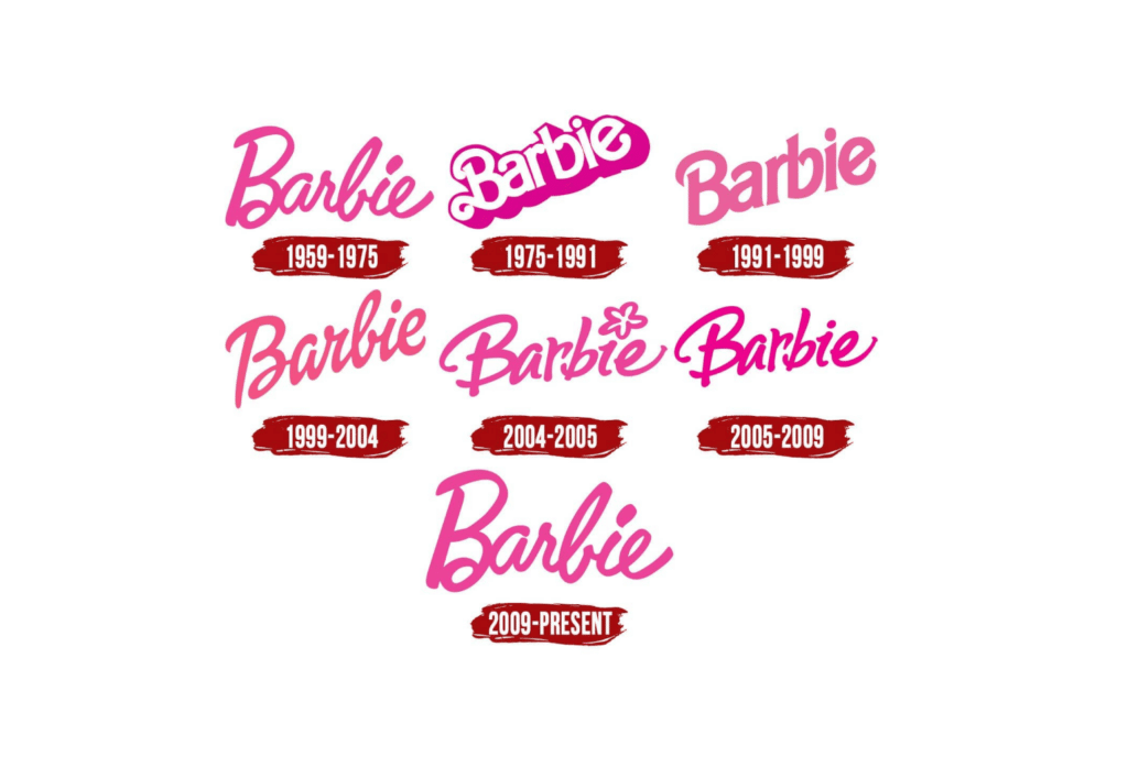
There is a current trend right now of big brands going back to their roots and using the original logos. Look at Barbie, the present logo is the same as what they launched within 1959. But they did not stay that way, you can see they made updates over the years to ensure the logo fit with the current times. But you always knew “that is Barbie”. They kept their iconic pink and kept the word mark style with a capital B.
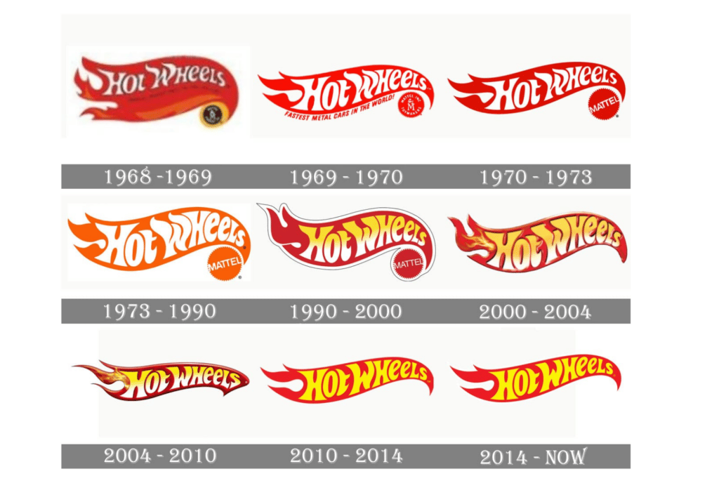
Hot Wheels is another iconic Mattel toy that has done a great job of maintaining its logo. Check out how the logo from 1968 is not too far off from the logo they are using in 2021. They have always made updates, adjusting the coloring, treatments, and letterforms but the idea of it has stayed the same. A flaming streak containing the word mark written in flame style letters.
Now let’s look at KFC! They have done an excellent job of updating their branding through the years with small re-brands and if you have a KFC in your town you might have been the updated stores. Painted with red and white stripes they create a nostalgic experience for their guests. I wanted to showcase KFC because they were our inspiration when we had to re-brand Big Mikes Philly Cheese Stakes. Big Mikes had an epic airbrushed (yes, airbrushed) logo of a muscled up beachgoer holding a massive sandwich and a giant pickle. It was pretty epic if you ask me… but the problem is it was not a proper logo… more like an air piece that should be painted on the side of a building. We needed to turn it into something that worked as a one color design. So we reference KFC since they also had a person (Colonel Sanders) as their logo. We were able to make Big Mike work as a one color with the help of the Colonel!
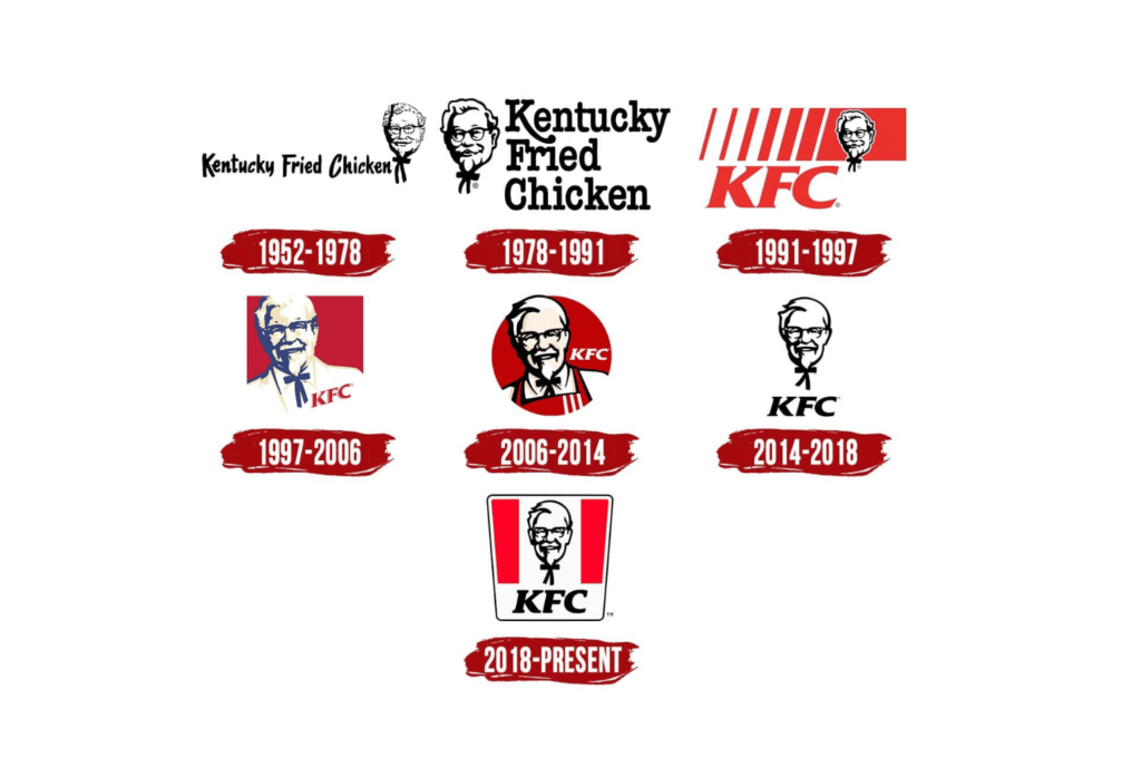
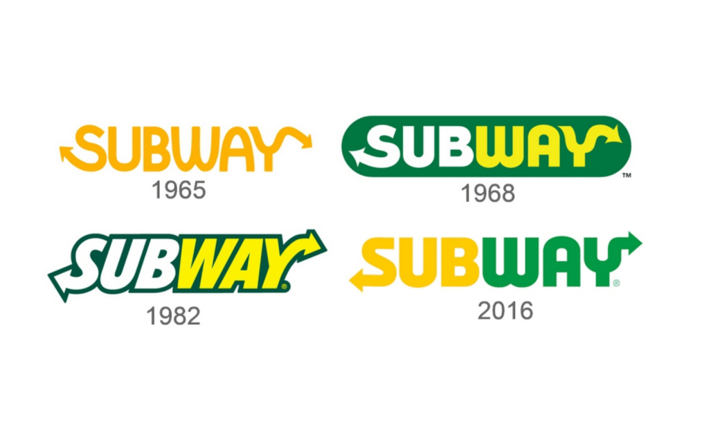
Here are a few other logo updates over the years we thought were worth sharing!
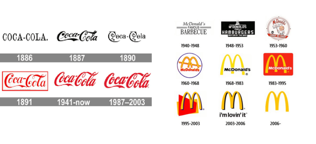
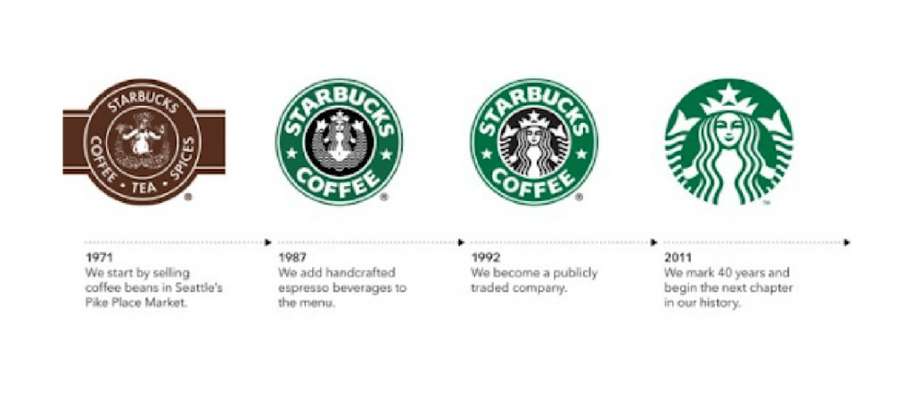
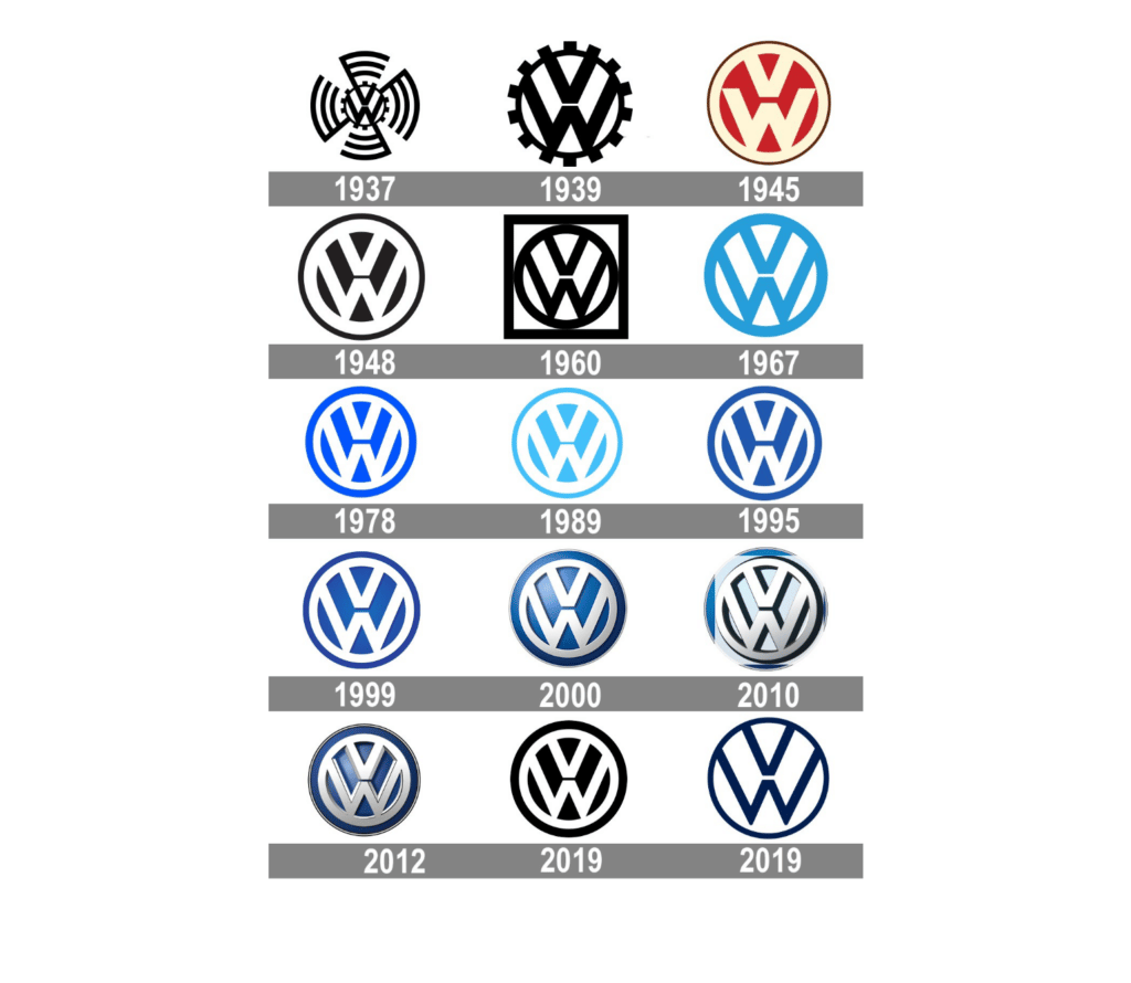
If you are interested in updating your logo please reach out! We do suggest looking at your logo and branding doing an audit every 7 years!
