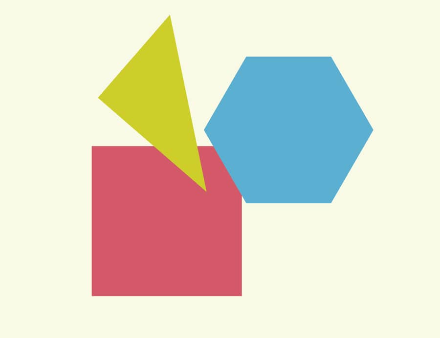
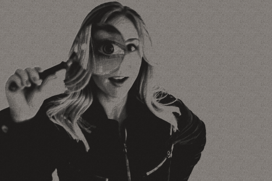
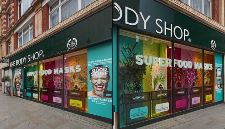
It’s no secret that graphic design experts are always looking for the next big thing in modern design. Ever since it was introduced by Google’s Material Design, layering shapes and elements in unconventional ways has been a growing trend. This technique is called geometric layering, and it’s a fantastic way to add interesting visual aspects to a design in a way that makes the consumer want to know more.
Here’s the basic principles of geometric layering. Bold shapes are added to simple frameworks to bring a new meaning or take on day to day pictures of objects like buildings, offices or meetings. Adding these fun shapes, cut outs and bright colors on a website leads the user’s focus to where you want it. The key of geometric layering is to use an effective design that serves a relevant purpose, like highlighting a headline or branding.
What graphic designers and consumers alike enjoy about geometric layering is the simple functionality of it. It allows users to be more interactive on websites while giving companies the ability to lead users to what they want online. By using angles and curves to point users from one section to the next, geometrical layering becomes an effective directional tool if used correctly.
If your brand’s website isn’t seeing the traffic you want it to see, and you think it’s bland or confusing, try consulting with a website designer about how geometric layering can help. Perhaps all your website and it’s users need is a little direction.
Examples of geometric layering in websites:
http://richbrown.info
https://www.epicurrence.com
