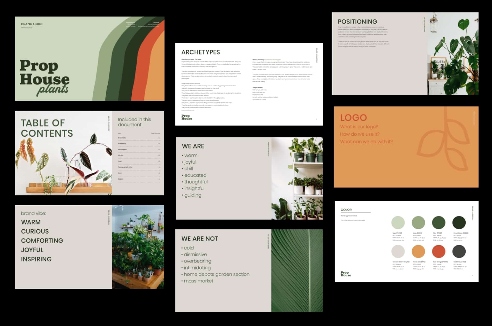
Your logo is a visual representation of your brand, why not have a great logo! It’s the symbol your audience will associate with who you are, and what your business represents.
There are three key qualities that make a logo great, and you should take these into consideration when you’re working with your graphic designer or branding agency to create one.

Quality 1: Color
Color triggers different emotions in people, and when chosen with care, color can communicate your brand’s personality to your customers.
For example, red is a color that is generally associated with energy, passion, and excitement. If your brand is playful, young, or bold then this is a great color choice for your logo. If, however, your brand is more professional, down to earth, or you want to convey trustworthiness then blue is a better color choice.
Consider basic color psychology when choosing your brand color and avoid simply choosing colors you like yourself.

Quality 2: Font
Fonts are often the last thing people think about, but they do play a role in communicating your brand’s personality. When incorporating font into a logo, you should consider a few key points:
- Is it easy to read.?
- Does it scale well?
- What brand values does it communicate?
Fonts are grouped into several different categories that communicate different values. For example, script fonts are seen as elegant, serif fonts are viewed as more traditional, and handwritten fonts can come across as informal or artistic.
Spend some time thinking about what your brand represents, and which fonts work best to communicate that.

Quality 3: Symbol
The icon, symbol you choose is the final component to consider when designing a logo. Symbols can be used by themselves as a simpler version of your logo (think Nike’s swoosh, or the Apple logo), or they can be used as part of the whole to convey your brand identity. The provide a visual anchor and can communicate so much about what your brand stands for without saying a word.
For example, round or oval symbols tend to convey a feeling of being friendly, harmless, and inviting. Sharp or angular shapes can communicate power, intelligence and stability.
Taken together to create your logo, your color, font, and symbol choice can tell your audience more about your business than you think. Consider all three when designing your logo, and communicate your brand values to your designer to help them choose the best way to ensure this comes across.
Check out this more in-depth read on Medium.
Want some help on your logo? Let us know! We would love to help. Reach out to us here.


