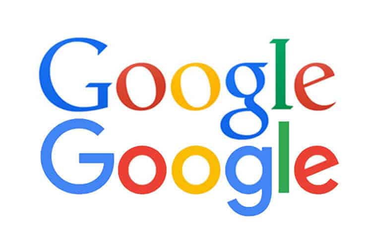

When people think of branding many undoubtedly immediately conjure up images of logos. A logo is easily the most iconic and striking facet of a marketing campaign, but often times they can be somewhat problematic. While logos are not necessarily moneymakers they are absolutely the image that is most connected to your brand and they make your company recognizable. Because of this it can sometimes be risky, and even scary, to opt to switch up your logo. Here at Stellen we broke down a few reasons it could be time for a change.
Technical Difficulties?
Some logos are just too much. Logos that are too busy are not as appealing and will have a much smaller chance of having that “WOW” factor. Aside from that complex designs don’t scale well onto smaller materials. Also at times too many colors can raise the price of printing your logo and when done incorrectly can be an eye sore.
Fix:
Focus on what matters most. If your logo is multifaceted, break it down and find what works best, the most prominent feature, and emphasize it. Analyze your colors, sometimes only one is needed, reference Stellen’s color guide, and pick one to create a cleaner, and strategic, look.
Know the Trends:
Sometimes a logo redesign does not mean a giant overhaul. Occasionally your logo just gets dated and needs an update. This is a great way to introduce an update without losing any recognition amongst your patrons.
Fix:
Our biggest suggestions would be embrace simplicity and do your research on successful trends in your industry. Also if your business has been around for a long time why not consider employing nostalgia as a rebrand strategy? Look through old designs and consider paying tribute to one, it could give your logo a retro look that will be appreciated by all generations.
Yawn:
With logos there is a fine line between simple and boring. It can be hard thing to admit, maybe you’re even too close to the problem to realize it but a boring logo can make your whole company forgettable. While we have encouraged to strive for simplicity we also say “spice it up a bit”
Fix:
A fun trend happening in the world of branding is hidden messages in logos. Lots of companies throw in sneaky images within their logos much to the enjoyment of the American populace. Think about the arrow in the FedEx logo, the 31 in Baskin Robbins, the Tour de France bike rider, the word “Mom” in Wendy’s logo, the list goes on. Another fix would be to reach out to us at Stellen! We would be happy to help out with making a decision about your logo, whether through a design consultation or a full rebrand!


