Logo design is something most entrepreneurs will do once, maybe twice in their lives…
and knowing what makes a good logo is not something everyone is educated on. Good news is, there are people like me in this world who make logos all the time. I have studied the art of logo design to know what makes a good logo and what does not work and why.
If you are curious about what makes a good logo, give this a read. And if you are unsure what a “logo” really is… give this article a glance!
But of course there’s much more beyond just a good logo. At Stellen Design we mostly build and refresh brands. And with branding comes problem solving, so for every logo redesign we do we start by identifying the problem. If we don’t know the problem, we don’t know if a new logo will help the client. Once we know the problem we can decide on a plan of attack!
Take a look at some of these “problems” and how we addressed them through a rebrand and/or new logo!
American Arbor Care Logo Design
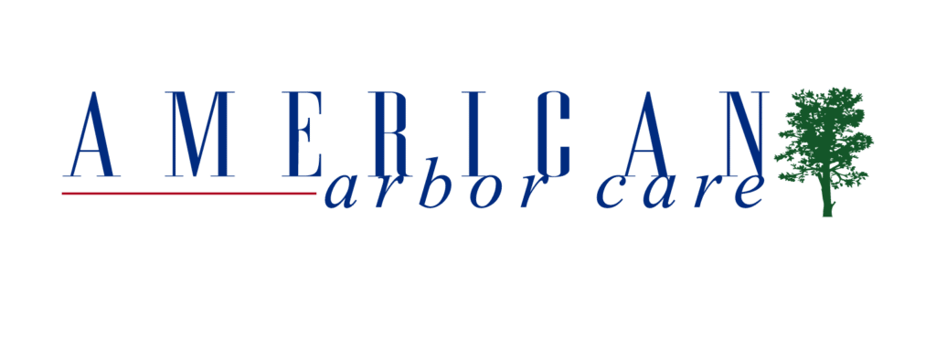
Problem: Their primary source of leads comes from visibility on their work trucks and the current logo was too light and detailed to be remembered if you saw it on a work truck driving down the street.
*Disclaimer … I did this logo when I first started! I am both happy and honored the client came back to get it re-done… I have learned so much in the past 7 years and have fine tuned my craft!
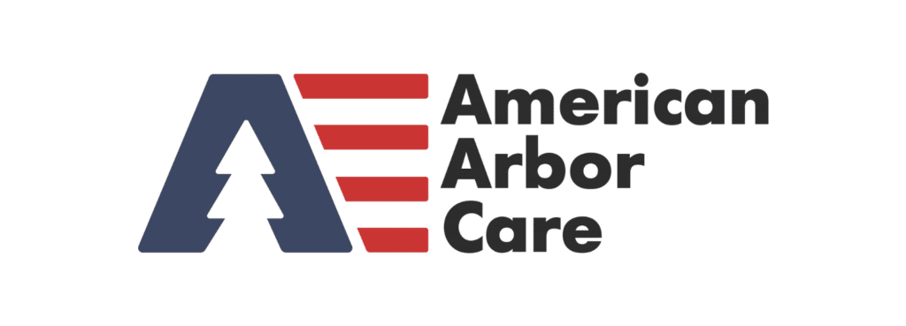
Solution: Simplified logo mark paired with bold text that is both visible and memorable.
The Kellie Kitchen Brand Design
Problem: She wants to get a cookbook published and become an authority in her industry. She needed a brand that looked polished and professional.
Solution: Create a brand that still felt fun like Kellie, but more elevated and mature, better connecting her to her target demographic of middle aged women.
One Stop Windows and Doors Logo Design
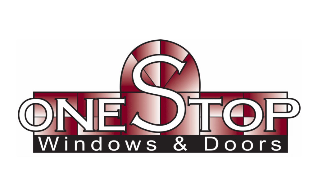
Problem: Their branding was not on the same level as the type of homes and projects they were working on and they wanted their brand to be inline with the quality of service they provide.
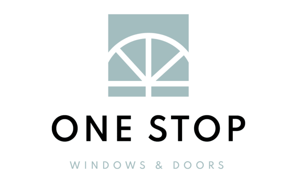
Solution: Make the brand feel light and airy like a beach house they would be installing windows on. We kept the same style of window as the old logo to maintain brand equity but brought it out of 1992 and into 2021. We also made sure their logo would be bold and visible from the street and on work trucks.
Sara Schulting Kranz Brand Design
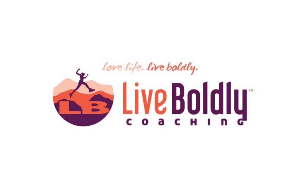
Problem: Live Boldly Coaching looked like an outdoor retreat business and while Sara does outdoor retreats, she also does a lot more and has ambitions well beyond retreats.
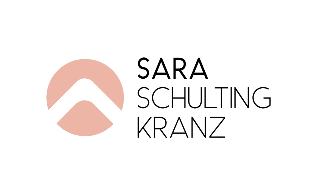
Solution: Re-brand to Sara Schulting Kranz and give her a mark that pays homage to the outdoors but doesn’t alienate her from other markets and projects.
If you are experiencing any of these issues we encourage you to book a brand audit call! We can asses your issues together and give you a proper diagnosis.
Check out our brand work.
