We started working with Dr. Caneel Joyce, a sought-after speaker, women’s movement maker, and startup culture builder a little over a year ago. She has consulted with some of the world’s most transformative entrepreneurs, including leaders at Snap, Slack, Amazon, Scopely, and numerous early-stage startups spanning space exploration, holographic imaging, AR/VR, healthcare, fintech, and new media.
Dr. Caneel came to us for both brand development and website design. Caneel expressed wanting something both organic and strong. We were a bit skeptical, as organic and strong almost conflict with each other. One is angled and bold, the other fluid. But with that being said, we took it as a design challenge to invoke both feelings in the same piece of work.
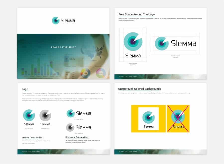
She expressed an interest in geodes and we realized that they were the perfect inspiration for something organic and strong. We liked the perfect round curvature of the Sans Serif C and incorporated a strong geometric pattern to represent the inside of geode.
We wanted to share some of the comps and renders we were working on during the design process. The logo design process is not nearly as pretty as you will often see it presented. We wanted to show you a little bit of the crazy process that needs to happen to create something beautiful.
Once we finalized the geode look of the logo, we moved on to the website. We wanted to do something user-friendly, yet dynamic. Most of Caneel’s work is represented in layers and breakthrough coaching, so we liked the idea of showing something in layers. Taking the idea of angled shapes breaking through, similar to the geode, we used angled shapes as container sections and backgrounds on her website.
Overall, we are very happy with the outcome of Caneel’s brand image; it is strong, organic, fluid, modern, and stylish. Working with clients who present conflicting directions can be tricky, but if you pay attention as a designer to the subtle clues they give, the outcome can be very cool.


