



The Problem
ACEQ Restaurant in Taos New Mexico was referred to us in need of a re-brand. The restaurant had recently changed hands and the new owner was once a chef at the restaurant. He had worked hard to elevate the menu and it was one of the few places in town offering gourmet dishes. He realized that the old branding no longer fit with his vision.
We then began our re-brand journey.
How We Helped
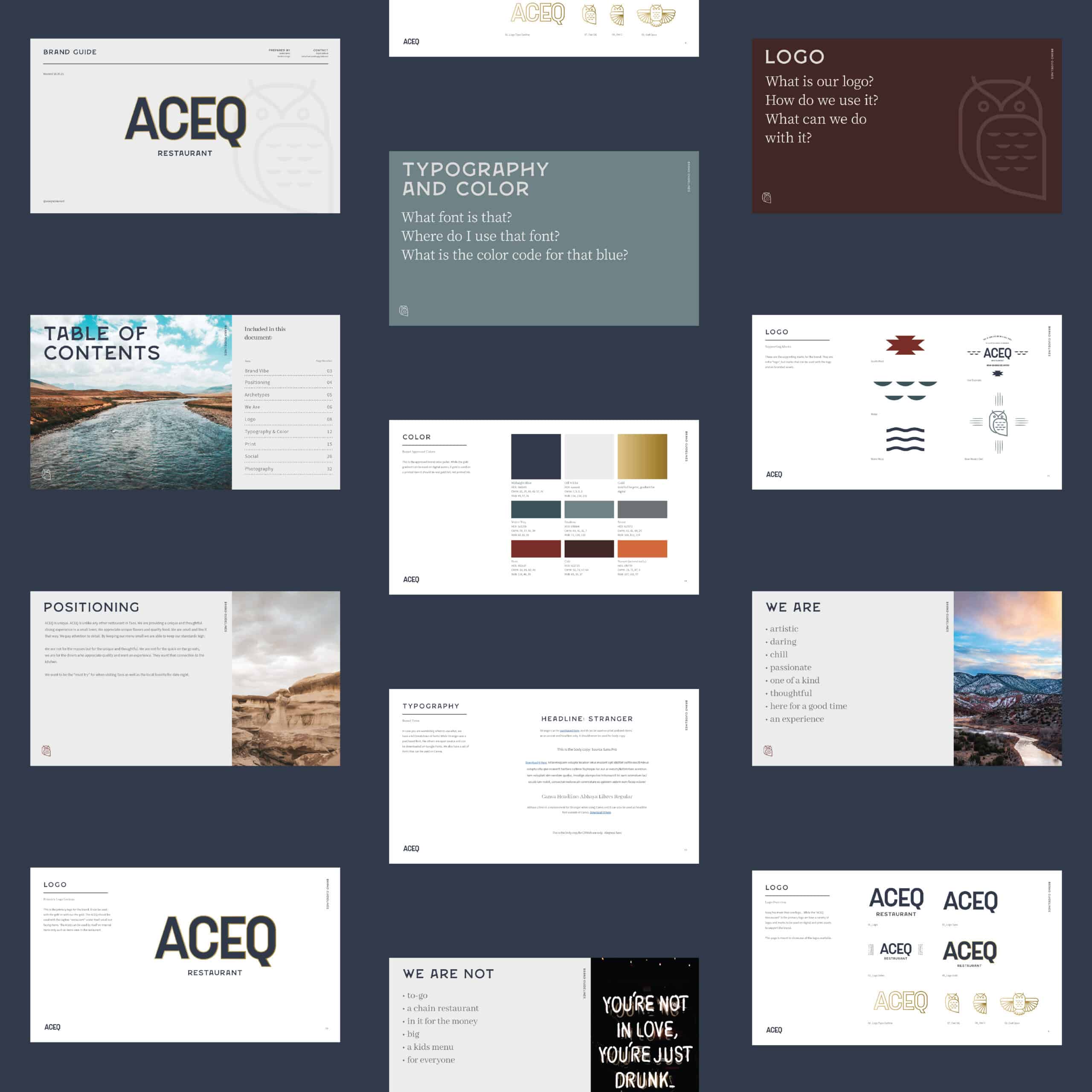
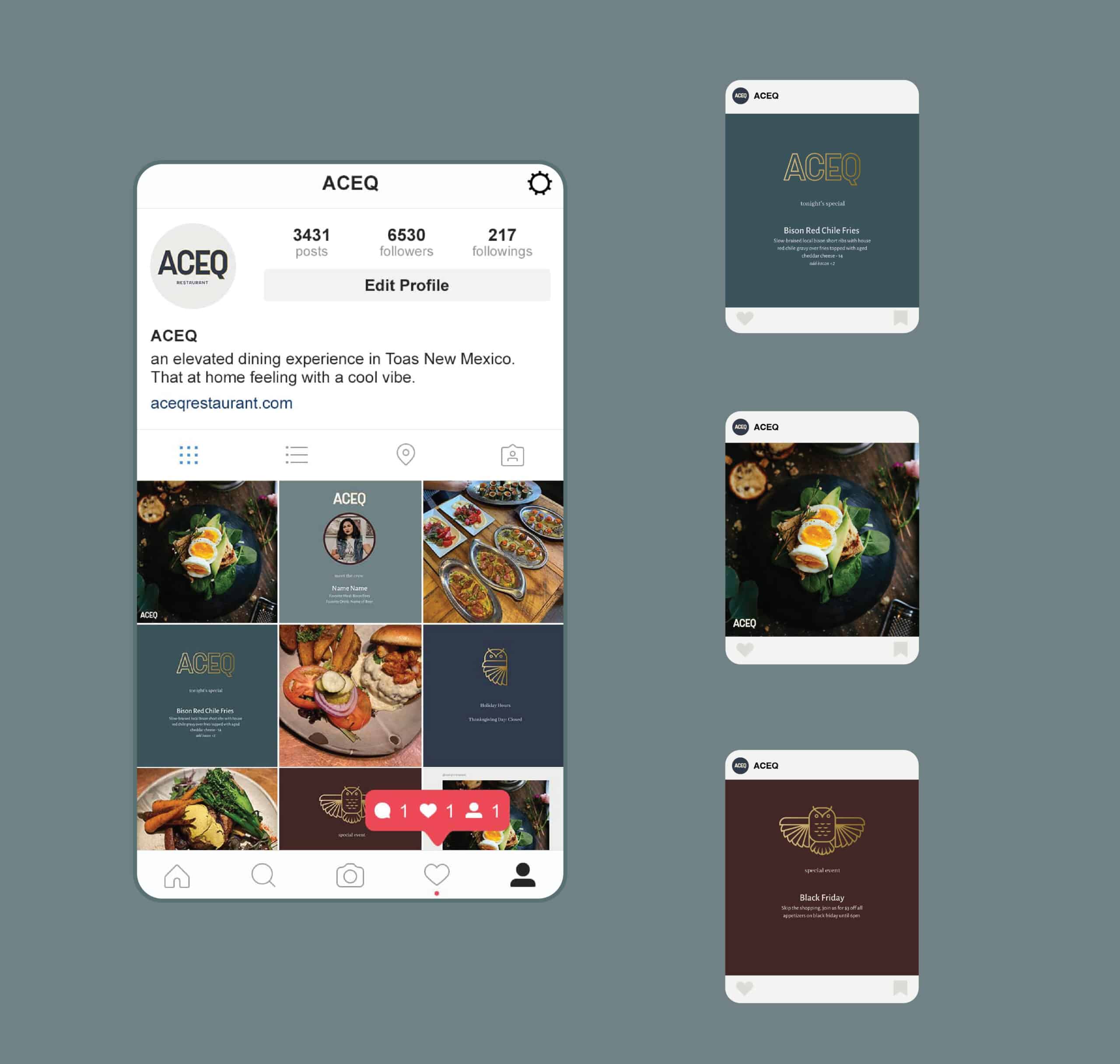
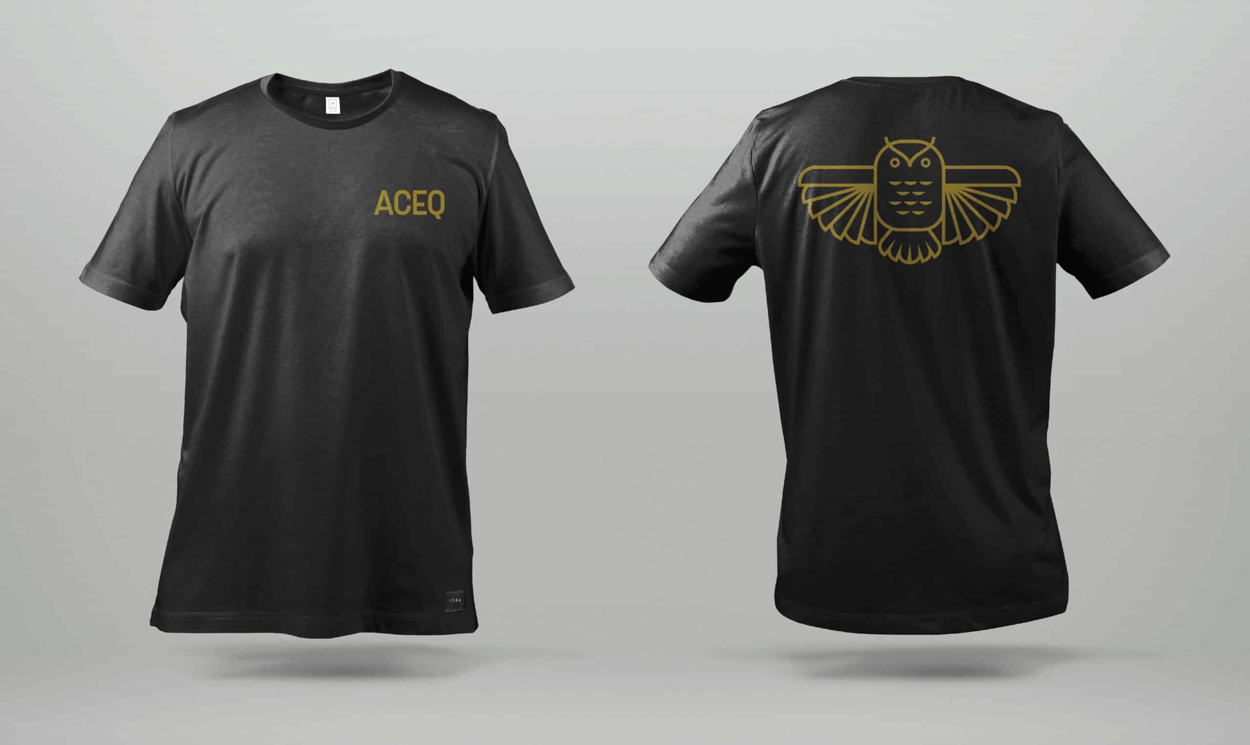
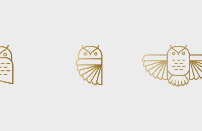
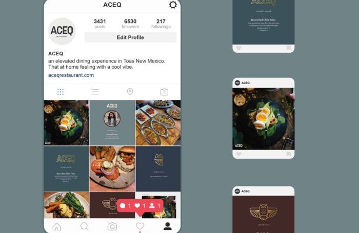
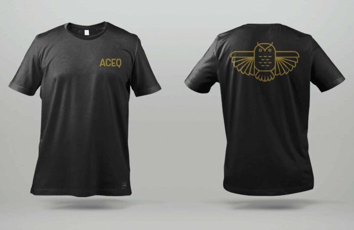
The Owl was in the original branding for ACEQ restaurant and we wanted to find a way to make it feel more contemporary… less playful and kitchy. We created a fresh owl that paid homage to the original logo. Through the process we ended up with not one, but 3 versions of the owl all with different personalities. The owner plans on using these different marks for different departments of his business. One for the restaurant, one for the catering business, and one for himself.
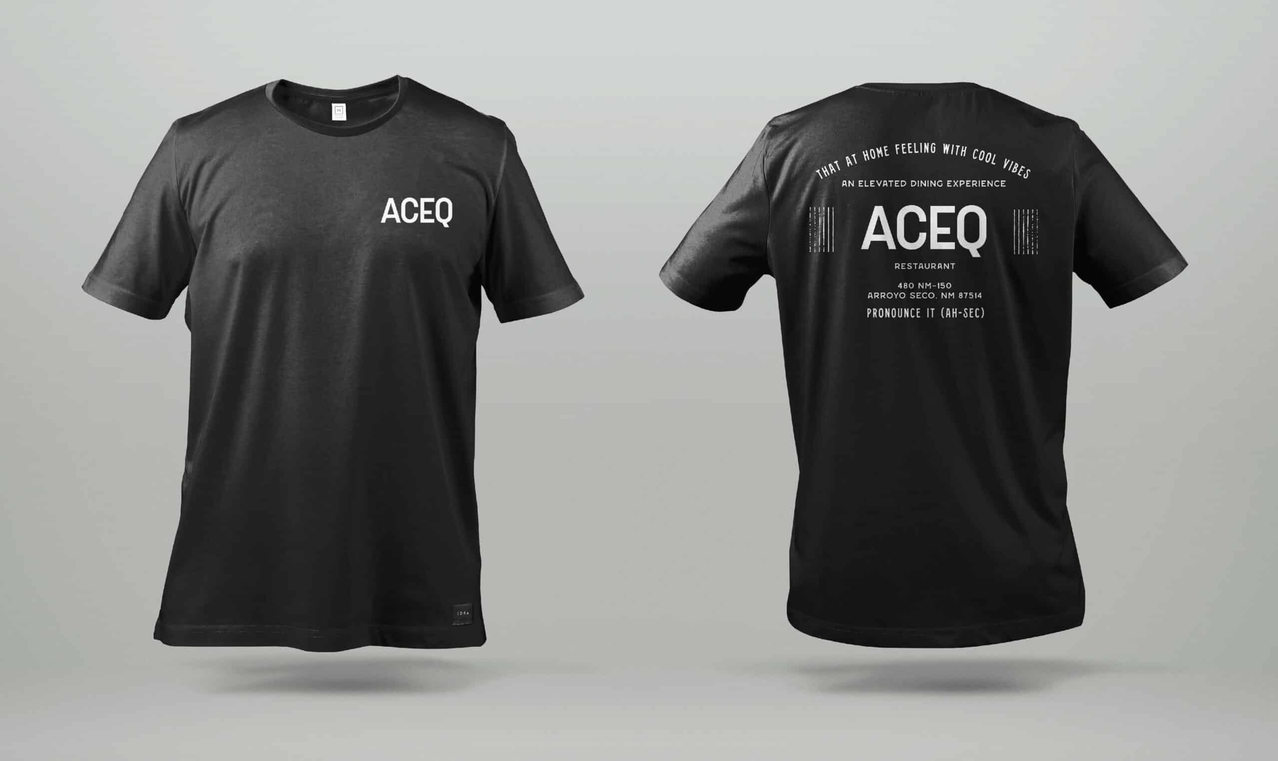
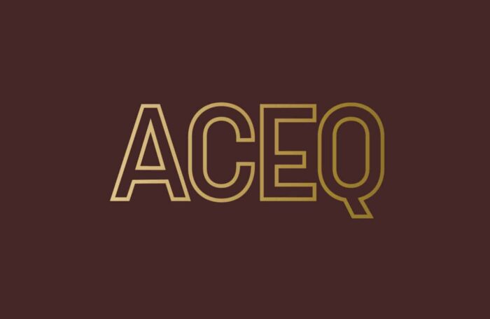
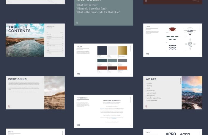
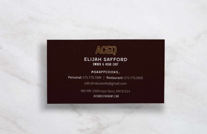
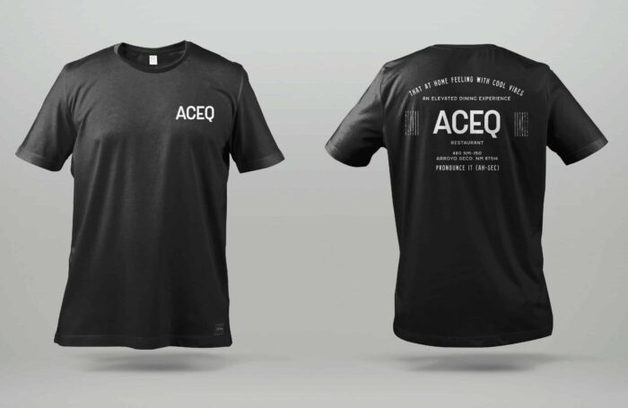
While we ended up handing off several “brand” assets, the primary logo mark for the business is a clean and refreshed “ACEQ” in all capitals. It can be used both filled in or as an outline.
During our discovery process we learned the ACEQ comes from a term meaning “water ways” as to how the irrigated the land. We pulled form that and included a water patter both as an accent mark and as the feathers in the owls wing.
The Result
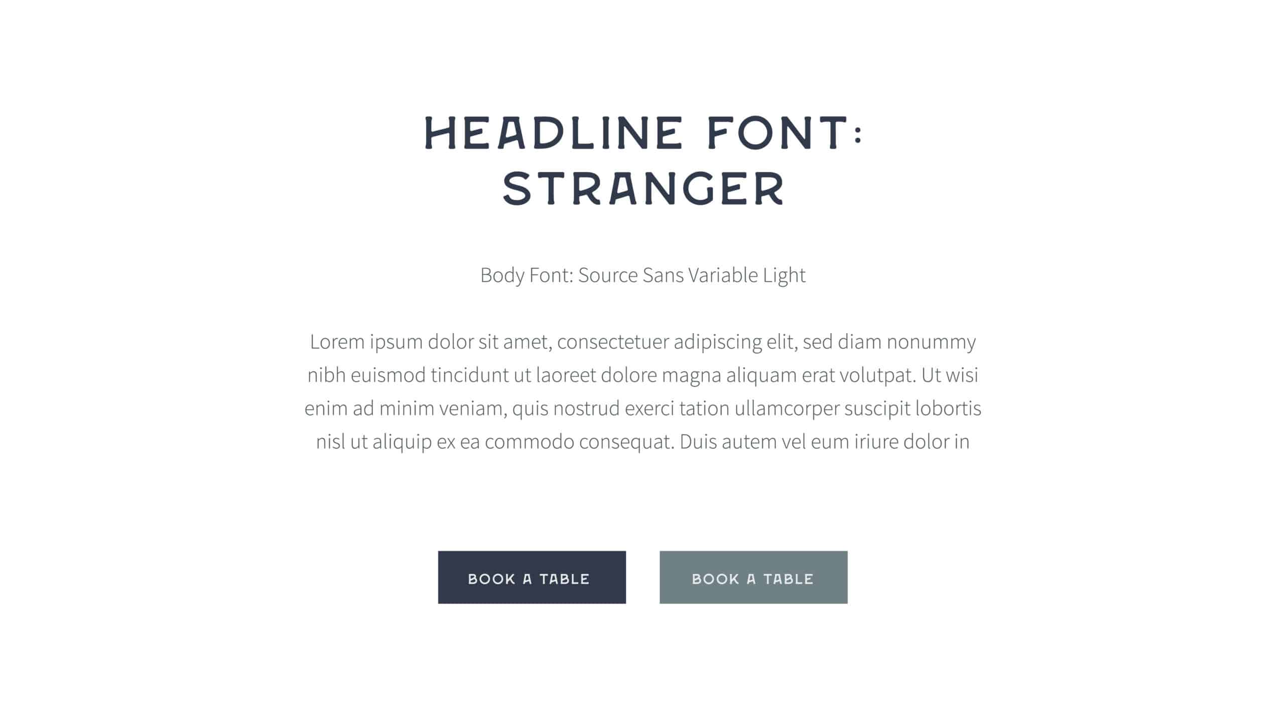
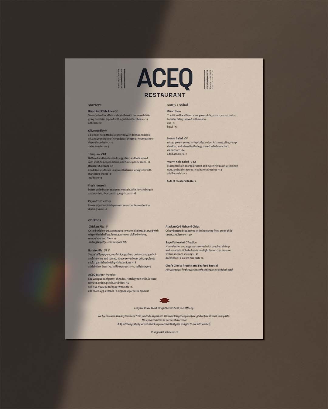
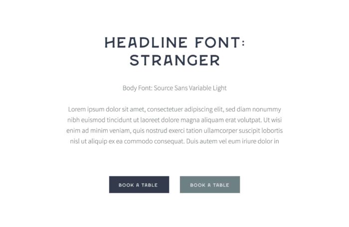
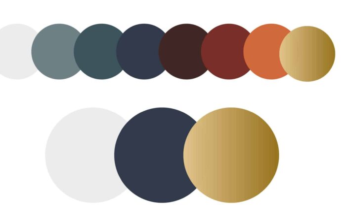
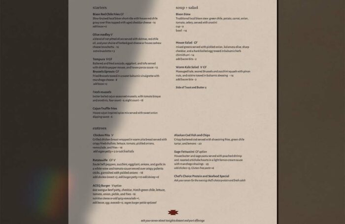
We create something that felt like a fine dining experience but also felt like Taos New Mexico. We achieved that look by using colors and shapes inspired by the south west but pairing it with clean sans serif fonts and a “less is more approach.”
Words From Our Client
“This brand is the backbone of my business. Before working with Stellen Design, I knew what I wanted the restaurant to be, but I had no way of articulating that to my staff. It all feels real now, it feels like my vision.”
– Elijah Safford Owner / Head Chef
Services
