Bask + Being is a “chief wellness officer-in-a-box” solution for businesses. They specialize in flighting burn out!
Logo Design
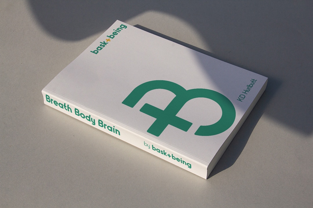
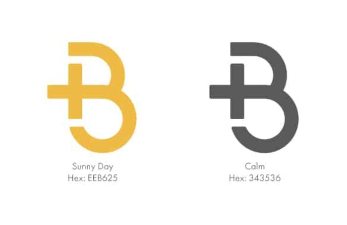
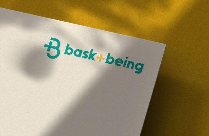
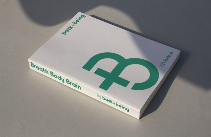
Through the discovery process we found that Bask + Being was about success and stress free… the idea of having it all is obtainable! With the right tools you can be successful and not pull your hair out. From that idea we knew we wanted the mark to show a +, not only since it’s positive, but it speaks to the ideas of both. Not one or the other. We utilized a fun yet modern sans serif typeface for the wordmark portion of the logo design.
Color Pallet
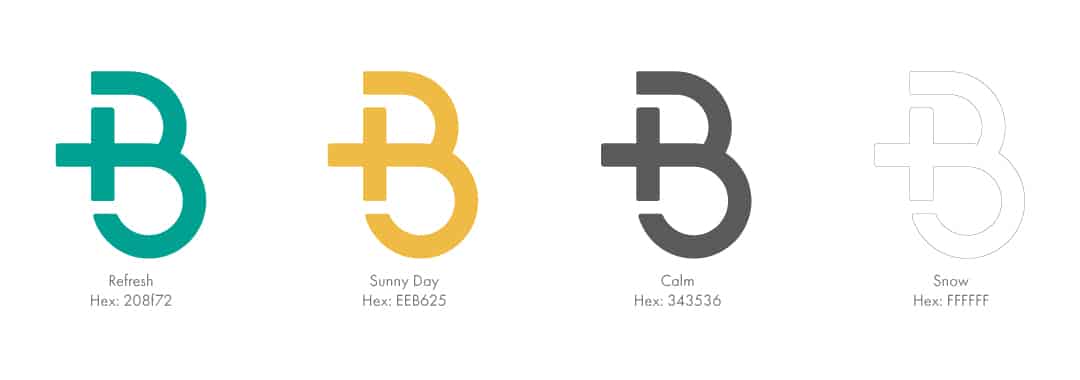
After doing a competitive audit of the industry we learned that orange was the “it” color for the mental health space… and we wanted to be different! We chose yellow and green since yellow is positive, energetic, and creative and green is serine, calming, and inspiring. All attributes we wanted to come across in the branding.
The Reset Deck
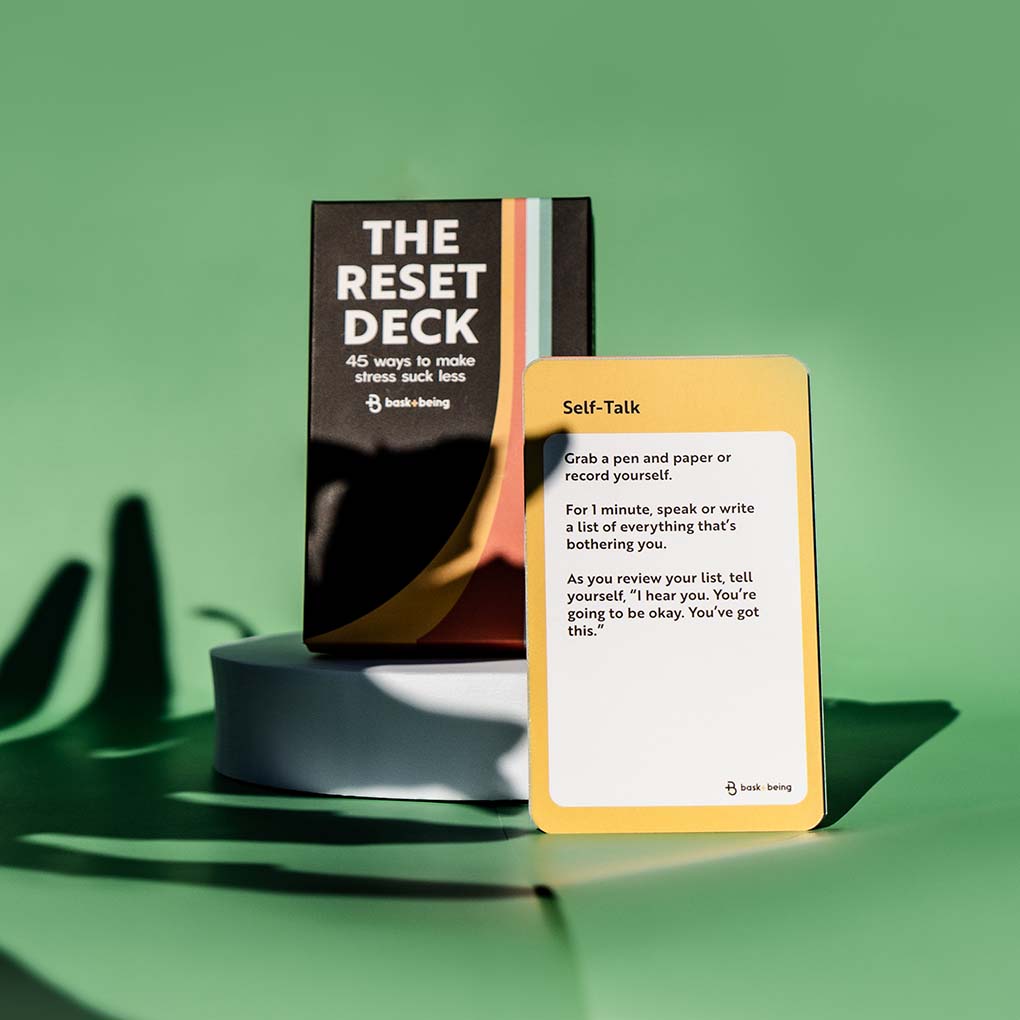
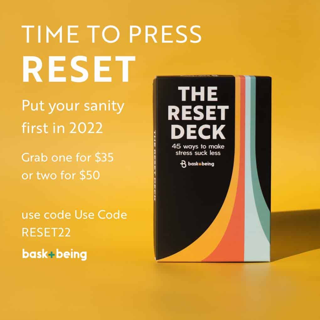
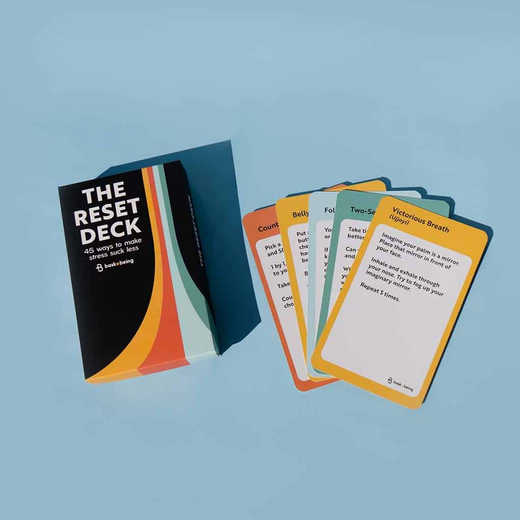
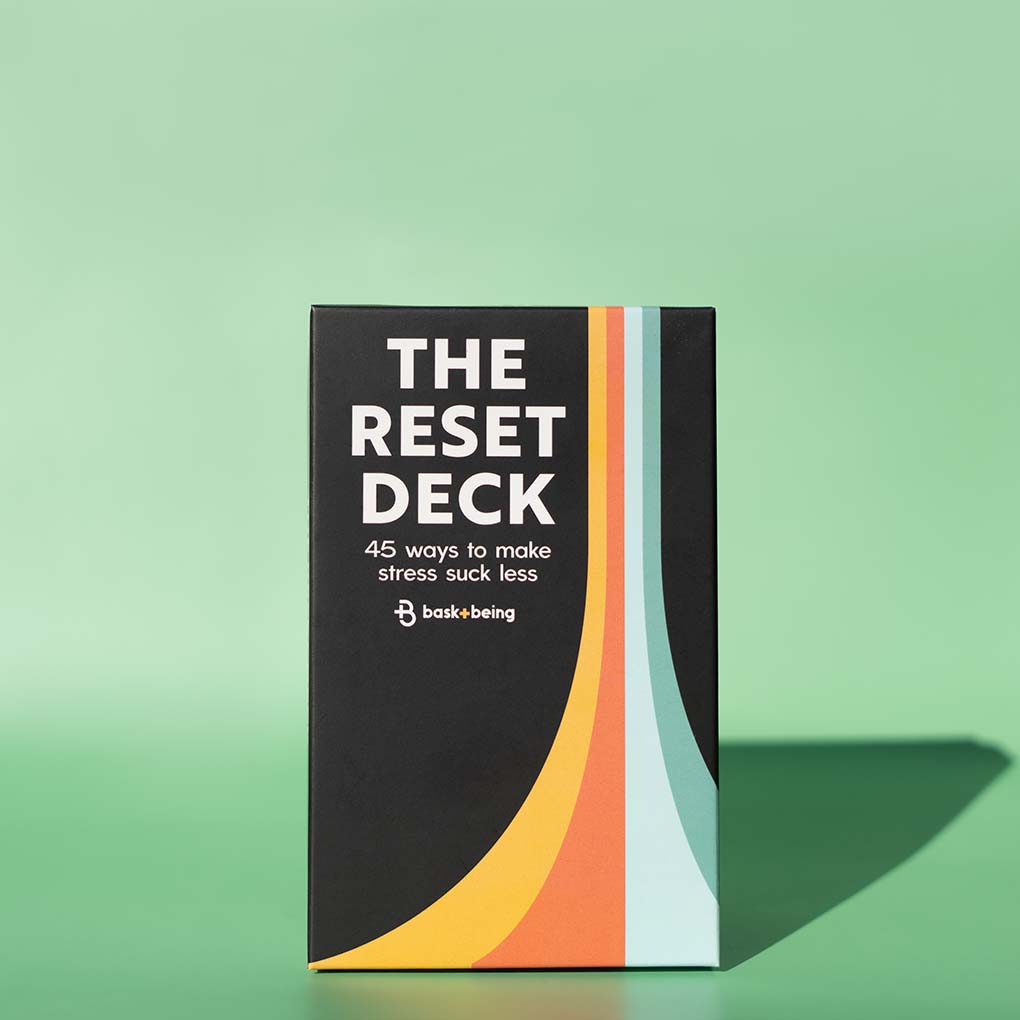
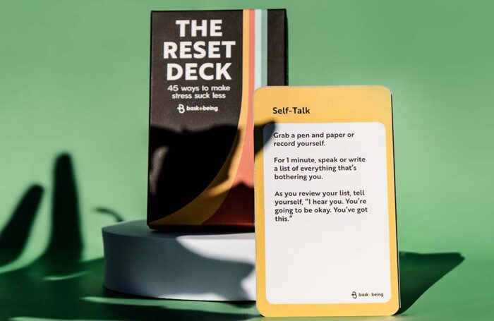
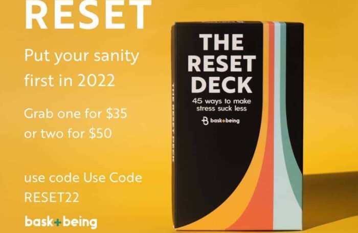
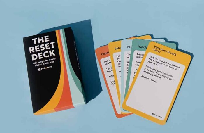
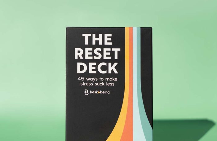
The Reset Deck is a mental health card came that is simple and fun. It boasts 45 ways to make stress suck less! For the design of the deck we were inspired by games from our childhood! We wanted the deck to entice you to take a break and play a card throughout your day. We added orange and blue to our pallet and created the illusion of taking off (or reseting) on the card box.
Find our more about The Reset Deck here.
Services
Words From Our Client
“Seeing this logo and having it as mine gave me this invisible boost of confidence. This “I can do this, and I am doing this feeling.” I get complements on my logo and The Reset Deck all the time! Jordis is a true genius of design. Worth every single cent and more”
– KD Hurlbutt
