

Beach Cities Solar Consulting is a solar energy consulting firm with offices in Southern California and Puerto Rico. They came to us in need of a brand identity. The logo they were using was an illustration of a solar panel. Not only was the existing logo a difficult graphic to interpret, it didn’t work as a one color design.
We immediately got to work defining the brand identity and target customer. We knew we needed something clean and professional, yet approachable. Once we got to the drawing board we played around with various ideas to show “beach” and “solar.”
After our first round of logo comps we decided the “beach” idea was reading too “beachy” and it was starting to look more like a surf company and less like a solar consulting firm. We ditched the beach and went straight solar!
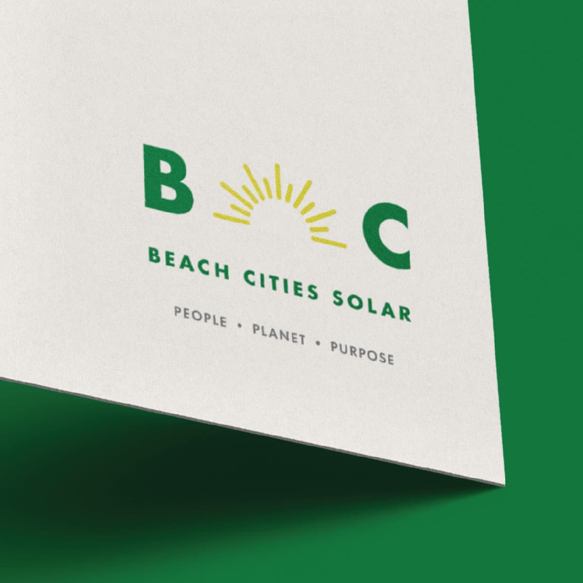
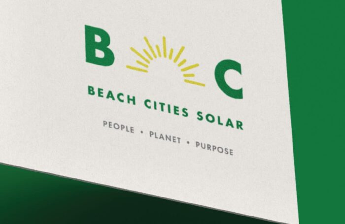
The finished logo is a sun logo mark paired with a clean san serif word mark. The overall style of the logo is clean, modern, cool, and approachable. Using the san serif font helps up achieve that look by being forward and not traditional.
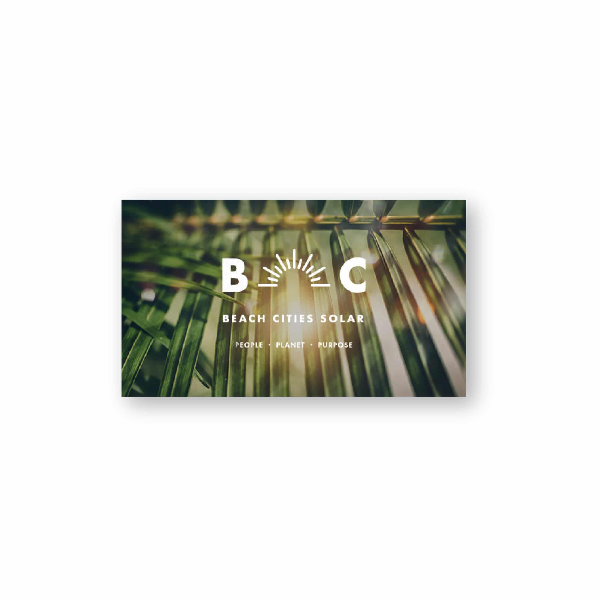
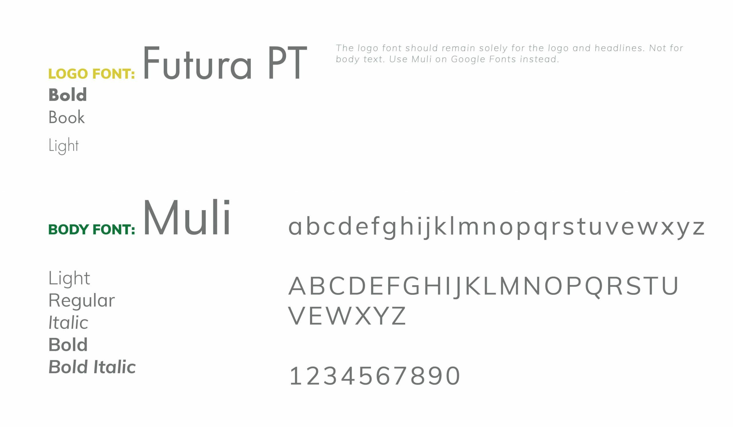
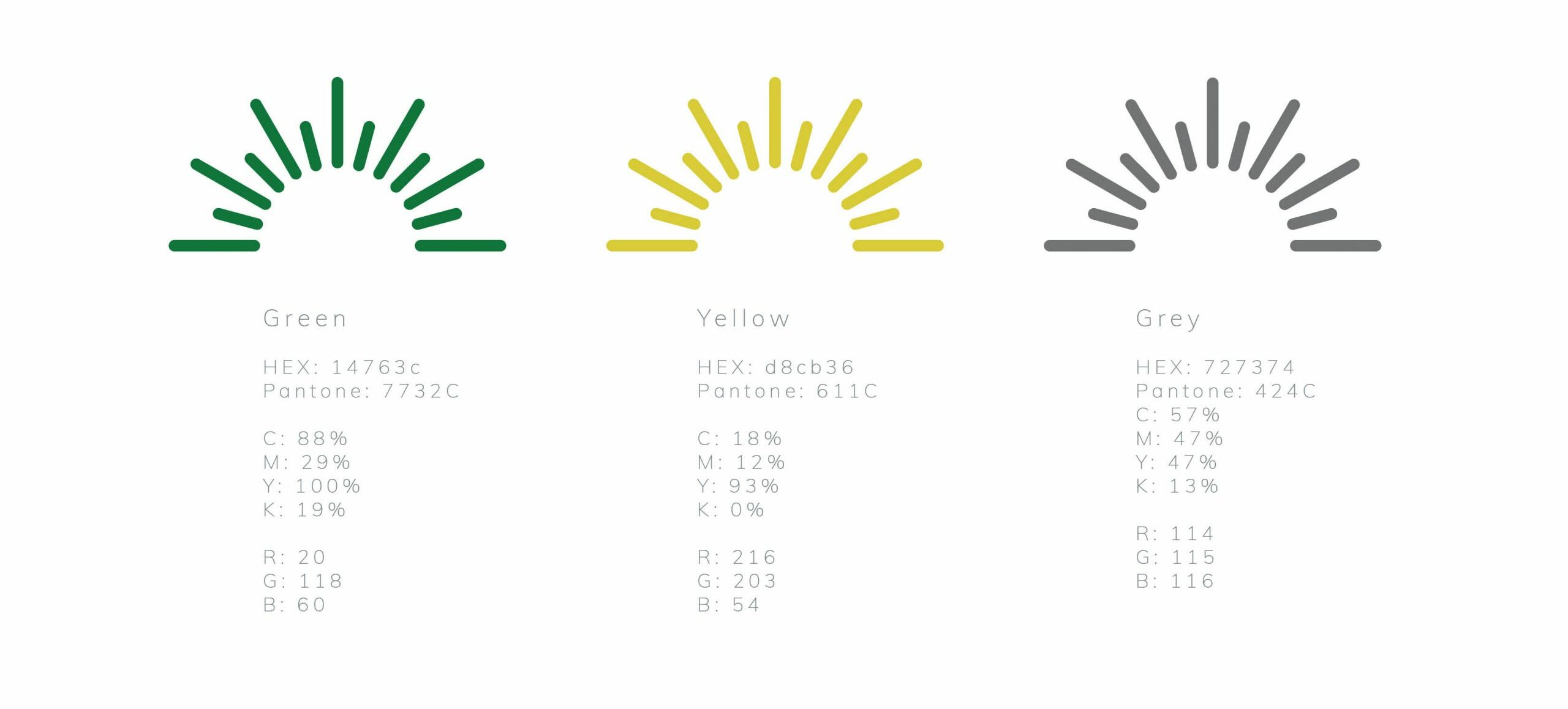
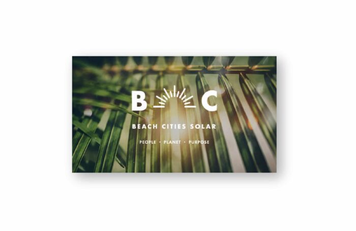
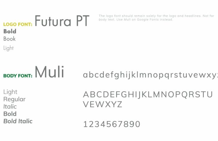
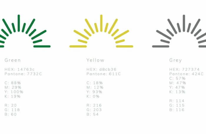
As we continued to develop the project, we moved on to define brand fonts, colors, and photography styling to be used. Next came business card and stationary set designs. Lastly, we documented all our work in a brand guide to ensure brand integrity as the company grows. Beach Cities Solar now has a clearly defined brand identity.
View our logo comps from this project at the bottom of the page.
Services
Logo Design
Branding
Check out other branding projects.
