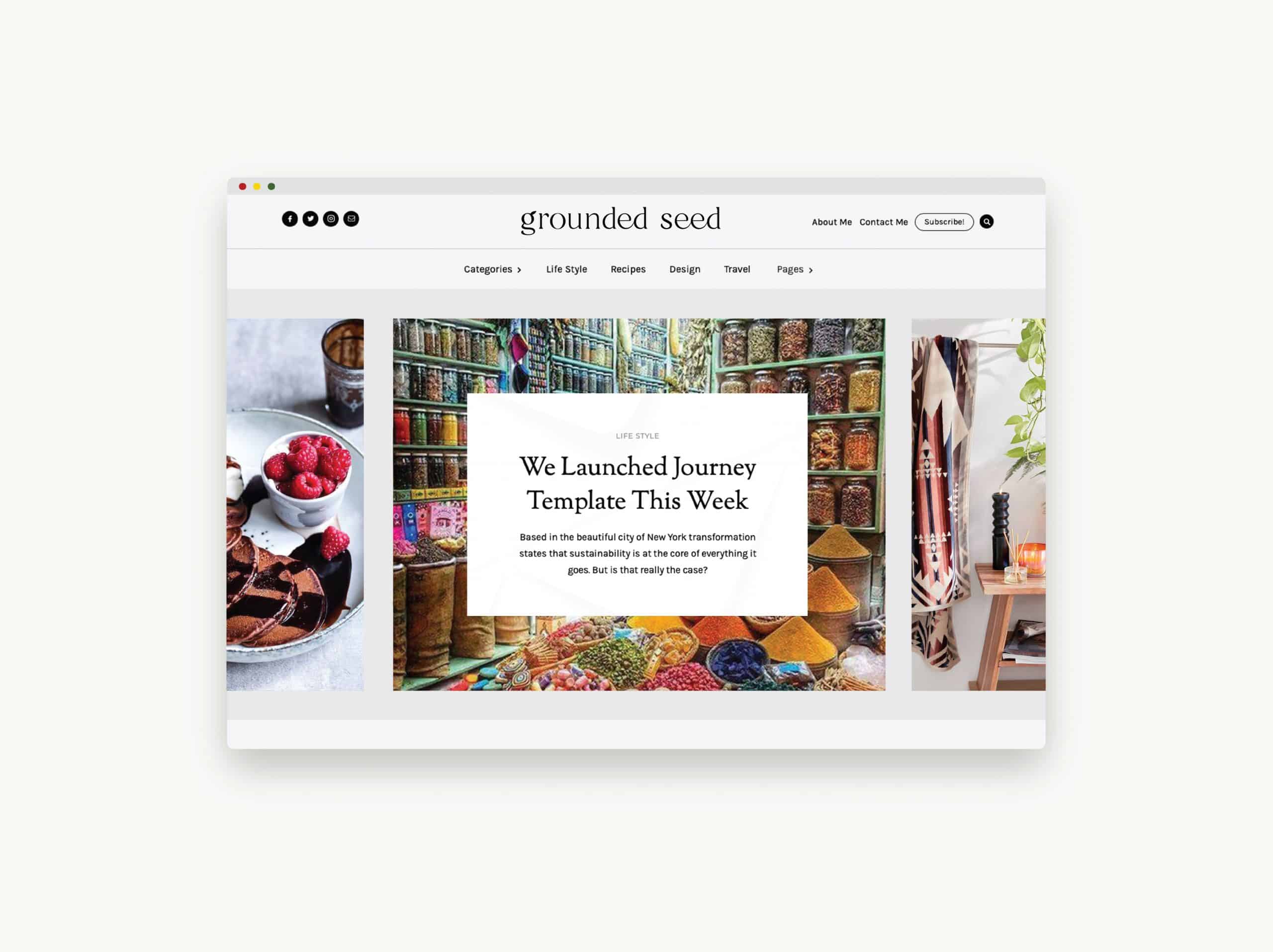


The creator of Grounded Seed came to us in need of a logo design for their website and brand.
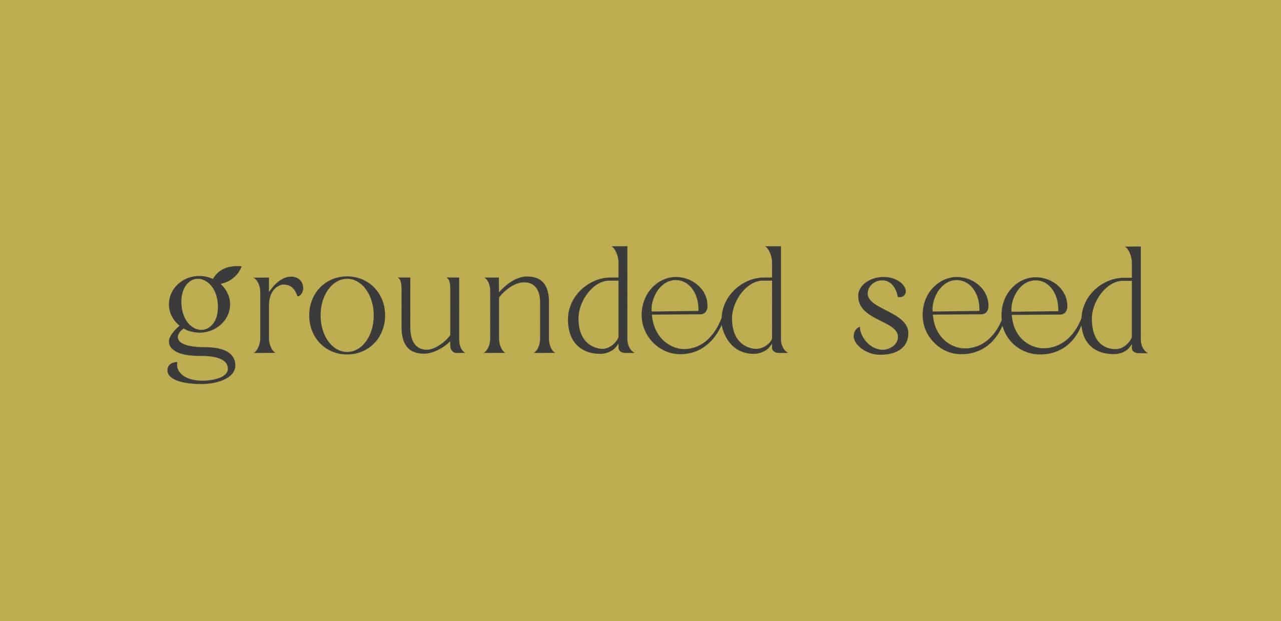
Grounded Seed is an emerging lifestyle brand based around a clean kitchen – and by clean, we don’t mean a bleached countertop. We mean clean as in packed full of fresh, healthy, and natural foods! She wanted a wordmark logo design to start, so we got to work messing with different fonts; we tried serif and san serif options and settled on a timeless serif. Then we added a custom flair by connecting some of the letterforms. Next, we presented the lower case G as a logo mark and favicon for the site. We incorporated the leaf to signify growth as if the G is the grounded seed budding into a plant. We loved working on this project.
It was fun to come up with something fresh yet timeless.
Services
Words From Our Client:
Jordis/Stellen Design,
First off, thank you! I am so happy with the final product for my brand! This was my first time working with a designer to create a wordmark/logo, and you made the process so easy and comfortable. Your edits and feedback helped shape the final idea and I couldn’t be happier! Thank you for your prompt responses, hearing my feedback and making perfect adjustments accordingly, and a timely and accurate layout of what this project would look like beginning to end. I appreciate your talent and time. I can’t wait to work with you again with future business!
-Ashley Horton

