

Chris Harvey, the founder of Harvey Esquire, came to us in need of some serious branding help.
Like many busy attorneys, he had used a variety of vendors in the past and never really had the time to address his brand’s creative direction. His logo and brand colors were not speaking to the level of clients he was working with, and his website was a basic template with zero customizations. He had a friend who was rebuilding his site at one point, but, as those projects sometimes do, it ran on longer than expected, and we eventually partnered on that as well.
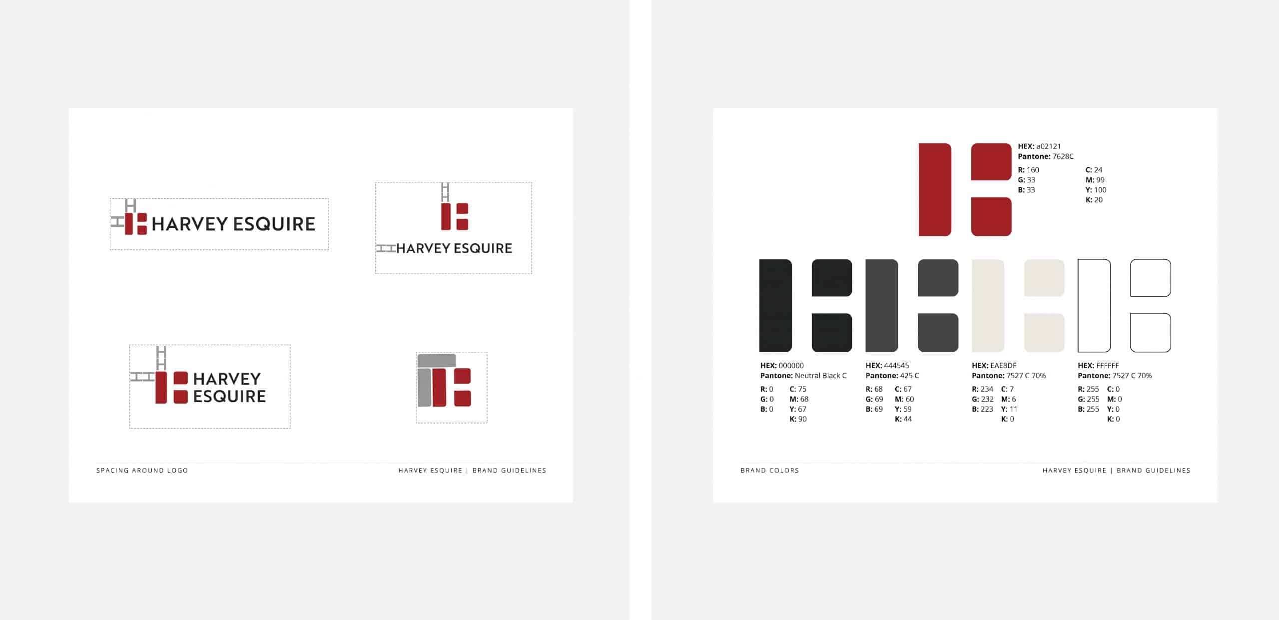
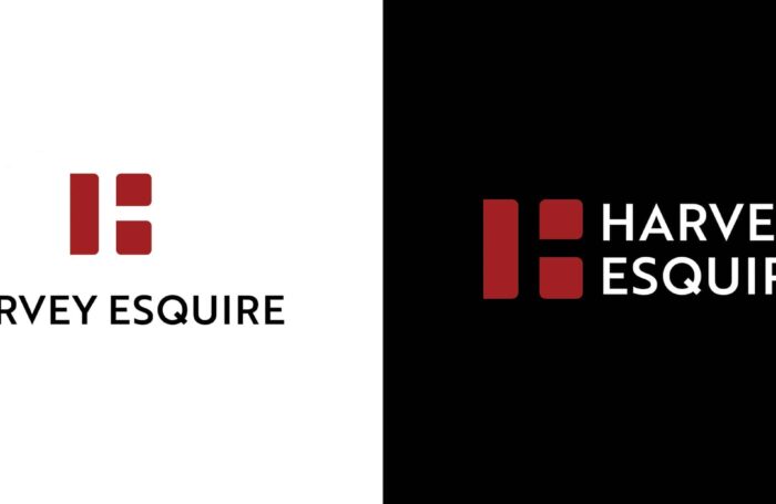
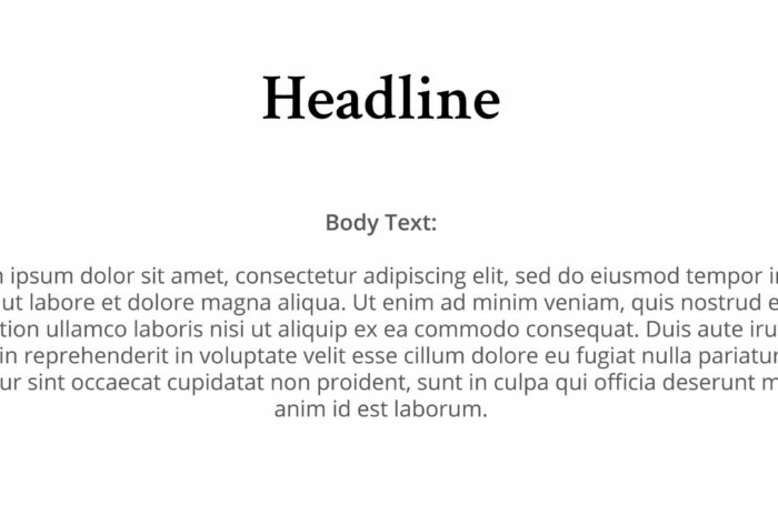
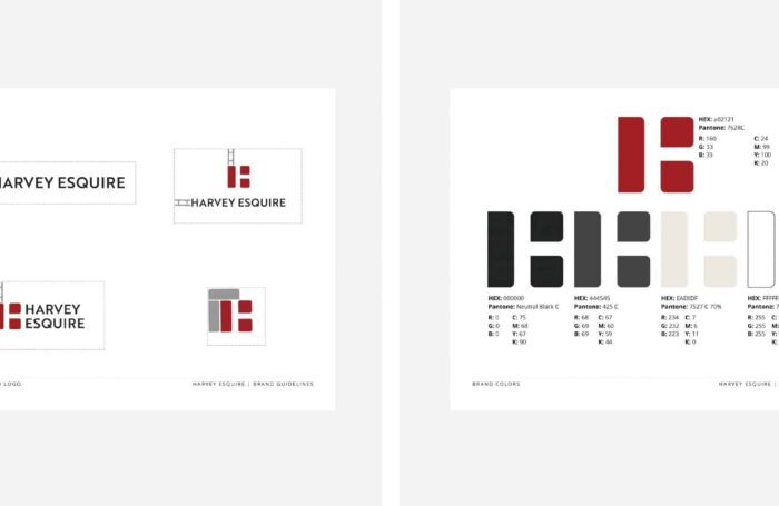
We were beyond thrilled to clean up his logo. We created an H logo mark working with the negative space of the H and adjusted the color palette. His brand color had always been red, but we went with a deeper, more sophisticated shade of red to give it a higher-end feel. We used a classic and professional serif style H in the logo mark and paired with a clean sans serif to give it a more fresh and clean feel. Mixing the two font styles we were able to be timeless and trustworthy while still being fresh and modern.
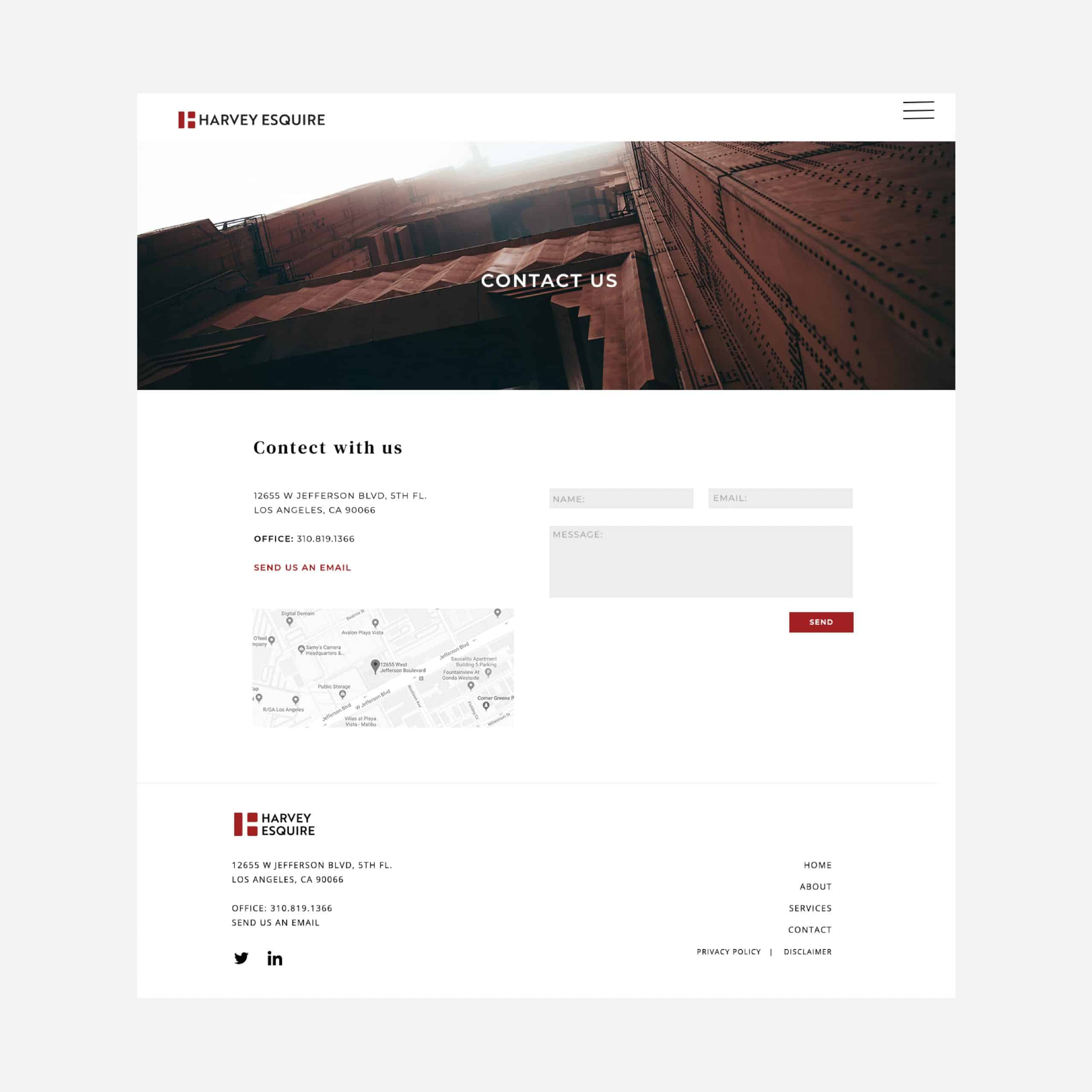
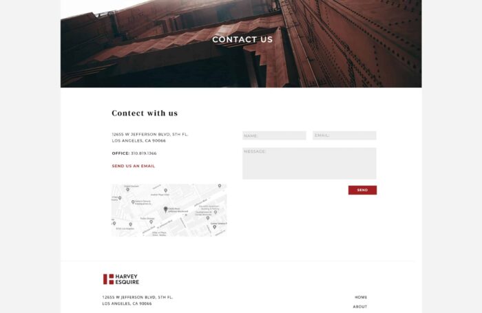
For the website, we kept it simple and clean with an impactful hero image featuring a bridge that pulled in from his brand colors.
Overall his target clients are VC who work in the tech space. We needed something that would feel polished, aware, relevant, and cool, yet professional. We needed to appeal to the Patagonia puffy jacket-wearing client, not the suit and briefcase kind.

