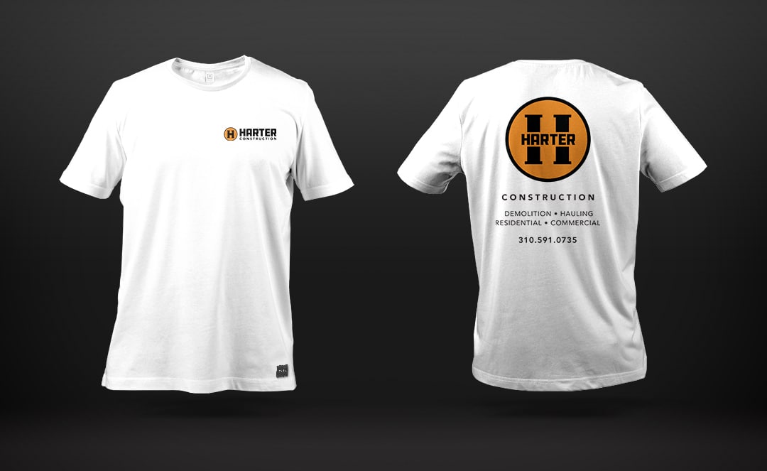
Harter Construction is a construction company in Southern California focusing on demolition and hauling. Harter construction came to us in need of a logo for their construction business. While most construction companies in Southern California have a high-end homeowner in mind as their target demographic, Harter is a little bit different. They wanted to appeal to General Contractors, who would hire them out on jobs they were managing for the high-end homeowner.
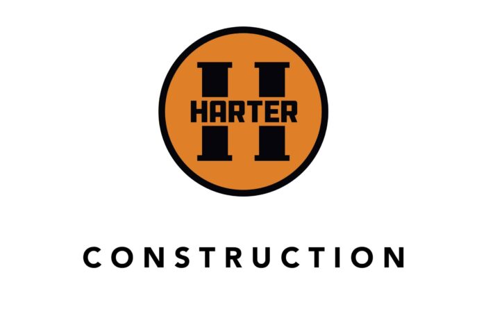
We presented a few different ideas and concepts. A few were based around a home structure, and some design options created an H out of construction objects. We ended up doing a solid and bold H with “Harter” written as the crossbar of the H. We used Aaron Draplin’s DC Hardware as the font in the crossbar and softened up the logo by using a clean Sans Serif for the word “construction.” The logo is bold and strong. It makes a statement and is very recognizable around town.
For the color palette for Hater Construction, we went with classic construction orange. Why do I say “classic construction orange”? Well, Home Depot did a hell of a job and creating brand recognition using orange. Plus, orange has always been a color used for city workers on the road, given it’s a bright, eye-catching color. Orange works well on both black and white backgrounds and is also very energetic and creative.
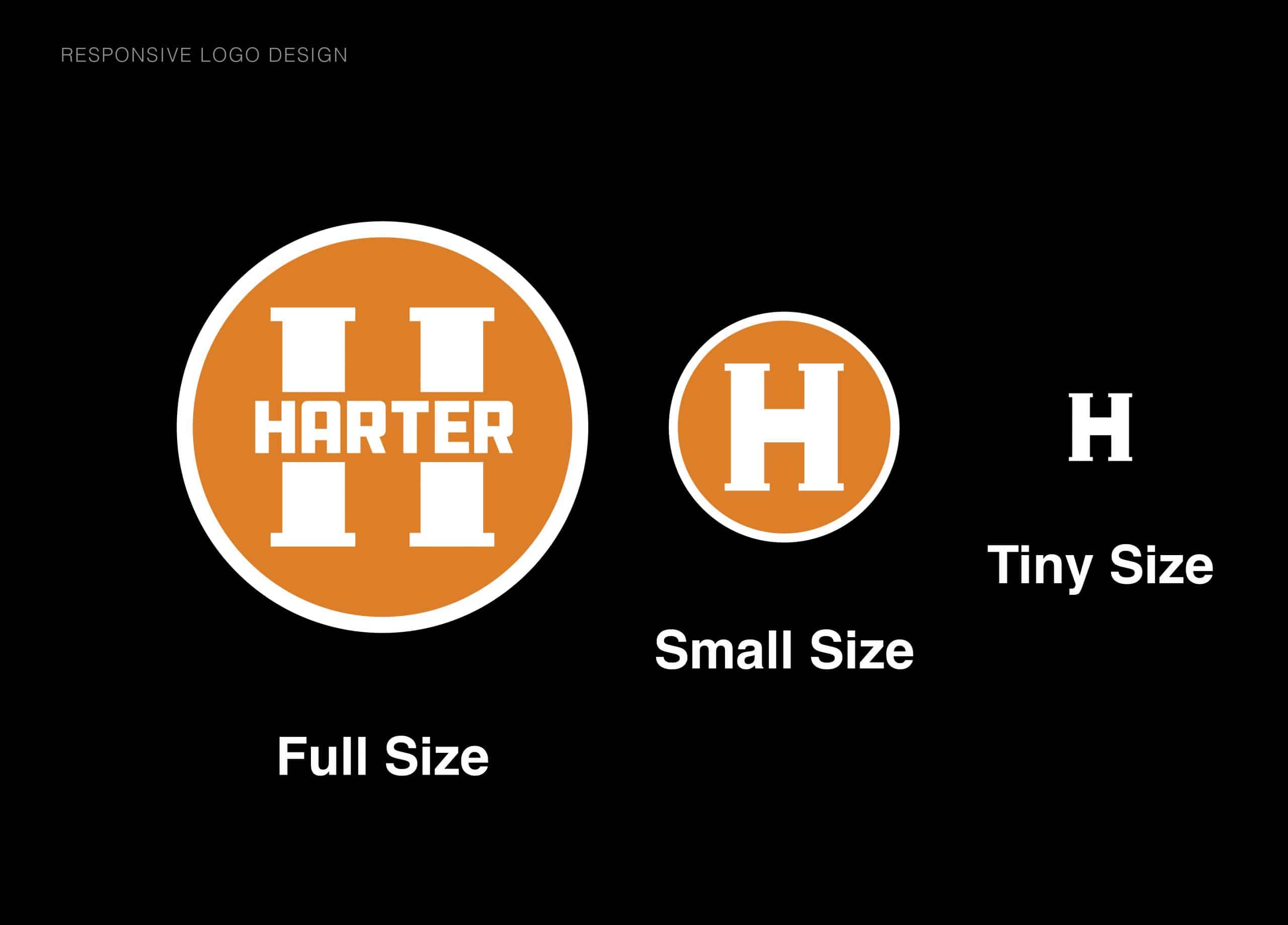
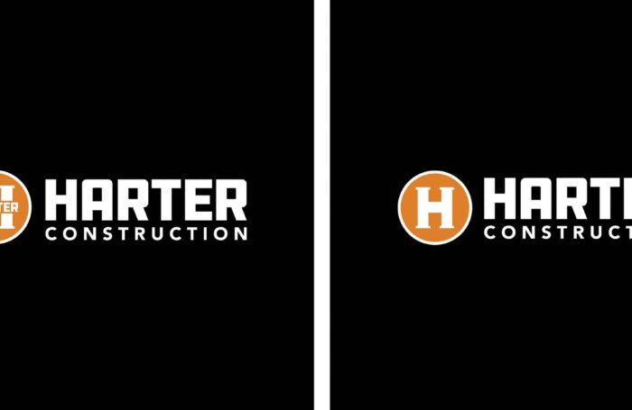
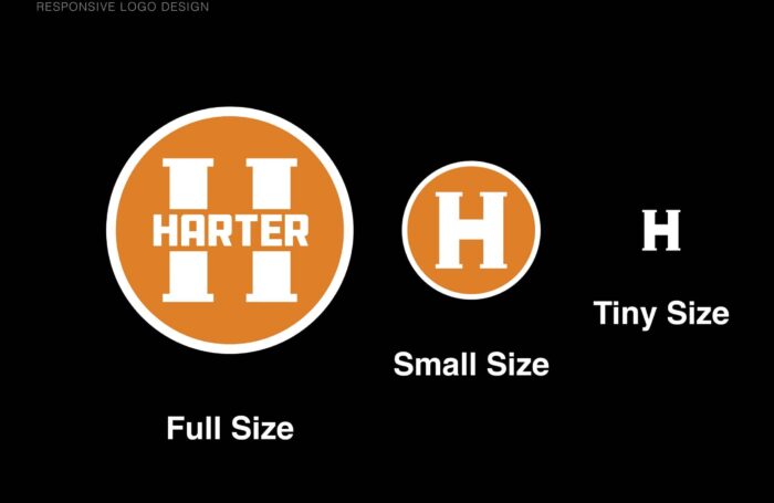
One challenge we had with this logo was making sure the design was responsive and worked in different applications. For example, if we only used the logo with the word “Harter” in the crossbar, it would not read on a small scale. We had to make some adaptations to create a workaround and give them a full responsive logo system.
We are very proud of the way the Harter Construction logo came out. Our client has been using the logo, and they, too, are very proud of the way it turned out!
Services
Looking for more construction logo projects? Check out the logo we did for Maycliff Homes, a high end home developer in Manhattan Beach.

