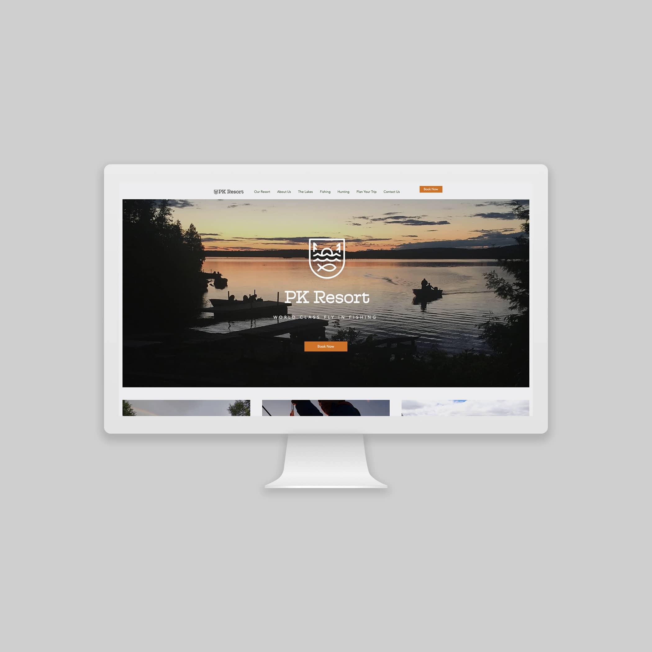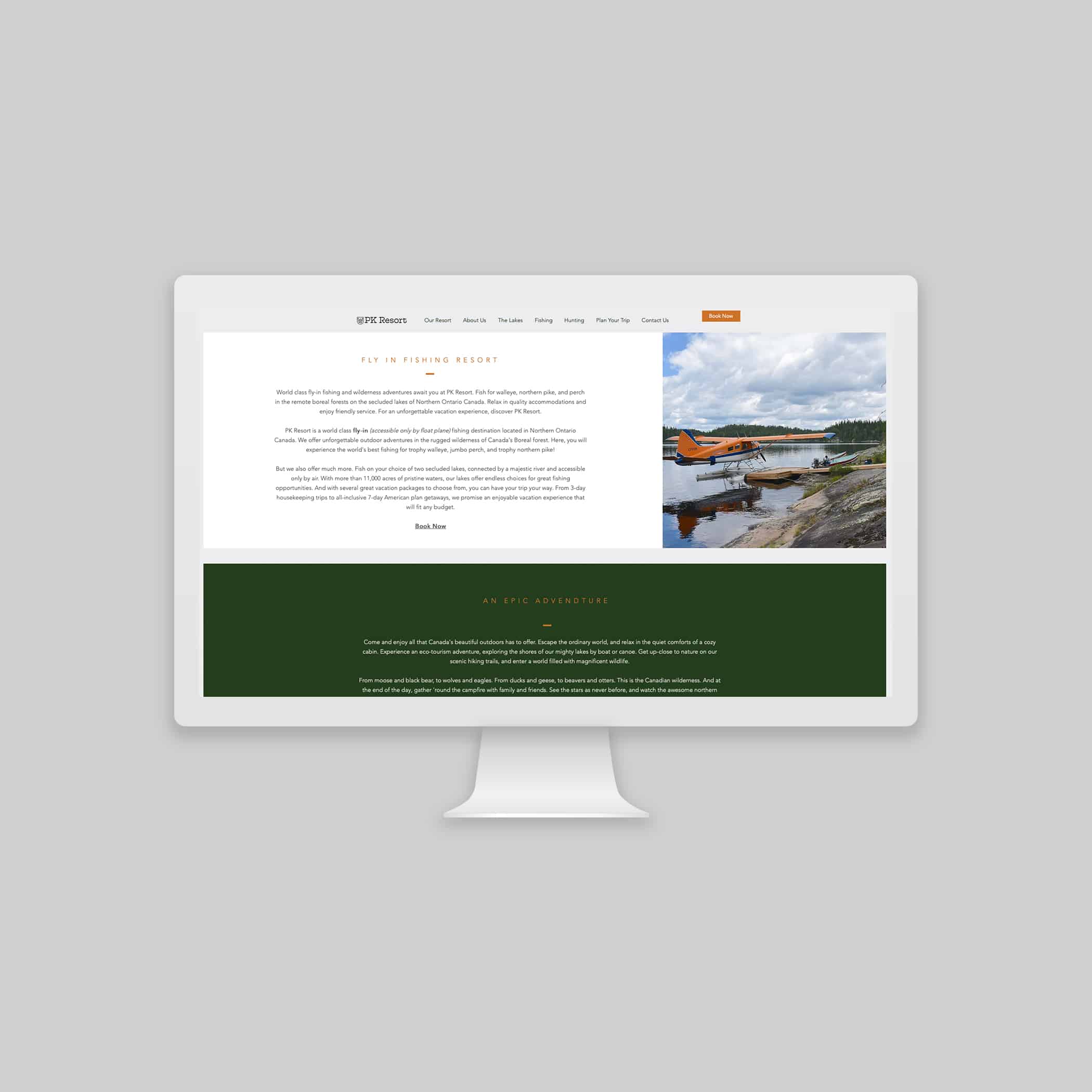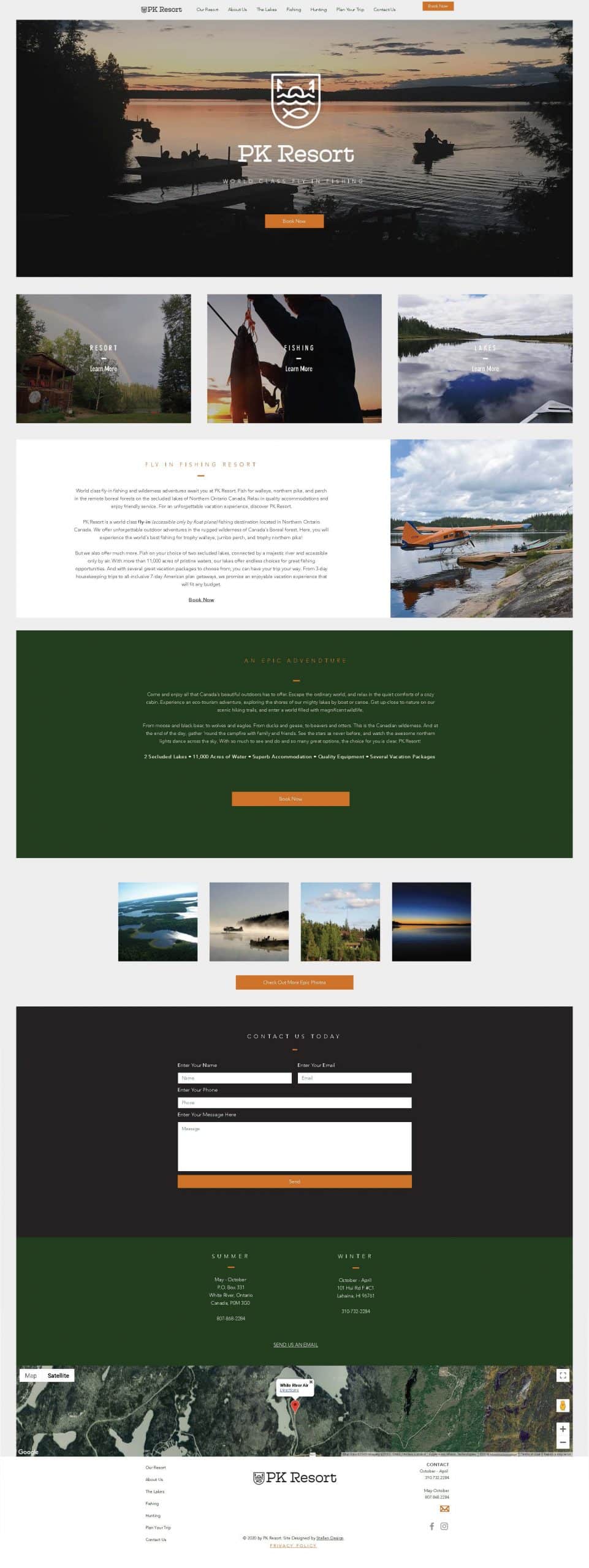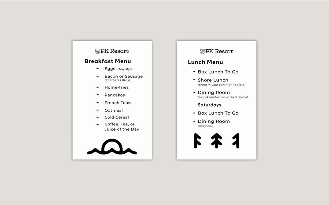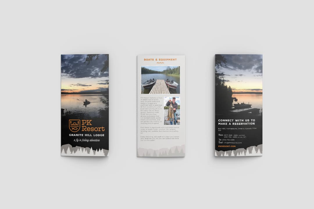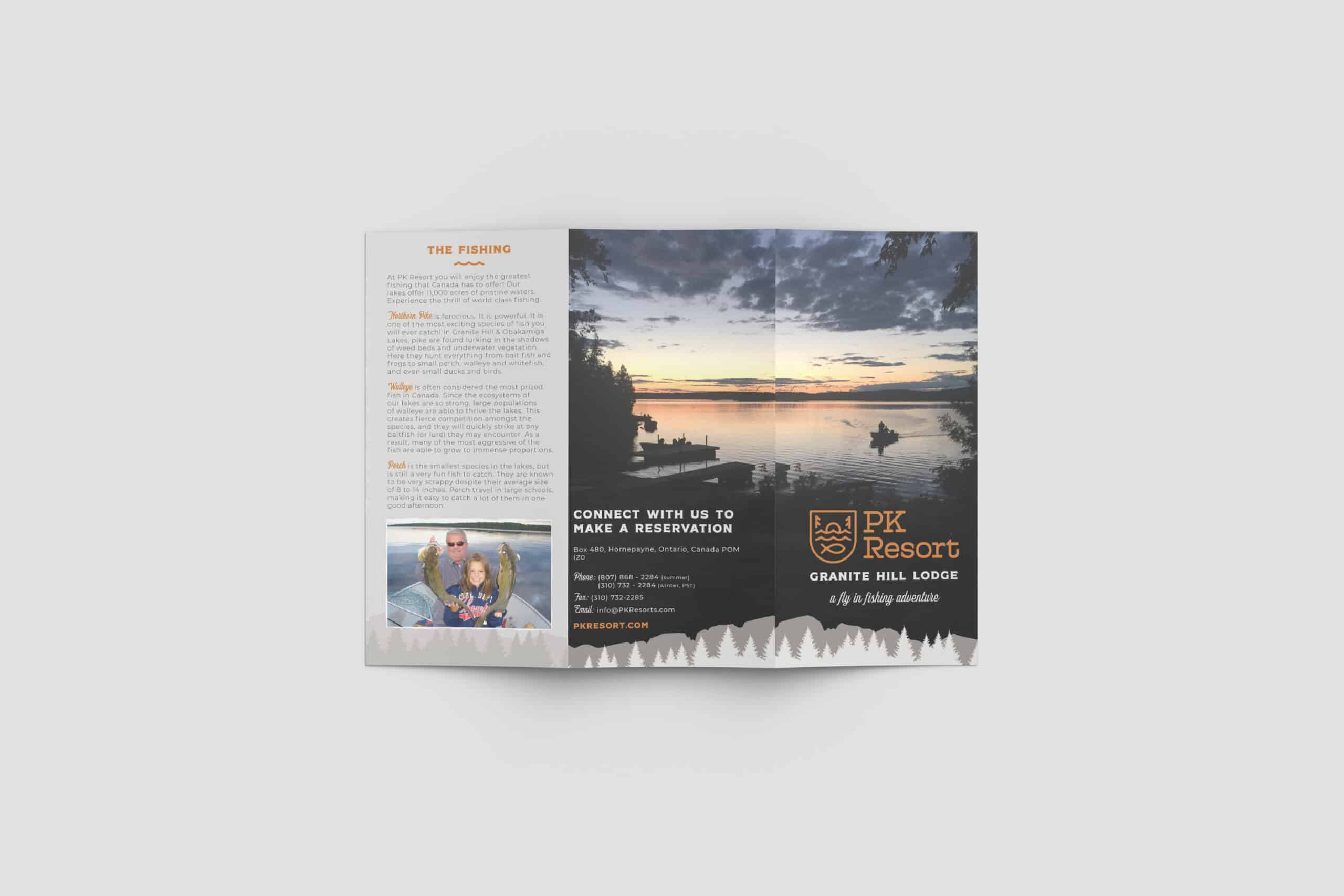
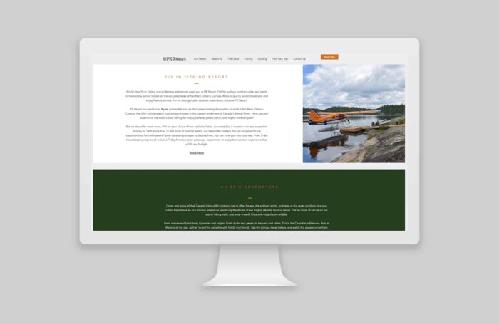
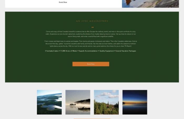
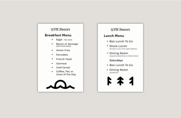
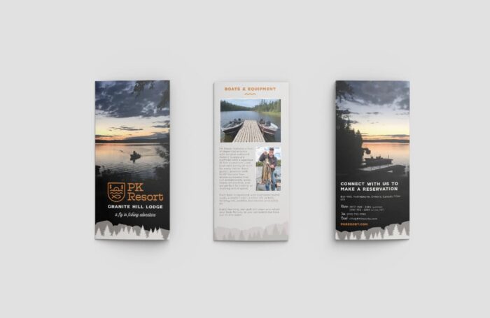
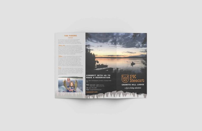
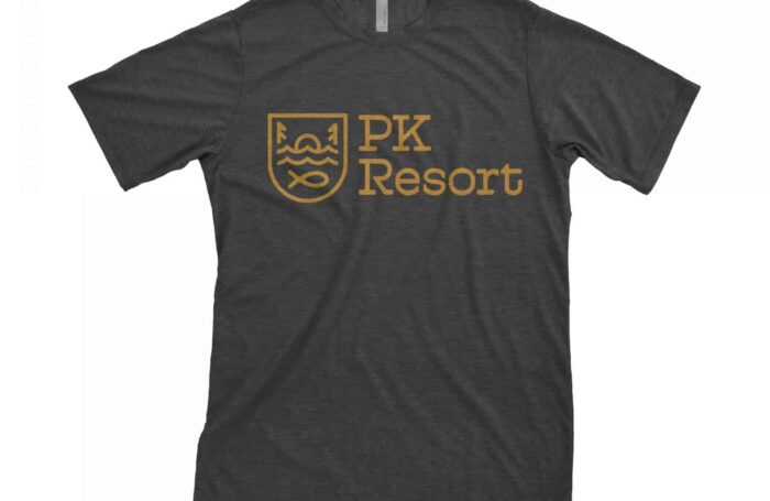
PK Resort in Ontario Canada is truly heaven on earth. We were fortunate enough to partner with this unique business on their brand and logo update. This resort is a family run business and, like many family businesses, time goes by and the branding doesn’t always get the necessary updates. When they came to us for help, we proposed a few different directions. One of the concepts we pitched was an update on the original logo and the others were brand new ideas.
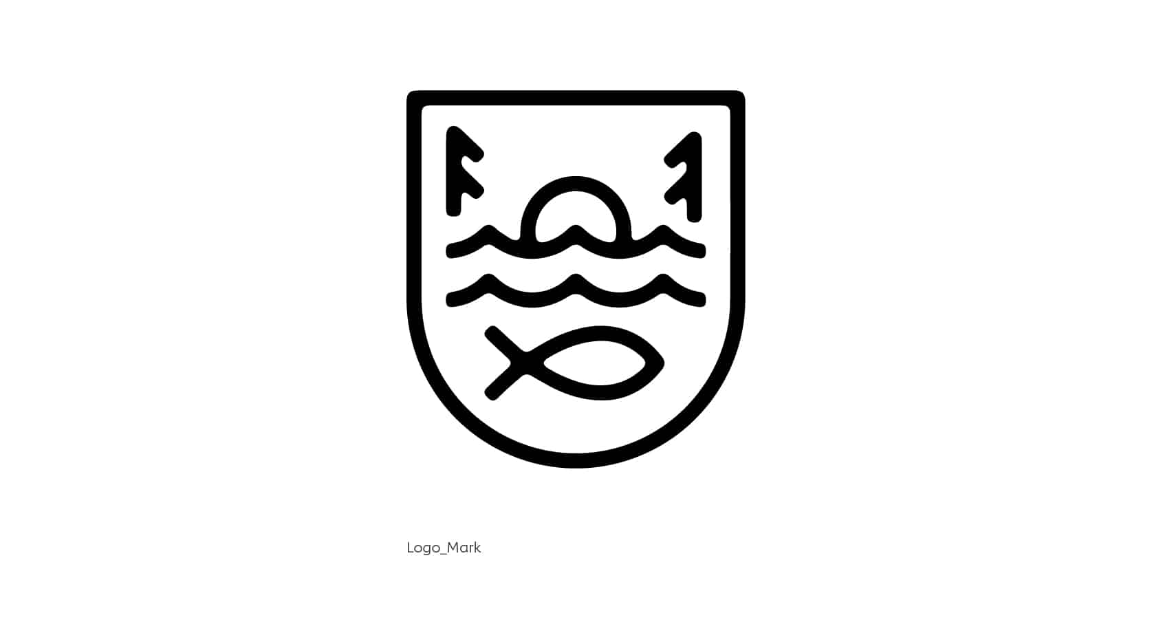
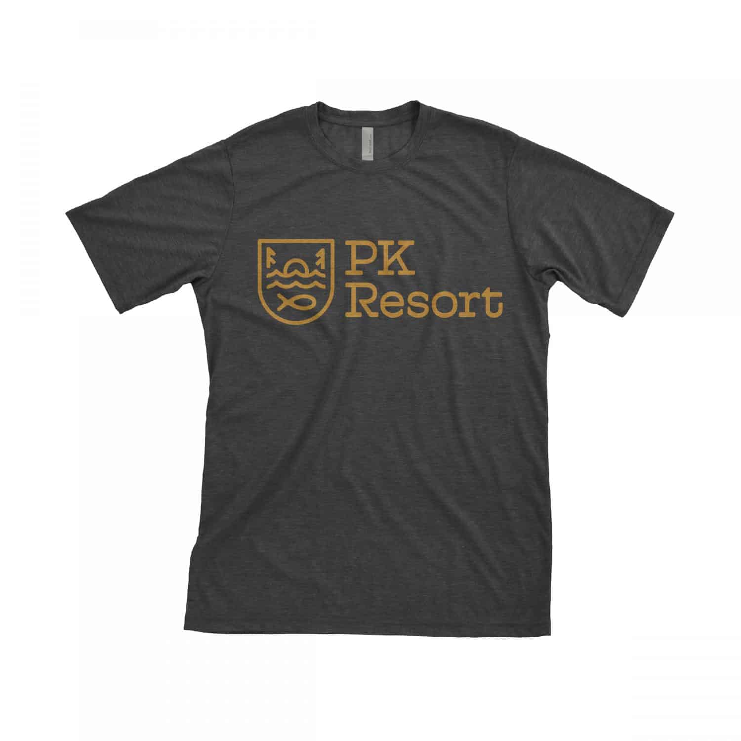
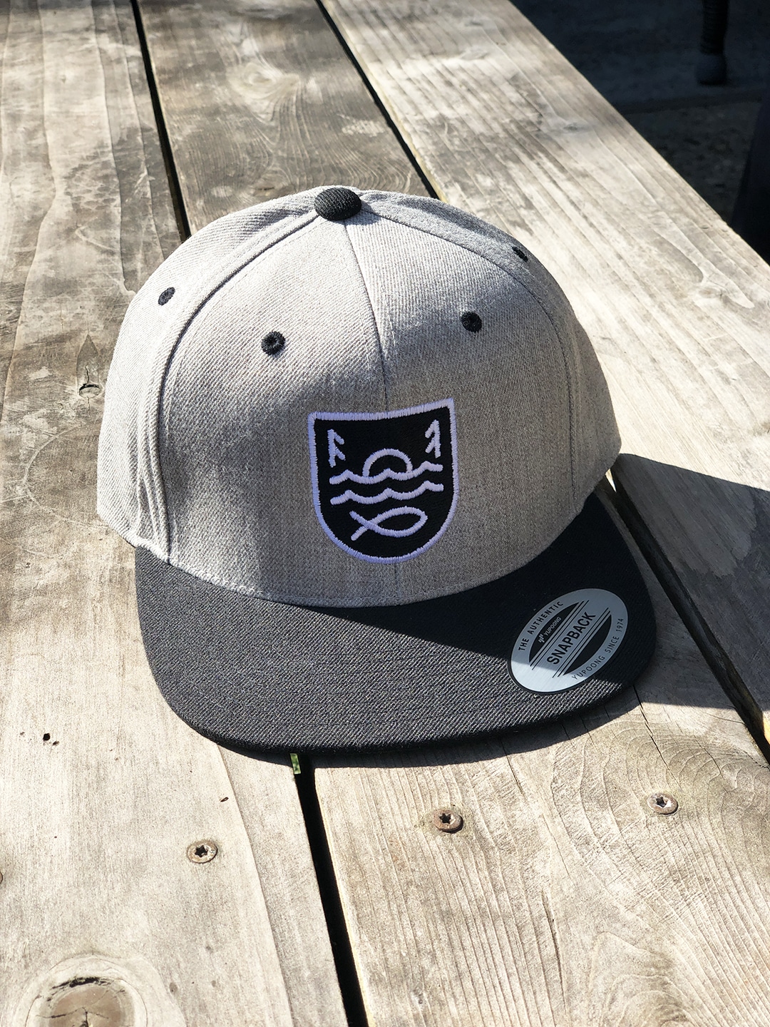
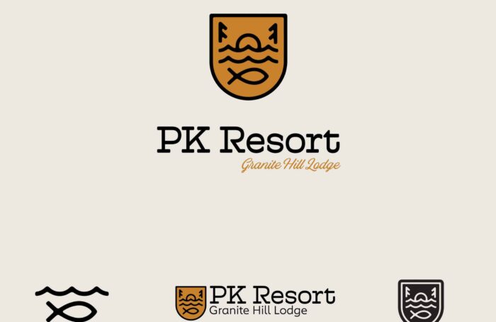
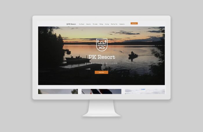
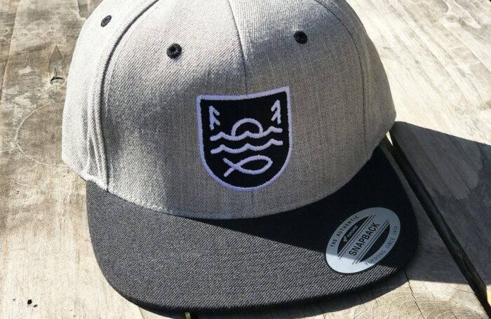
Having been to the resort in the past, we understood the magic and felt they needed a logo that helped embody the ambiance of the fly-in fishing resort which is truly in the Canadian bush. Most of their guests are fishermen who have been coming for generations, but as part of the brand evolution they wanted to appeal to a new audience. To capture the vibe of the resort and appeal to a new demographic, we created a camp badge style logo mark that incorporates the trees, the lake, an epic sunset and the native fish. Pairing the mark with a slab serif font, we were able to keep the “family run” feeling.
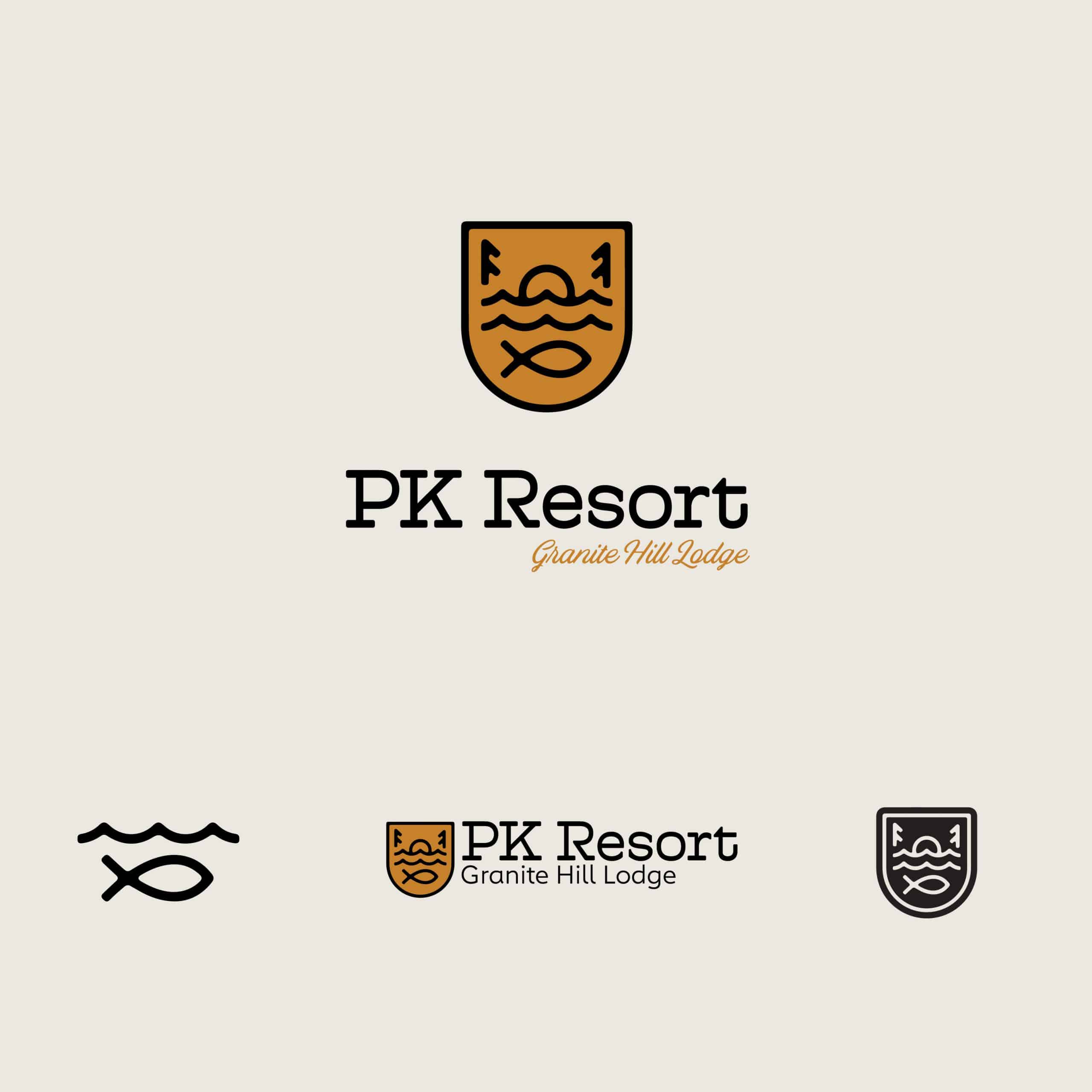
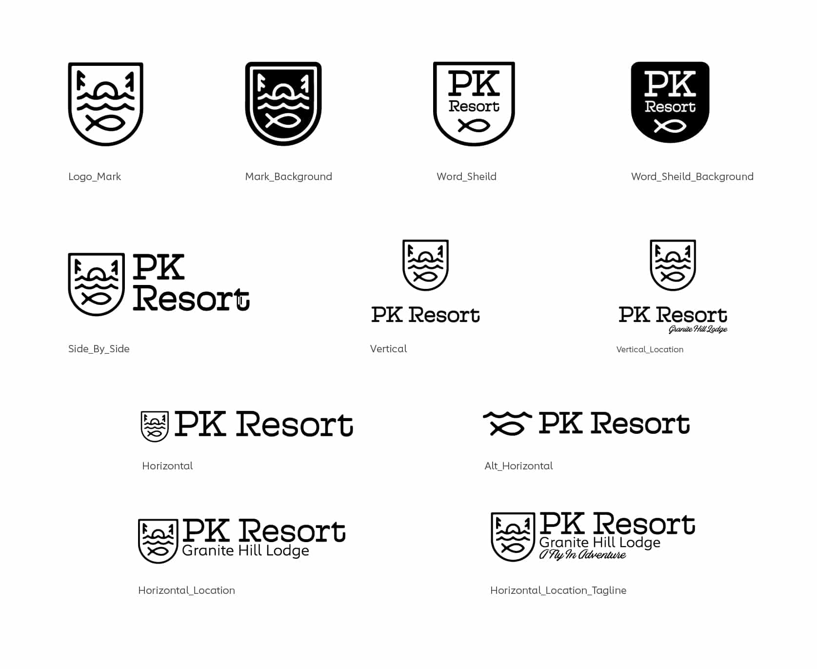
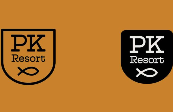
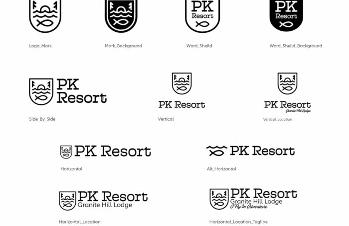
We also expanded the logo system so they would be set up for success with several options. We made sure they have a logo would work on their marketing materials as well as apparel and fishing gear.
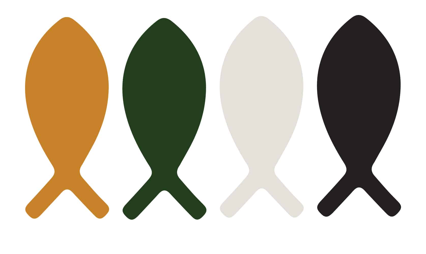
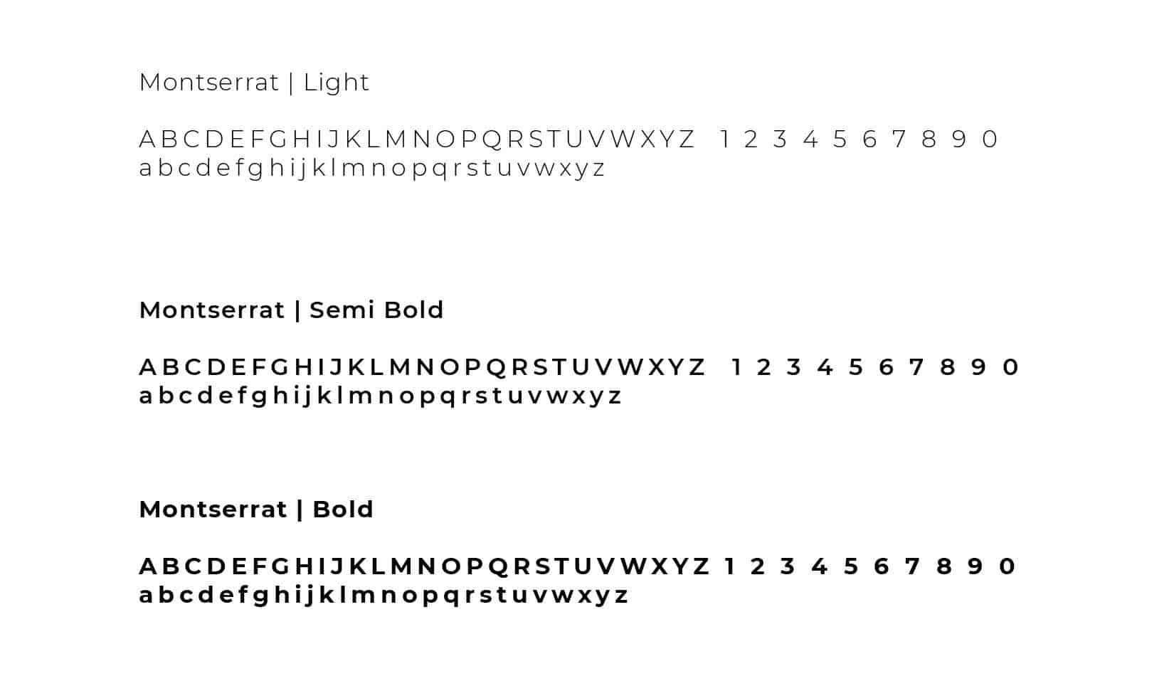
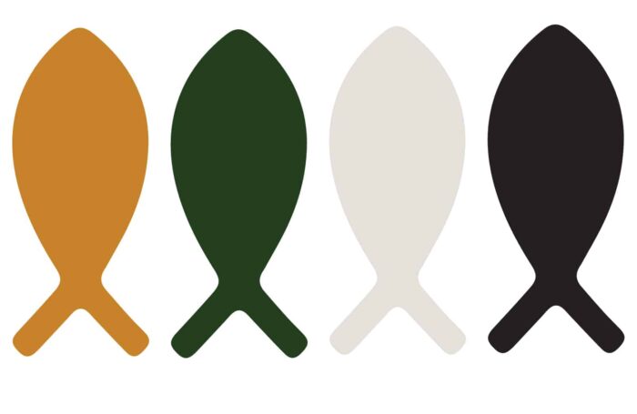
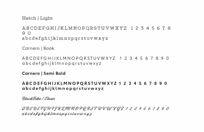
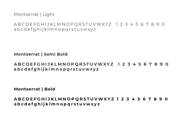
To complete the brand update, we outlined brand fonts, colors, and logo use.
Below you can see some of our roughs as we worked through the logo design process.
Services
Apparel Design
See the brand update for ICAN here.
See more branding projects here.
