


Impact Since Re-brand
Sales upped 3x
Website traffic improved 110% each year
Retreats booked with waitlists
The Sara Schulting Kranz branding project is probably one of my top 3 projects we have worked on! I love how this project evolved. It’s the prefect example of how a brand needs to evolve with the people behind the brand.
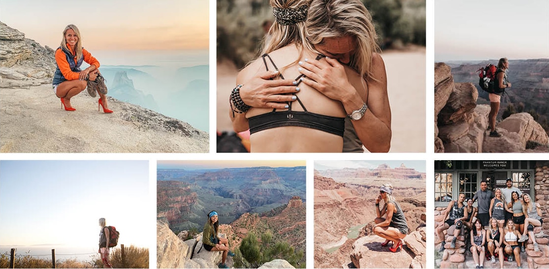
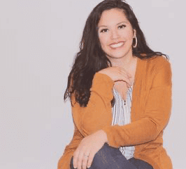
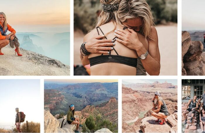
Sara Schulting Kranz is a bad ass woman who coaches people through trauma. She is a certified wilderness guide who leads hiking groups to the bottom of the Grand Canyon, a public speaker, a published author, and a single mom of 3 boys. In my book she is incredible!
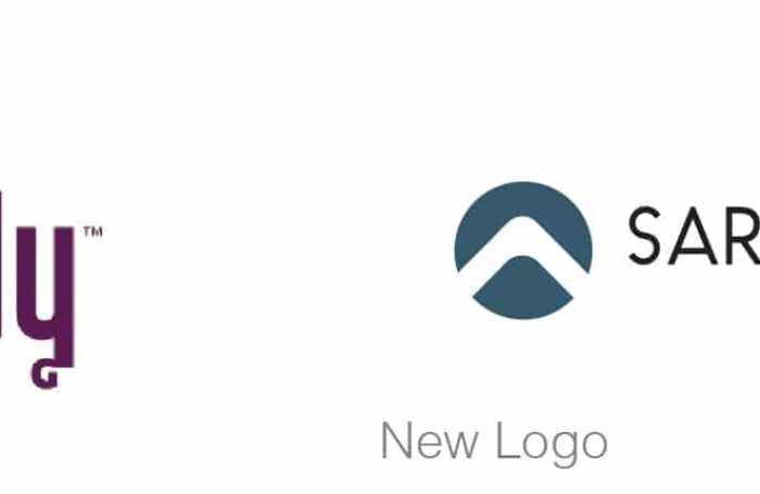
She first hired Stellen Design in 2017 to help create a website for “Live Boldly Coaching”. That was the name of her business at the time and she had an existing logo that she loved. It has a coral and purple color pallet and showed a woman hiking the Grand Canyon. It was very descriptive of her work.
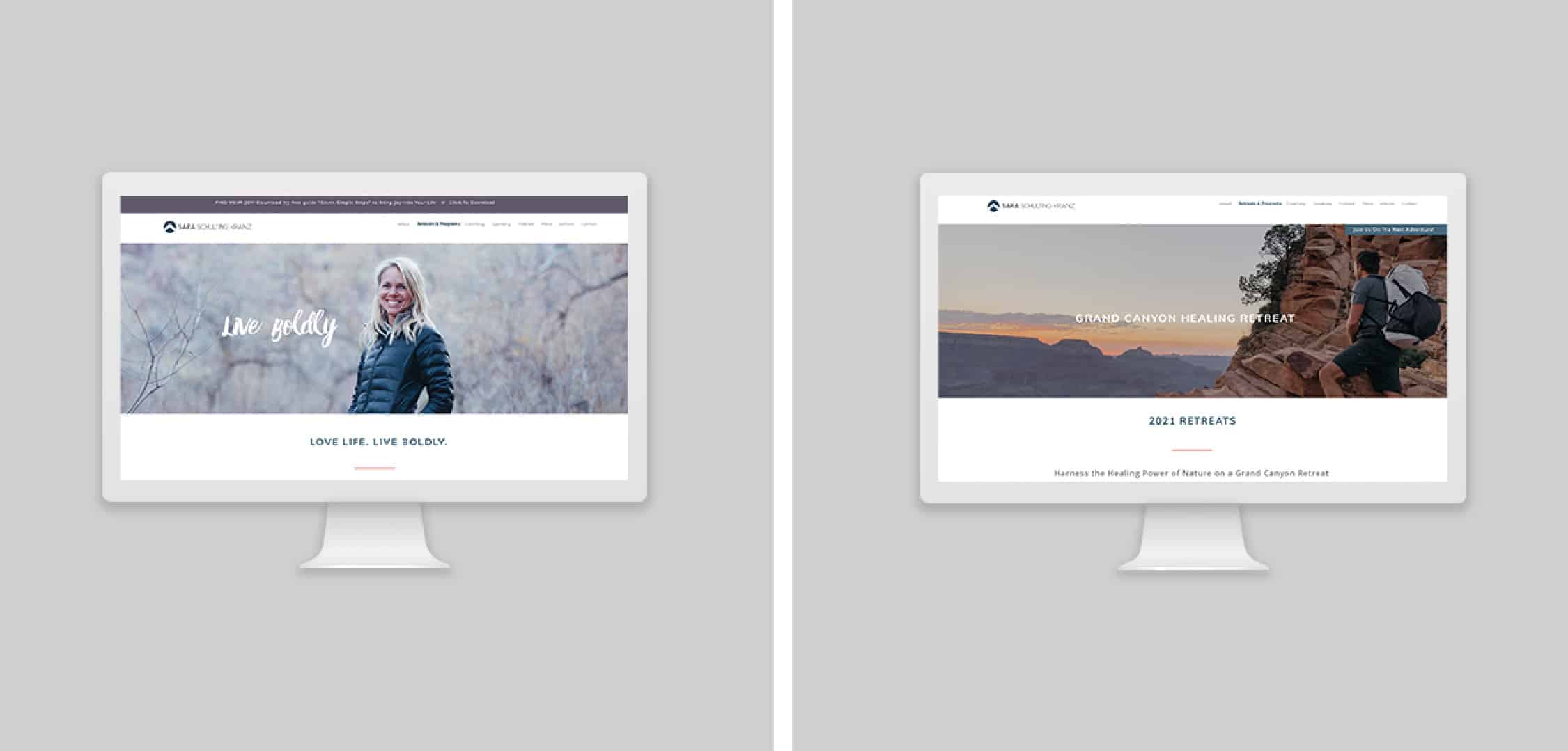
For her initial website we worked off the logo and used movement to show the mountains in the distance. A background and foreground effect. It was cool! If you were looking to get excited about hiking the Grand Canyon, it did the job!
Then one day in 2019, we got a call from Sara saying she was talking with her master mind group and they all think she should change her website domaine from LiveBoldlyCoaching.com to SaraSchultingKranz.com. Now, if only a quick domaine change was the fix… but, the real problem was Sara had outgrown “Live Boldly Coaching” and was now doing many more things than just leading Grand Canyon Healing Retreats. She was working on a book, giving TedX talks, and starting a documentary project. It was big stuff. She needed a brand that could hold all of that good stuff together.
She was still doing Grand Canyon retreats and we didn’t want to lose that… but we needed to grow up a little bit. Basically we needed to take the brand out of just the Grand Canyon, give it a hot shower, swap the hiking boots for some stylish booties, and make it look like a brand creditable of doing a Ted Talk.
Once we explained to Sara that more than just changing a domain was needed she was on board 150%. She was just as excited about the process as we were.
We started the project like all our other projects, with a detailed discovery and hand sketches of logo ideas. We knew we wanted to keep the mountains or the Grand Canyon in the logo somehow. After all, that was where the business started and it was important to not lose that.
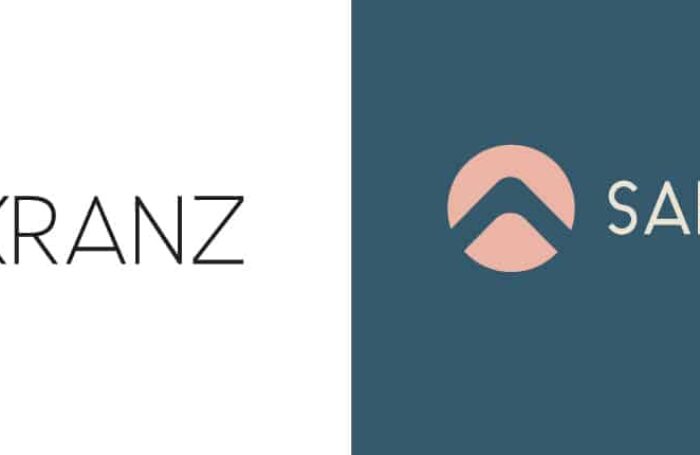
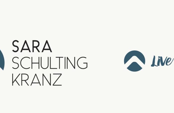
We paired 3 different logo marks with 3 different sans serif type set word marks. Using a sans serif for Sara’s branding was a no brainer. She is athletic, fresh, and cutting edge. She is not traditional or serious so a serif font felt too conservative for her.
One comp we used specifically the Grand Canyon and the other two more generic mountains.
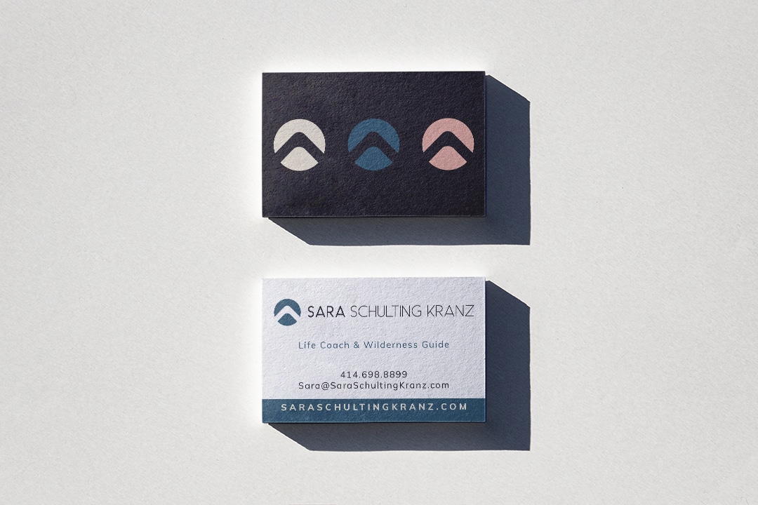
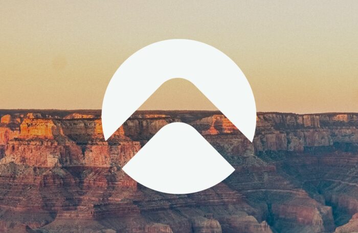
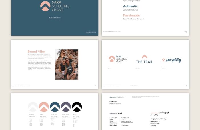
She chose the second comp we presented. A circle with a mountain cut out of the negative space. Mountains are a great mark for any entrepreneur or coach but especially when your business was started by hiking.
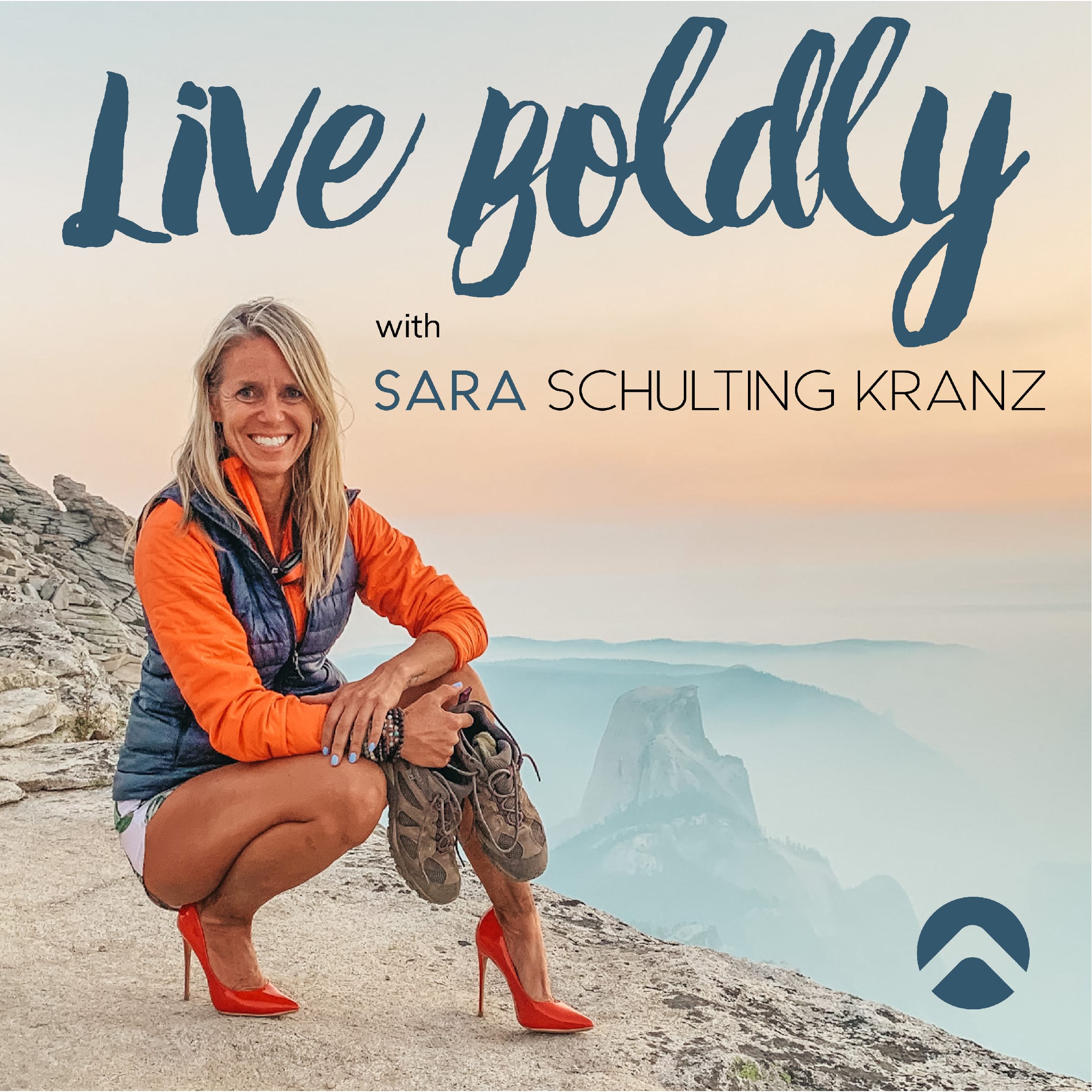
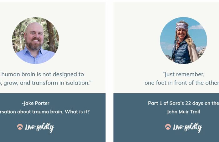
We added in the tagline “Live Boldly” to her logo and used a rough brush script. That was a nice way to bring back in a little bit of the grit from her original logo. The brush script feels bold and organic.
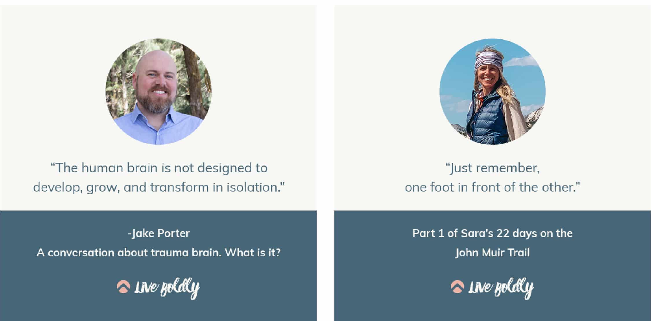
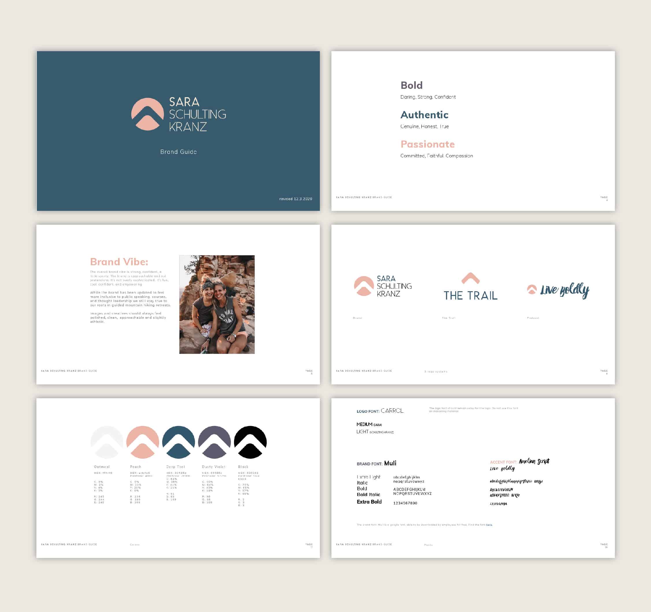
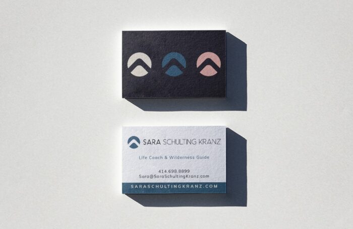
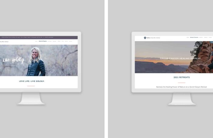
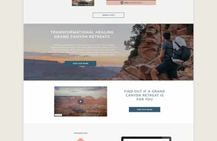
After finalizing the logo and color pallet we moved on to re-do the website, business cards, and create course and social media templates for the brand. We documented all the changes in a brand guide.
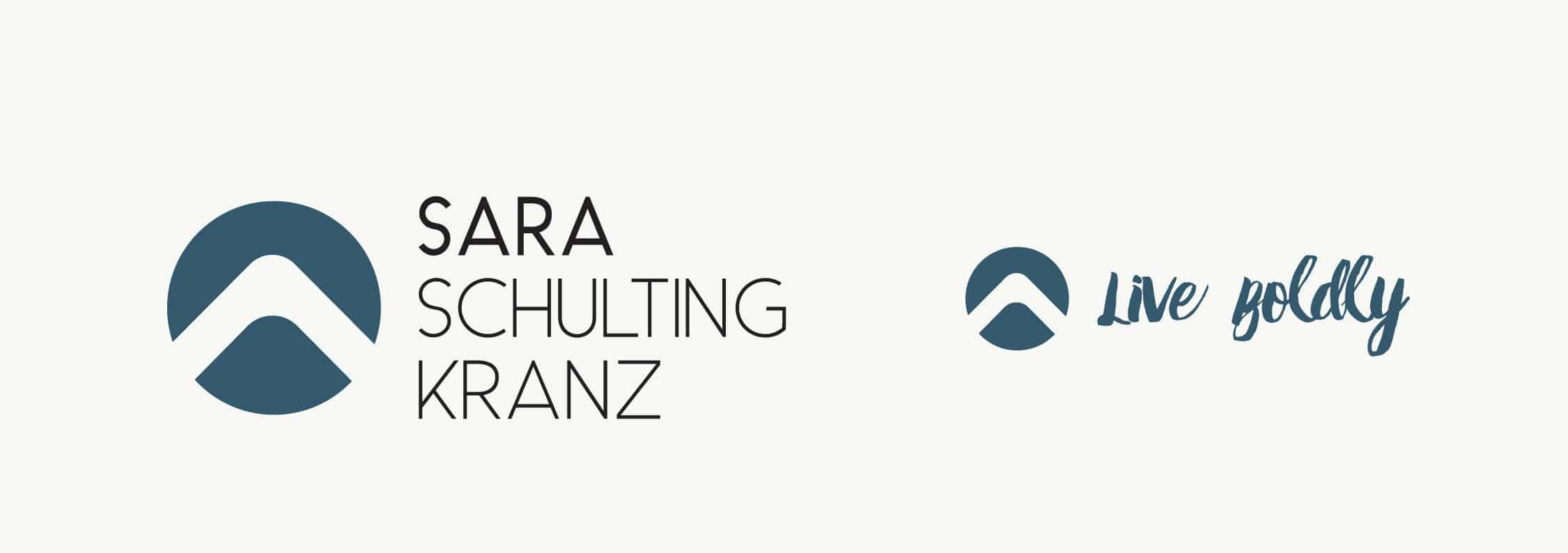
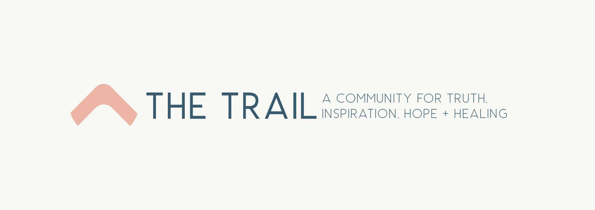
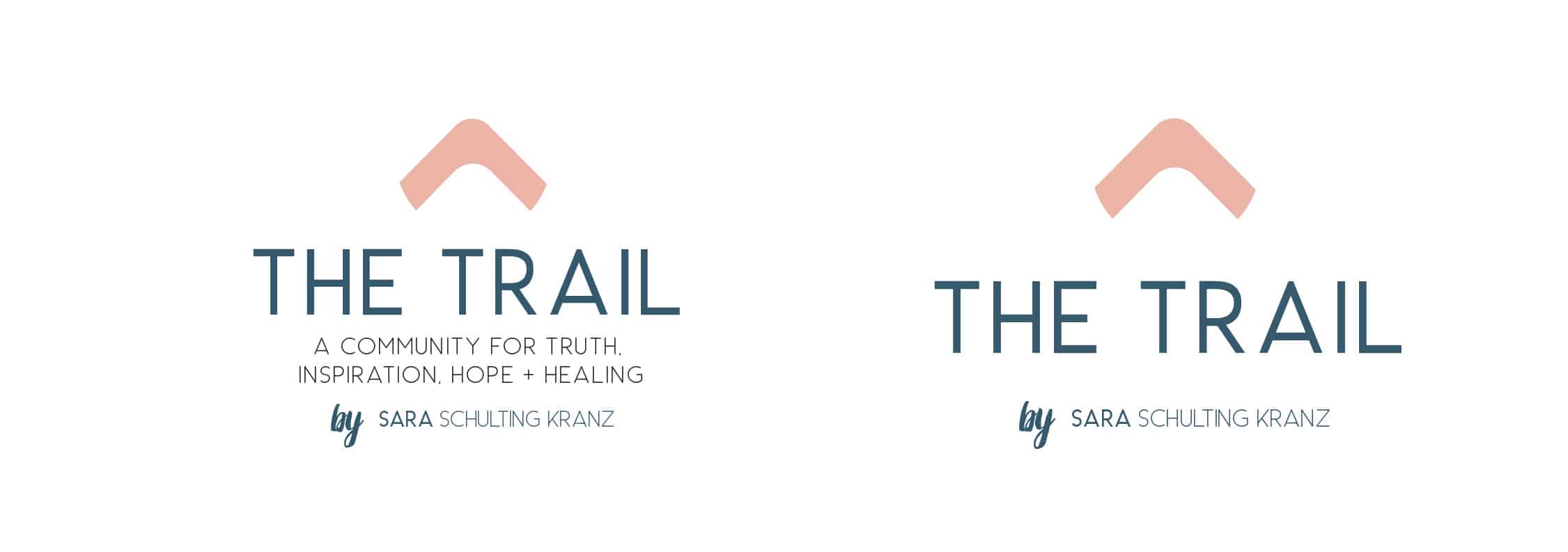
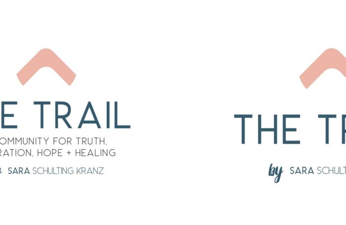
About a year after doing the re-brand Sara reached out and needed a logo lock up for an online group she was starting called “The Trail”. This is when we knew 110% we chose the right logo for her… by taking the negative space of the mountain on her logo we were able to create literally “The Trail”… This new logo lock up still looks and feels like Sara Schulting Kranz, but it’s noticeably something different from the whole brand.
Having the branding done and documented has made working on future project for Sara a walk in the park. There is no guess work. When she needs a landing page we are able to get one done in just a few days. The design heavy lifting is done and now it’s just adhering to the brand guide and making slight adjustments as needed to keep the brand fresh and relevant. Whenever we do a new landing page or creative piece for the Sara Schulting Kranz brand we make sure to add it to the brand guide or update the guide with any new design assets or changes we have made. This practice keeps her branding up to date and cohesive.
We look forward to watching Sara Schulting Kranz grow and supporting her along the way!
View Sara Schulting Kranz Retreats Pages
Services
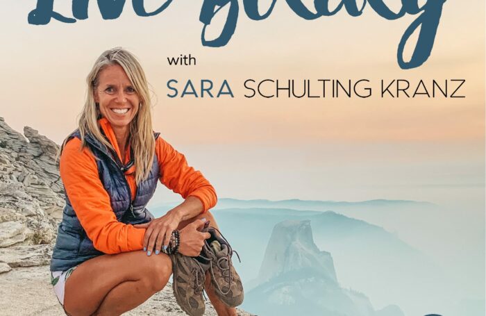
Podcast Cover & Episode Art
