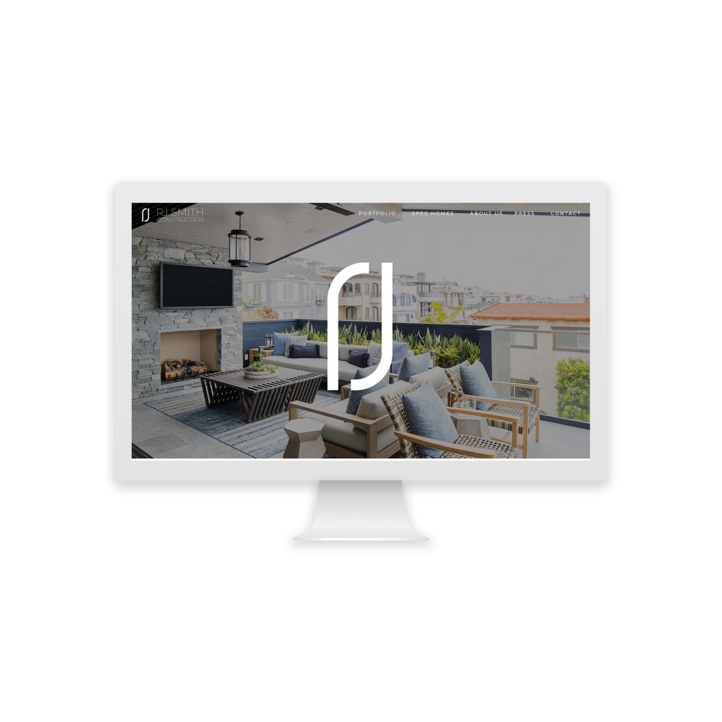
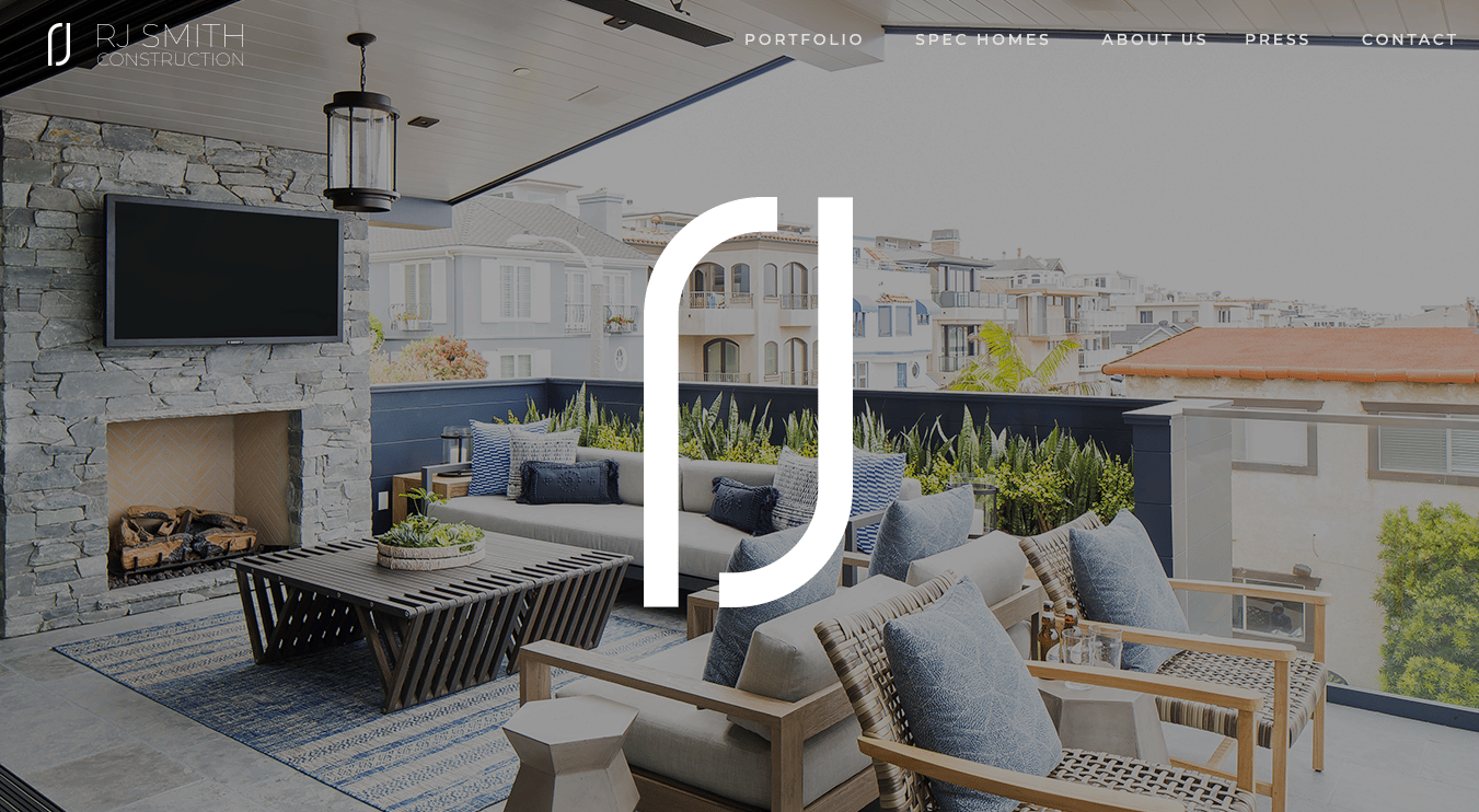
We partnered with RJ Smith Construction to create a new construction firm website. RJ Smith is one of the top full-service construction companies in the Los Angeles beach cities. He designs, and custom builds unique and beautiful homes.
RJ and his team paid attention to their branding and digital presence. Even though his business was growing, and he had no problem landing jobs on word of mouth alone, he knew his out-of-date, simple website did not align with his work’s quality and magnitude.
The Issue RJ Smith Construction Faced
Having an outdated or unattended website can be detrimental to any business. Imagine that you want to build a multi-million dollar home. A friend of yours raved about their contractor, but when you go to their website, it looks like it was made in 2001 and hasn’t been touched since. Would you trust that person to build you the multi-million dollar home of your dreams? Probably not!
Even if your website is not a big lead generator for your business, it can hurt your business if it doesn’t align with your work. And, yes, you need a website – it’s 2020 after all, so ignoring it altogether is no longer an option.
After we started the project, I talked with a mutual friend, architect Anthony Laney, who has worked with RJ on several projects. Anthony mentioned how charismatic RJ was and said it wants to make him stand out as a developer. That was the little nugget of information I needed to make the project a success. How do I make RJ’s charisma come across on a website?? I wish I could take full credit for doing that with web design alone, but I knew we needed more. We needed video content to help make RJ stand out.
The Solution
We connected RJ Smith and his team to our friend Stacey Jean, a local videographer who we knew would help bring RJ’s charisma to virtual life!
While they started on the video content, we started the website by gathering images from various projects. Beautiful photography is necessary for a beautiful website. Without it, good luck! We started small, by just showcasing four projects that were beautifully photographed. Then we gave each property a name based on appearance and worked with RJ’s team to describe each project and what made it unique. We designed the project gallery to grow with the client. They can add more properties as they wrap the projects.
We pulled inspiration from RJ’s airy coastal ascetic for the website. With the intentional use of white space, we made the website feel light and open. For an accent color, we used the branded dusty blue. Blue is a great color to convey trust and loyalty. It is also a calm color. All characteristics you would want in a contractor.
Once the videos were edited, we added a video to the home page and project specific videos to the showcased homes.
The RJ Smith Construction website came out beautifully. It’s reflective of his work and looks relevant, fresh, and cared for. It is a website set up to grow with him as he adds more high-end homes to his portfolio.
Now, if a friend was to refer RJ Smith Construction to you and you checked out their website, you would get a warm, welcoming feel. You’d see gallery views of each project and read about the development process. You’d be able to view videos to see how charismatic RJ is and make a connection with him before your first inquiry. Most importantly, you would visit a website that would make you feel confident in RJ Smith Construction!
Check out more of our website projects
