Are you opening a restaurant or questioning your existing restaurants’ exciting brand colors? You might be wondering what the best brand colors for a restaurant are?
I have helped countless restaurateurs establish their brands and choose the right colors for their restaurants!
Do you need colors?
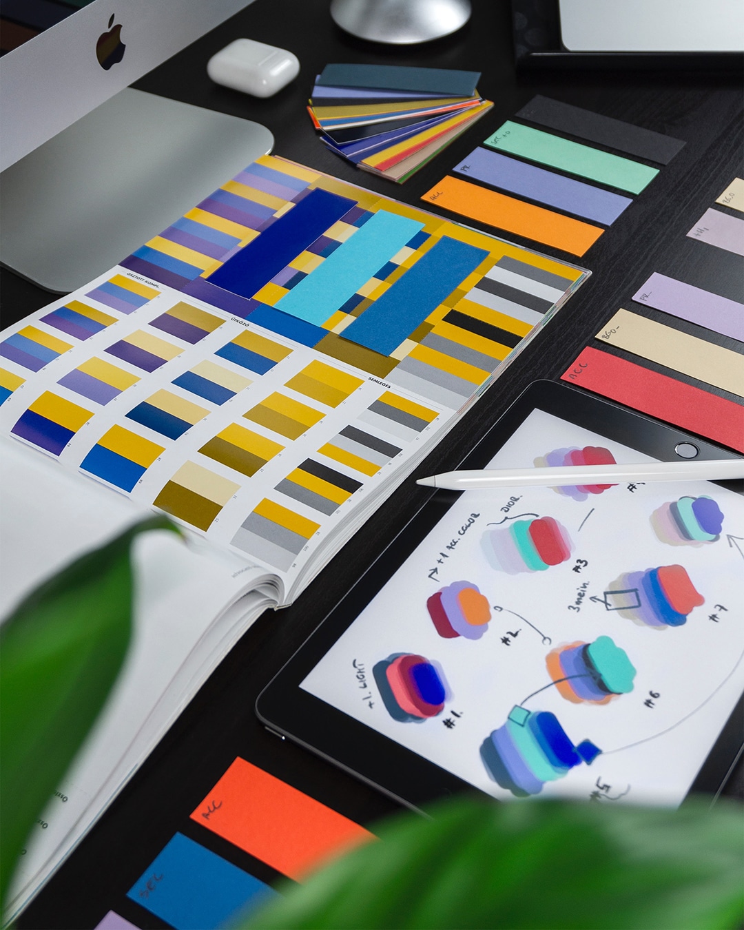
Yes, 9 times out of 10 you will want some sort of a consistent palette. You don’t need to go painting the whole place red, but think of having a palette that will tie in the interior design of the space with the color pops you use on your menu or by incorporating colors from your logo. Having a cohesive color palette makes people feel calm, their brains don’t have to work so hard, and inturn, they will stay a little longer!
What are the best colors for your restaurant?
There is no one-size-fits-all color palette for restaurants… but we use color in our brand favor. We start by identifying the brand attributes and how you want your brand to make your customers feel. From there we know what colors will work best for that particular restaurant.
Want to make people hungry?
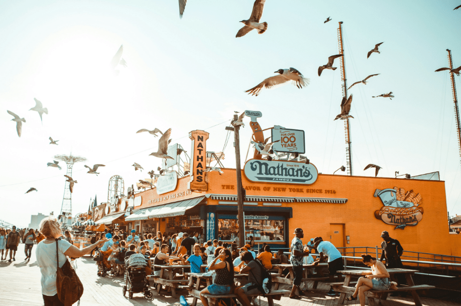
Go with red and yellow. These colors are scientifically proven to make you hungry! Red is a great authority color and yellow is energetic and happy… So basically those colors together are telling your brain, eat this now and you will be happy! That might be a bit of an exaggeration but you get the gist! There’s a reason 90% of fast food restaurants use red and yellow.
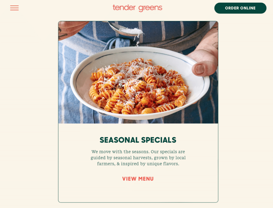
Check out Tender Greens… Green is in their name, but their color palette was orange and is now red and yellow! They have “Greens” in the name, used orange as brand color because they are an exciting brand and one of the first to serve sit down restaurant-level meals in a fast casual setting, but now have graduated to the “we want to make you hungry” color palette. You can read more about their re-brand here.
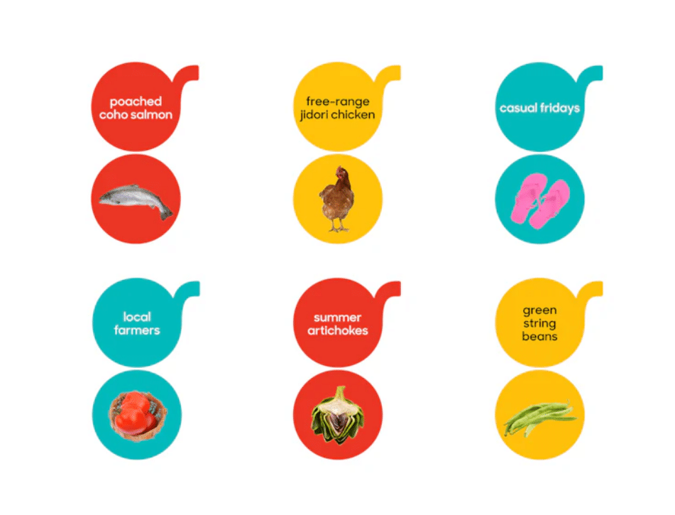 Coincidentally… in the time from when I wrote this article to when I was sourcing images for this blog (maybe 3 weeks), Tender Greens actually ditched their branding done by the world renowned agency, Pentagram. They have now adapted a dark green as their primary brand color! Check it out here.
Want to feel clean and healthy?
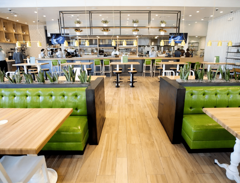
Green all the way! Green is the color of longevity and health. It’s a very calming color and has become the international color of health. If your restaurant specializes in vegan, healthy eating, or is based around clean healthy foods… go green all the way! You can accent with another color if you want to spice it up but green will serve you well. Check out True Foods Kitchen, they recently changed a bright green to a more army green but are accenting with an orange button to create excitement!
Want to be energizing?
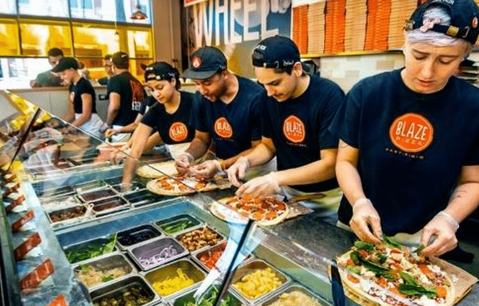
Orange! Orange is the most energizing color of the rainbow. This is a great color for a fun restaurant concept or if you are bringing something new to the market. If you are boasting a new creative menu, orange is the color for you.
Going high end dining?
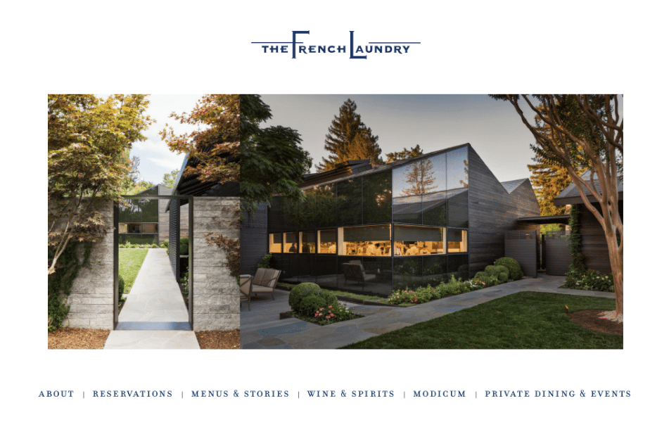 What if you are a high end dining establishment and feel like color would cheapen the brand… you are not wrong. However I would suggest utilizing a neutral pallet. Black and white or an off white color are timeless. But also, don’t shy away from a color. Thomas Keller’s French Laundry uses a deep blue color. Blue is regal and loyal. Great traits for a fine dining establishment. They use the color very sparingly, it’s in the logo and the staff aprons. His Surf Club Restaurant also uses blue but a lighter teal toned blue accented with pops of coral… very beachy but still high end. The colors are not too vibrant.
