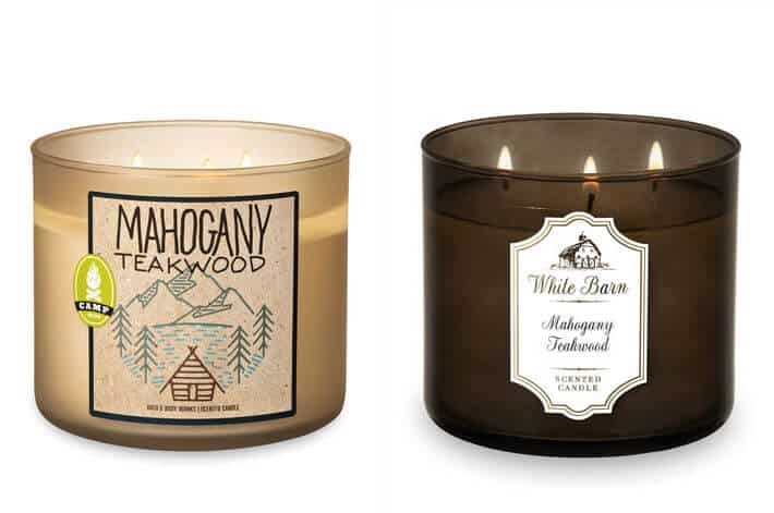
Packaging updates or changes are a great way to help increase sales. When new products hit the shelves, your product can get lost in the mix, but making subtle changes or updates to your packaging can help ensure your product stands out.
One of the most powerful examples of dramatic and effective use of packaging can be seen at Bath & Body Works. The retail giant has an extensive line of home fragrances and often offers the same scented products with different packaging. While the scent and the name of the fragrance stay the same, the label can vary from playful and kitschy to clean and sophisticated. They have also managed to rebrand the same scents to work for different seasons. For example, Fresh Balsam is usually only brought out during the holiday season but has recently been re-marketed as a “summer camping” type scent. Instead of a pine sprig on the label, it features an illustration that evokes thoughts of camping in summer. Mixing up the label designs in this way allows the retailer to have the appearance of offering more products while recycling the same scents with minimal work involved.
Another example of the power of packaging can be seen abroad: in Japan, many brands make the most of the cherry blossom, or “sakura,” season to create an increased demand for their products. During this springtime phenomenon, brands such as Asahi beer will brighten up their packaging with images of cherry blossoms in keeping with the season. While the beer in the can stays the same all year round, the cute and bright packages you find in March and April encourage shoppers to choose Asahi for their sakura celebrations and make the beer stand out from its competitors in stores.
We’re always inspired by brands who think creatively and use their packaging to stand out from the crowd, and a packaging redesign is a clever way to both keep things fresh and keep the customers coming. Have you seen any inspiring packaging updates recently? Tell us about your favorites in the comments!


