What is a logo system?
The last thing I like doing is making my clients feel inadequate by using words like “logo system,” but this is more than a buzzword and is something every business owner should be aware of, so let’s dive in and learn what a logo system is!
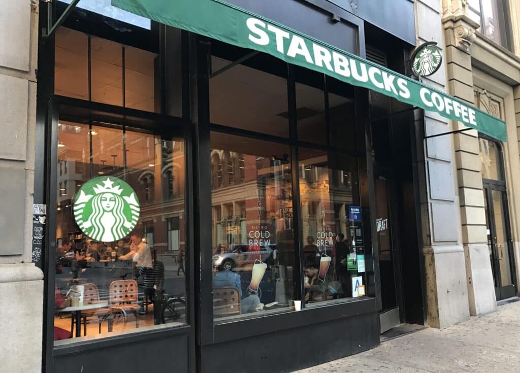
A logo system is basically different versions or variations of your logo that you will use in different places. My favorite reference for a logo system is Starbucks. Their original logo was a circle seal style logo. It worked great on coffee cups! But once they grew and grew with store fronts, they needed to adapt and have a logo that was visible on the side of an awning or a storefront. They needed what is called a “horizontal logo”. They use the same typeface as what is used on the seal, and will sometimes add the seal to the right or left side of the typeface.
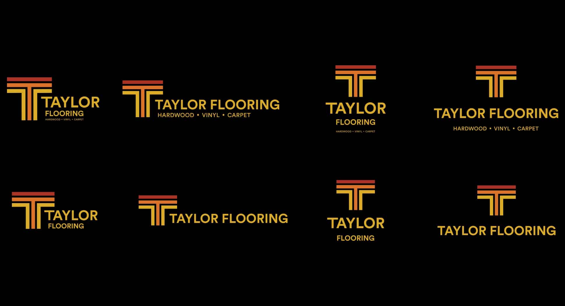
All good logo systems have these key layouts:
![]()
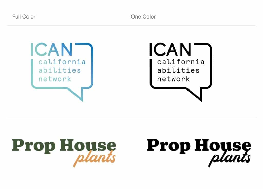
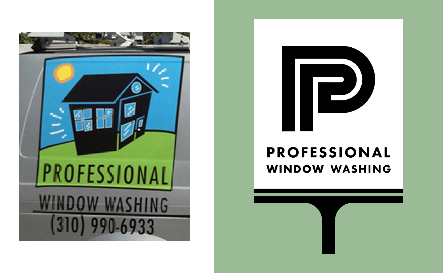
A primary logo: This is all the core components of your logo in the layout that you will be using the most. This varies from business to business. If you are a restaurant, you might want your primary logo to be a horizontal version since you know that will work on the top of a menu, top of a building, and on top of a website header. If you are a coffee shop, you might want to use a stacked version that is more square or circular since you will be using it on coffee cups and to-go bags. The primary logo will contain the mark, wordmark, and if you have tagline, the tagline.
Secondary logo: This logo will be the alternate of the primary… if you went with the horizontal logo as your primary, the stacked logo will be your secondary or vice versa. This is a version of your logo you will use whenever the primary doesn’t fit!
Horizontal logo: This is a horizontal type face of your logo usually paired with your logo mark on the left side.
Stacked logo: A stacked logo is where the logo mark and the type stack on top of each other. If your business name is 2-3 words they too are usually stacked. The mark is usually placed above the stacked type either left aligned or centered.
Rectangular layout: This is not always necessary but you might also have a version that is the logo mark on the left side, and stacked text on the right that is right aligned.
A mark: A logo mark is a small icon style mark that identifies your business. Think of the Nike swoosh, the Target circles, or the Apple apple-icon.
Wordmarks: The wordmark logos are versions of your logo type without the logo mark. Some brands use this a lot whereas others never do. It’s always good to have a version of this in your back pocket for times when the mark is not necessary or might seem redundant if the logo mark is being used as a design element.
Testing your logo for a system
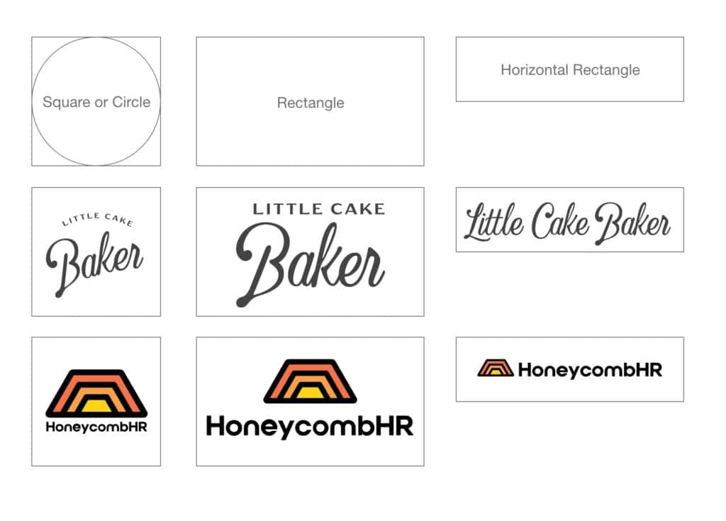
Take all of these shapes, a short and long rectangle, a rectangle, a square and or a circle… you should have a version of your logo that occupies each of these spaces. Make sure you have versions that fit in these shapes with both the logo mark and the logo type. If you are missing one of these layouts, reach out to a designer and see if they can create one for you!
Why do you need a logo system?
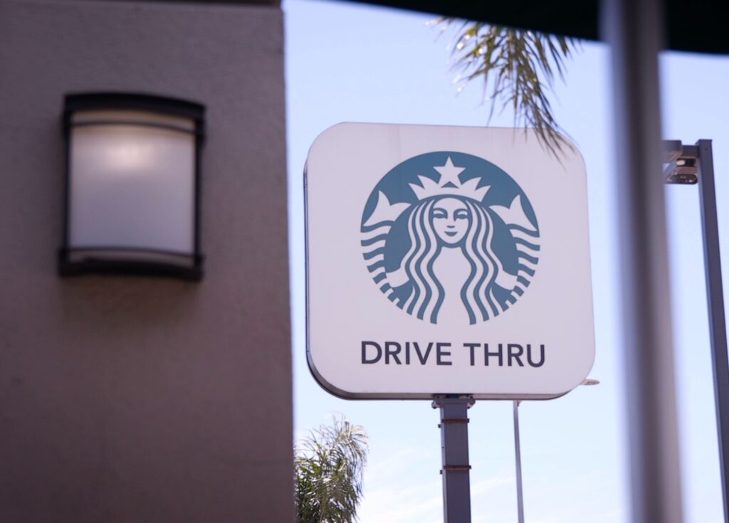
Max visibility! It’s important to remember that your logo’s only job in this world is to identify your business as your business. It is not meant to communicate, only identify. Ensuring you have a logo version that works in each of the shapes will give you maximum visibility and give your logo the best chance of being seen and identified! Think of how much visibility Starbucks would lose if they had to shrink their green icon down to fit on the side of an awning that was 4in x 24 feet? It would be a huge waste of space and loss of visibility!
Now Starbucks is a funny reference for this since they now officially “made it” where they don’t even need to say “Starbucks” anymore… A lot of their new signs will be the green logo mark and the word “Drive Thru” under it. That only happens after YEARS AND YEARS of great visibility and tons of brand recognition. I could now drop a green circle on a coffee cup and you would assume I mean Starbucks. Don’t think you are Starbucks. Start building that brand recognition by utilizing a logo system!
Want help creating a logo system? Book a call.


